
Hey,
Welcome to the 107th edition of Ad Pulse Monday!
For those new to this series, every Monday, I select an ad or ads that have performed exceptionally well. I’ll break down their success factors, key takeaways, and how you can apply these insights to your business.
If you’re already familiar with Ad Pulse Monday, welcome back!
Consider bookmarking these posts, creating a handy repository right in your browser.
Without further ado, let’s dive in
Breaking Down the Revive Essential Oil Ad
1. Thumbnail Score
I’m giving it a 4.5 out of 5.
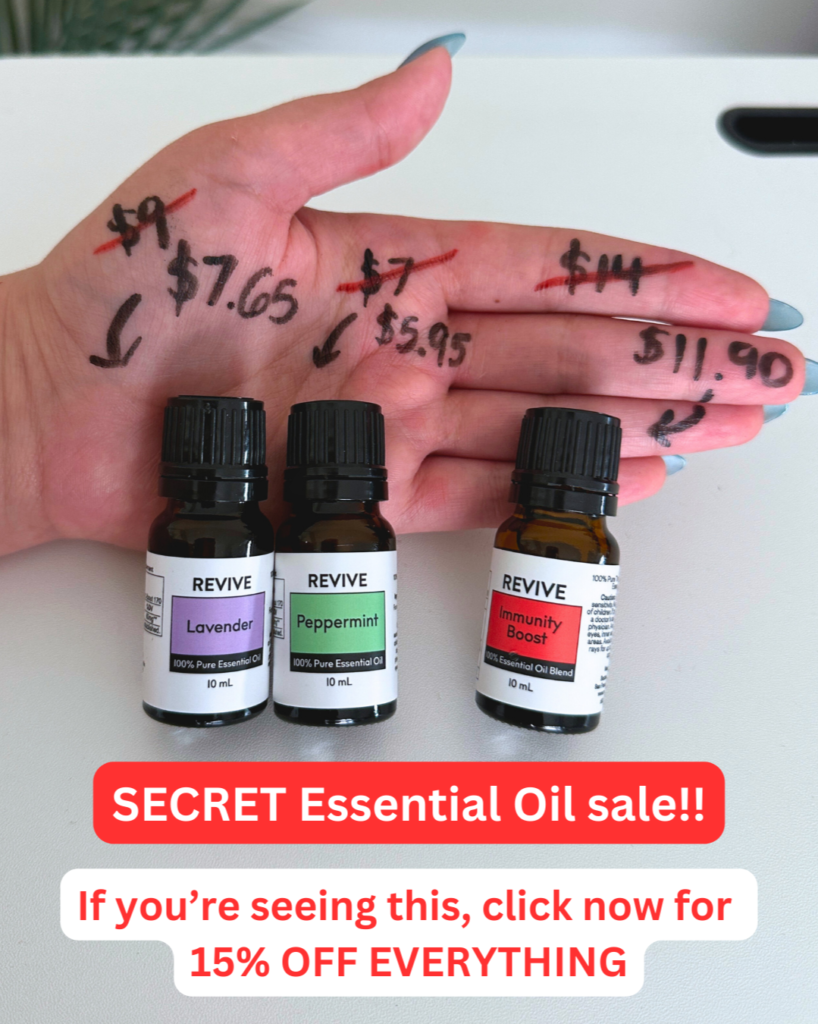
The thumbnail uses a hand with prices written directly on the skin in black marker. It looks like a quick phone picture rather than a polished brand campaign.
The crossed-out numbers and handwritten arrows create an instant pattern interrupt on the social feed. It feels out of the ordinary and worth paying attention to.
The product bottles sit directly on the hand below the price cuts. Red and white text overlays highlight a “SECRET sale” and 15% discount.
It highlights the savings right away.
The image works as a BOFU sale ad that creates urgency.
2. Click Score
This earns a 4 out of 5 from me.
Framing the ad as a “SECRET SALE” creates instant curiosity and FOMO. Viewers feel like they are getting exclusive access to a special discount.
The graphic explicitly tells the user to “click now for 15% OFF EVERYTHING”. Showing real prices directly on the creative drives clicks.
This delivers higher intent traffic to the store and boosts overall CTR.
Caption
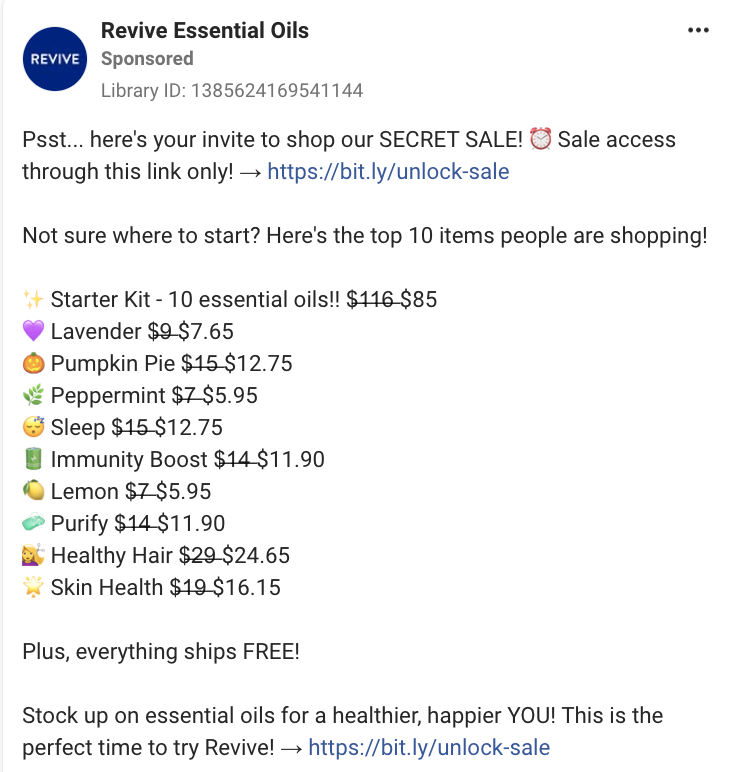
The hook uses conversational language (“Psst… here’s your invite”) to set an exclusive tone. It also provides direct links right at the top to make clicking easy.
Moreover, it lists the top 10 popular products along with emojis and strikethrough pricing. The use of strike-through pricing makes the discount feel significant.
Short lines and emoji bullet points make the text easy to skim.
It’s a good caption that immediately shows its offers and urges BOFU leads to take advantage of the sale before the time runs out.
Headline
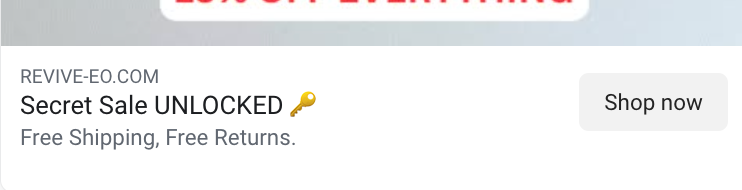
The headline is short and direct. It reinforces the idea of unlocking a secret sale.
It works as a teaser for the sale and creates curiosity.
But it could’ve used real numbers to substantiate its claim.
Description
The description directly presents a free shipping and return policy. It helps push hesitant buyers to convert.
The description could’ve been improved by providing concrete numbers.
3. Ugly Score
This ad scores a 5 out of 5.
It relies completely on ugly ad principles with a simple hand photo. The marker writing on skin feels completely unpolished and amateurish.
Moreover, the native overlay text boxes make it feel like a real social media story.
This unpolished look immediately stands out and stops the scroll. It’s an interesting visual that is extremely unpolished and organic.
4. Congruency Score
I give this a 2 out of 5.
The landing page links directly to the product shop page. There’s no mention of the “Secret Sale” that was mentioned in the caption and description.
While the products listed in the caption are immediately visible, there is no “Sale” or discounted pricing, which severely decreases the page’s congruency.
All the brand products are listed in a grid format, with product images and the “Add to Cart” CTA buttons right below each product image.
The layout is too overwhelming at first glance.
The number of product images is simply too much for any visitor, even for the highest-intent BOFU users who know what they want.
Every product, regardless of its importance, is displayed in the same manner without any hierarchy or pointers. It’s a mess to look at and doesn’t feel inviting enough to click.
A cleaner product page with hierarchy and division would work better. Moreover, the page can be filtered and organized into a dialog box that takes users to the product listed in the ad.
How Can You Use This For Your Business?
1. Use Handwritten Props
Writing the price on paper or skin creates scroll stops by interrupting the feed with an unpolished, unusual look.
2. Highlight Value By Using Strikethrough Pricing
Showing the original prices crossed out next to sale prices creates value for the sale price and drives conversions.
3. Streamline the Landing Page
A confusing landing page drives away leads. Streamlining the page will help you get better results.
Main Insights From the Ad
- Thumbnail Score: 4.5 / 5
- Click Score: 4 / 5
- Ugly Score: 5 / 5
- Congruency Score: 2 / 5
What Works Well
- Unpolished visuals with handwritten numbers as a strong scroll-stopper on social feeds.
- Strikethrough pricing in the caption creates more urgency and leads to faster conversions.
- Addressing shipping costs directly in copy helps boost conversions.
What the Ad Can Improve
- The landing page needs to be overhauled to feel less overwhelming.
- The ad’s headline and description could be stronger, with more evidence or storytelling.
Check Out the Landing Page:
https://www.revive-eo.com/shop
Related Ad Breakdowns
- Ad Pulse Monday 108 – Bella Belts Hole-Less Belt
- Ad Pulse Monday 106 – Locklab Custom Hair Regrowth
- Ad Pulse Monday 105 – Splash Cleaning Spray
This post is packed with insights; I again recommend bookmarking it in your browser for future reference.
Well, that’s all for the post, folks!
Happy Marketing!
Pingback: Ad Pulse Monday 100 - Teen Skincare from Norse Organics
Pingback: Ad Pulse Monday 109 - Froya Organics Arctic Balm - Sannidhya Baweja
Pingback: Ad Pulse Monday 110 - NX1 Project Skincare - Sannidhya Baweja