
Hey,
Welcome to the 109th edition of Ad Pulse Monday!
For those new to this series, every Monday, I select an ad or ads that have performed exceptionally well. I’ll break down their success factors, key takeaways, and how you can apply these insights to your business.
If you’re already familiar with Ad Pulse Monday, welcome back!
Consider bookmarking these posts, creating a handy repository right in your browser.
Without further ado, let’s dive in
Breaking Down the Froya Organics Arctic Balm Ad
1. Thumbnail Score:
I give this a 5 out of 5.
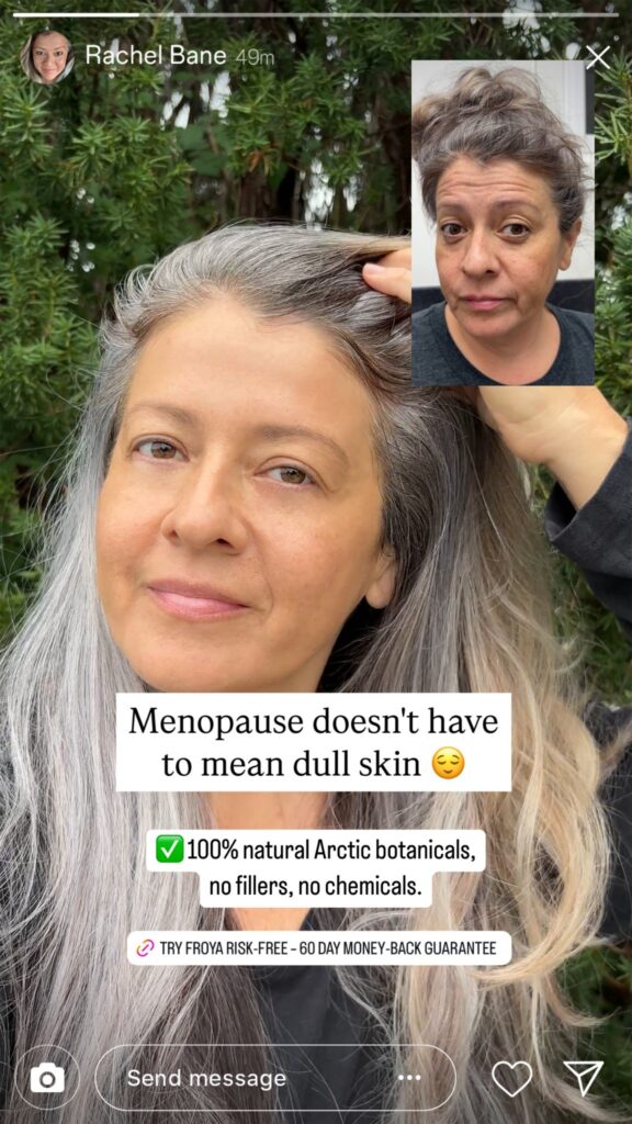
This ad is a great pattern interrupt designed specifically for mobile feeds. It mimics a native Instagram Story, complete with profile header and response overlays.
The primary visual features a genuine customer selfie highlighting her glowing skin. A separate overlay picture in the top corner shows a raw “before” shot of dull, fatigued skin.
This before/after setup instantly shows visual proof without feeling staged.
The hook text overlay also targets a specific niche pain point aimed at women in menopause.
It includes overlays like “100% natural Arctic botanicals” and a “risk-free money-back” button link to increase the product’s assurance.
A creative like this blends seamlessly into organic story feeds and makes the user trust it more than a regular ad creative.
2. Click score:
I’ll give this a 4 out of 5.
The creative creates immediate curiosity about how the product reverses dull skin. And the direct visual contrast drives users to read the supporting copy for details.
It pairs strong social proof with high scarcity in the headline to maximize CTR.
Caption:
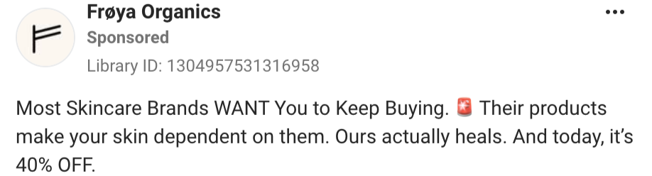
The caption is very short. The hook uses a villain angle by positioning the brand against traditional commercial skincare.
Following it up with the line “Their products make your skin dependent on them. Ours actually heals” creates strong brand contrast. It makes the brand look more authoritative and confident in its product.
The caption ends with an immediate offer incentive: “And today, it’s 40% OFF.”
While it does its job, the caption could’ve continued from the ad creative and used a bit of storytelling to expand on the image.
Headline:

The headline leverages extreme scarcity and social proof to trigger immediate FOMO.
By telling buyers that a product previously sold out in 2 Days, it encourages immediate action.
The headline drives high-intent clicks directly to the landing page.
Description:
The description text adds a personal emotional payoff by continuing from the headline and the creative.
It frames the transformation around a real-life reaction rather than corporate claims. This angle resonates strongly with the target demographic.
Finally, the CTA is a “Shop Now” CTA button to push users to the page.
The CTA could be better. It should have used something more specific in relation to the product, rather than a generic “Shop Now”.
3. Ugly score:
I give it a 5 out of 5.
It uses raw, unedited smartphone imagery with natural outdoor lighting in the Instagram Story format.
The creator’s messy hair and unposed expressions make it feel 100% authentic.
The way it uses native IG Story UI elements like the top progress bar and bottom chat bar makes it feel truly native and organic.
Users will see it as a recommendation from a friend rather than a sponsored campaign. It completely bypasses feed blindness and creates curiosity for the product.
4. Congruency Score:
I give this a 5 out of 5.
The landing page continues from the ad creative seamlessly.
The first section shows an image of the product with an image of a smiling woman, along with a few trust badges that authenticate the product.
Moreover, the copy also shows the 5-star review count of 583,000, along with the product’s hero line and a short description of the product’s benefits.
The CTA is clearly given with the “Save 40%” incentive as well as a list of immediate results.
After that, there’s a section with positive endorsements from different skincare magazines. Right below is a Before/After section with customer images and reviews, which greatly increases the product’s trustworthiness.
Following that is a Scientific Proof section that explains how the product works with specific terms like “Collagen & Elastin” as well as specific numbers like “delivers 17x more Vitamin C” to expand on the product’s mechanism.
Right after is a results section that shows the results on a horizontal bar chart with numbers. The next section is another benefit call-out with the CTA.
The final few sections all expand on the product’s trustworthiness by giving a list of unedited positive reviews, video testimonials, more scientific backing, and even a note from the supposed founder.
All in all, it is a great landing page that removes any doubt about the product. It establishes the brand and its product’s results as trustworthy and pushes prospects toward the CTA naturally.
How can you use this in your Business?
- Utilize Native Instagram Story Formats: Frame static image ads inside Instagram Stories to blend into organic feeds.
- Call Out Specific Audiences: Use targeted hooks like “Menopause skin” to immediately capture traffic from your target audience.
- Frame a Common Industry Villain: Position your product against traditional competitors by calling out industry flaws.
Main Insights from the ad:
- Thumbnail Score: 5 / 5
- Click Score: 4 / 5
- Ugly Score: 5 / 5
- Congruency Score: 5 /5
What works well:
- Native story format bypasses ad blindness and lowers overall CPC.
- Powerful before/after proof using an organic selfie format.
- A great landing page that flows seamlessly from the ad creative and removes any doubt regarding the product.
What the ad can improve:
- The caption could use storytelling to continue from the creative and create an emotional connection with the user.
- The CTA should be more specific to the product.
Check Out the Landing Page
Related Ad Breakdown
- Ad Pulse Monday 108 – Bella Belts Hole Less Belt
- Ad Pulse Monday 107 – Revive Essential Oils
- Ad Pulse Monday 106 – Locklab Custom Hair Regrowth
This post is packed with insights; I again recommend bookmarking it in your browser for future reference.
Well, that’s all for the post, folks!
Happy Marketing!
Pingback: Ad Pulse Monday 110 - NX1 Project Skincare - Sannidhya Baweja