
Hey,
Welcome to the 100th edition of Ad Pulse Monday!
For those new to this series, every Monday, I select an ad or ads that have performed exceptionally well. I’ll break down their success factors, key takeaways, and how you can apply these insights to your business.
If you’re already familiar with Ad Pulse Monday, welcome back!
Consider bookmarking these posts, creating a handy repository right in your browser.
Without further ado, let’s dive in
Breaking Down the Norse Organics Teen Skincare Ad
1. Thumbnail Score
I’m giving it a 4.5 out of 5.
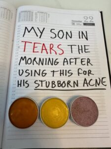
The physical notebook layout is something unusual and is an instant pattern interrupt in the social feed.
It looks completely organic, which helps it bypass traditional consumer blindness to hyper-polished static image ads.
The word “TEARS” is written in bright red ink right after “My Son” in black, serving as a visual anchor.
“Stubborn Acne” is also underlined, highlighting the pain point for the product’s target audience.
From the image, it’s clear that the product’s target audience is teens with acne, but the ad’s angle targets secondary buyers, such as parents.
The ad copy is also designed to trigger empathy in parents whose children have the same problem.
Moreover, the three product tins at the bottom display the formulas naturally, without high-production-value studio lighting.
But it is unclear which tin contains what, which drives curiosity and clicks.
There is also no clarity in the copy about whether the “tears” are tears of joy or frustration.
This again creates curiosity and drives engagement to find out the actual resolution.
The only reason it doesn’t hit a perfect score is that it lacks a subtle product label to build brand attribution.
Moreover, a clear native-looking scribble with the discount could help drive more clicks.
2. Click Score
The click score earns a 3 out of 5 for me.
The post is made to look like it is from “Anne’s skincare blog”, which creates the feeling of an organic recommendation from a skincare blogger.
Caption
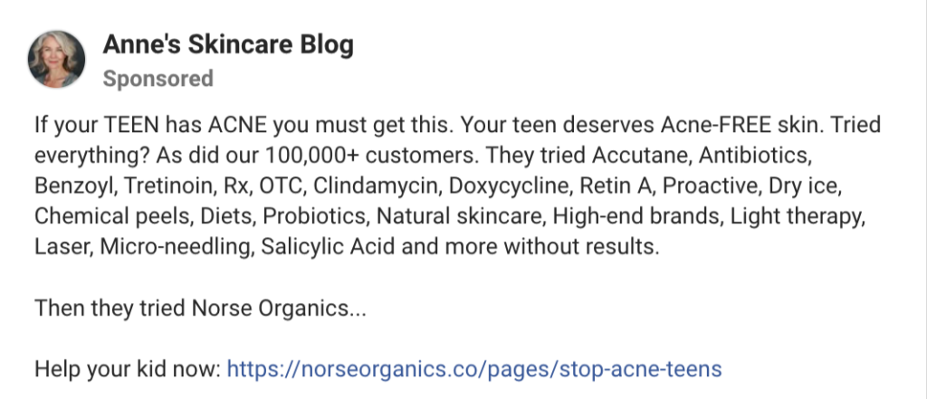
The hook is very average. It highlights the target audience and the pain point, but otherwise it’s a generic “If you have X problem, you must get Y” hook with no changes.
The rest of the caption works better than the hook.
It lists various skincare methods that usually come up as solutions to the problem, and it ends with “and more without results,” implying they’re ineffective.
Instead of the usual methods, the caption suggests that Norse Organics’ products are the solution.
The line “Then they tried Norse Organics…” hints that the brand’s product solved the problem, yet it refuses to provide any concrete results.
This creates curiosity in parents to see the results, which drives landing page clicks.
It ends with a basic “Help your kid now” CTA link that does the bare minimum to create an emotional connection.
The caption could have benefited from a stronger emotional angle to support the claims, backed by hard data on the various skincare methods, or with a storytelling format.
Heading
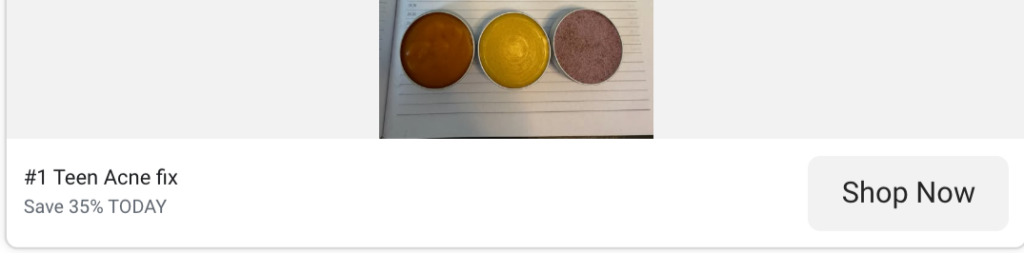
The heading is a basic one-liner that says “#1 Teen Acne fix”.
It does its job, but it could be improved by citing a source for its claim to be #1 or by pivoting to an emotional angle.
Putting a parent quote instead of the generic line could drive more clicks by appealing to emotions.
Description
The description is a standard “Save 35% TODAY” which doesn’t stand out as much as it could.
Though discounts and offers always guarantee higher CTRs and conversions, a basic one like this doesn’t really draw high-intent clicks.
A line about the product’s benefits or another emotional storytelling line with the discount could have increased the believability of the ad copy.
Otherwise, it looks like it’s just another discount offer for another product on the feed, despite the great static image.
3. Ugly Score
I give this a 5 out of 5.
The ad exemplifies what a great ugly ad looks like.
Making the claim a handwritten note on paper gives it a raw, authentic feeling that is unlike anything on the feed.
It stops viewers in their scroll and makes them curious to check out the ad.
The extreme imperfection and the unclear, highlighted words appeal to both emotion and curiosity.
It makes the creative feel very human, trustworthy, and relatable.
Ugly creatives like these also don’t cost much to create and scale.
They also almost always outperform polished creatives because they stand out and feel authentic.
4. Congruency Score
I give this a 4.5 out of 5.
The landing page continues from the ad.
It immediately puts the discount offer, CTA button, and headlines “STOP ACNE & SAVE 40%” in red and “No. 1 most sold Acne treatment for teens” front and center.
Below the headline, the copy outlines the product’s benefits, including a line stating “95% were cured of acne” in “clinical trials”.
Next to it, the product images are also shown, along with a customer testimonial as a comment graphic.
Just below is a 5-star rating graphic with text that says “500,000 Real Teens helped (4.9/5).”
This is a strong opening that provides easy, seamless access to the CTA while giving just enough information to validate the product.
The product image, branding, comment testimonial, and ratings all help build credibility for the brand.
Scrolling down, there’s a horizontal-scrolling Press Mentions banner with logos and one-line reviews from reputed sources like CBS and Forbes.
Moreover, a Before/After grid image is right below, with another testimonial to back the claim.
Further scrolls reveal Facebook comment reviews, video testimonials shot on iPhones by mothers, teens, and a medical professional.
All this adds to the brand’s credibility, making the product seem trustworthy and successful at its claim.
The more testimonials and visual evidence, the higher the brand’s trustworthiness.
Despite this, the Add to Cart and full discount information are placed a bit further, which could have been placed a bit earlier.
The last few scrolls are full of infographics on the product’s ingredients, a Clinical and User Trial section with links to studies, and a comparison list against other methods.
All of it is very informative and helps build trust in the brand.
The only thing missing is a Common Questions/FAQ section to completely remove any doubt.
Otherwise, it’s a very good landing page that is congruent with the ad’s claims.
How Can You Use This For Your Business?
1. Lean Into Handmade and Analog Formats
Try writing your hooks on paper, whiteboards, or sticky notes to feel authentic and destroy feed blindness.
2. Target Secondary Buyers
Write specific angles meant for loved ones or parents, who buy products to solve a family member’s pain point.
3. Make Use of Curiosity Gaps
Frame your headlines and captions so that users are forced to click the CTA to get the full picture.
4. Keep Product Shots Unedited
Show raw photos of your product to reduce customer skepticism early on.
Main Insights From the Post
- Thumbnail Score: 4.5 / 5
- Click Score: 3 / 5
- Ugly Score: 5 / 5
- Congruency Score: 4.5 / 5
What Works Well
- The handwritten format achieves a fantastic thumb-stop rate on social media feeds.
- High emotional pull attacks a deep personal pain point to drive more clicks.
- Use curiosity gaps and highlighted text to create an incentive for viewers to click on the ad.
- The ad is easily scalable due to its low production costs and replicability, which lowers your nCACs.
What Can Be Improved
- Adding a small, unpolished brand logo could help create brand attribution.
- A clearer, native looking discount code can further incentivize the click.
- The caption, headline, and description can use storytelling and data-backed claims to motivate more engagement with the ad.
Check Out the Landing Page:
https://norseorganics.co/pages/stop-acne-teens
Related Ad Breakdowns
- Ad Pulse Monday 108 – Bella Belts Hole-Less Belt
- Ad Pulse Monday 107 – Revive Essential Oils
- Ad Pulse Monday 106 – Locklab Custom Hair Regrowth
This post is packed with insights; I again recommend bookmarking it in your browser for future reference.
Well, that’s all for the post, folks!
Happy Marketing!