
Hey,
Welcome to the 106th edition of Ad Pulse Monday!
For those new to this series, every Monday, I select an ad or ads that have performed exceptionally well. I’ll break down their success factors, key takeaways, and how you can apply these insights to your business.
If you’re already familiar with Ad Pulse Monday, welcome back!
Consider bookmarking these posts, creating a handy repository right in your browser.
Without further ado, let’s dive in
Breaking Down the Locklab Custom Hair Regrowth Ad
1. Thumbnail Score
I give it a 5 out of 5.
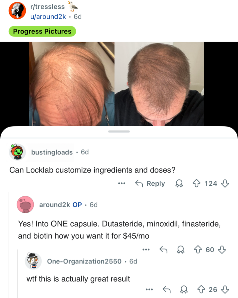
The thumbnail uses a raw screenshot of a Reddit post from r/tressless.
It creates an immediate pattern interrupt on the feed because it looks like organic forum content rather than a paid ad.
The top half shows clear Before/After hair regrowth progress pictures. This visual proof immediately captures attention and targets audience pain points.
The bottom half highlights a real comment thread asking about Locklab’s custom ingredients and pricing. It answers major customer objections directly in the graphic. The comment “wtf this is actually great result” provides massive social proof.
This ad format drives top-tier engagement for MOFU audiences.
2. Click Score
This earns a 4 out of 5 from me.
The combination of progress pictures and Reddit comments creates strong curiosity.
Users want to know how the user got those results for $45/month. Revealing the ingredient customization and a positive review in the screenshot generates clicks.
This leads to higher traffic and a strong CTR on the ad. It naturally pushes interested users to hit the CTA to learn more.
Caption
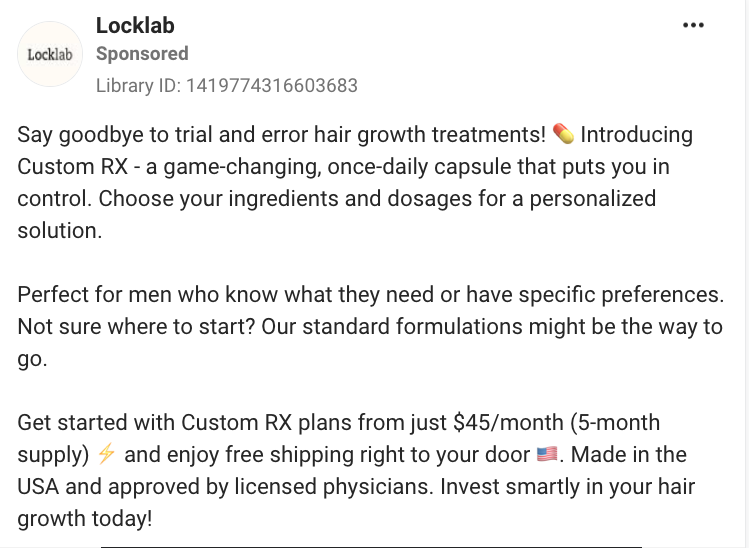
The hook directly targets men dealing with hair loss by promising to end their experiences with “trial and error” hair growth treatments.
Then, it introduces Custom RX as a personalized, once-daily solution. The caption clearly outlines key benefits, including custom ingredients and dosages.
It establishes transparency by listing the price starting at $45/month for a 5-month supply.
The references to “Made in USA” and “approved by licensed physicians” build trust quickly.
A checklist or bullet points of the benefits could’ve made the copy easier to skim through.
Headline
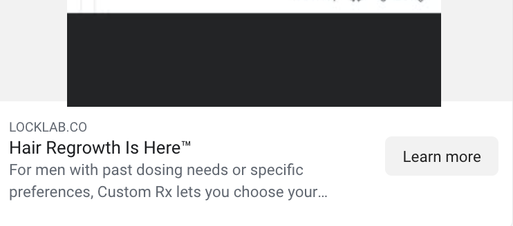
The headline communicates the primary benefit.
It aligns with the visual proof shown in the thumbnail.
But it could’ve used the starting price of $45/month for a 5-month supply as a catchier, more urgent headline.
Description
The description targets men with specific dosing preferences or past treatment needs.
It reinforces the core message of custom formulations and personalized care.
The description does a good job of creating interest and flows well with the caption.
3. Ugly Score
I give it a 5 out of 5.
It relies entirely on ugly ad aesthetics by using an unpolished screenshot from the Reddit mobile app.
The design includes native platform elements like Reddit upvotes, username tags, and comment UI.
It looks like a genuine post from a real user rather than a polished corporate campaign.
Users become curious about the before/after pictures, the organic comment thread, and the positive review, which incentivizes them to click on the ad.
This raw, imperfect look drastically lowers ad fatigue and CPC.
4. Congruency Score
I give this a 5 out of 5.
The landing page matches the ad by immediately showing the product and the custom ingredients under the product headline. It is clean, has consistent branding, and is easy to skim through.
The pricing in the ad is also front and center next to the “Get Started” CTA button, with two drop-down menus for “Ingredients doctors trust” and “Safety”.
This establishes congruency between the ad and the landing page, which fosters trust.
Right below is a carousel with Before/After photos and customer reviews, which further strengthens the ad’s trustworthiness.
After that, there is a table explaining each ingredient’s benefits and a “How our Capsule Customizer works” list that details how the product works. Finally, there is an FAQ section that addresses common customer questions.
Taken together, the landing page is a great continuation from the ad and works on all levels to create trust and remove doubts and hesitancy before clicking the CTA.
How Can You Use This For Your Business?
1. Use Native Forum Screenshots as Creatives
Real community discussions or Q&A threads create high-converting ugly ads.
2. Answer Price and Product Doubts Early
Put core pricing and product details directly inside the comment section of the image creative.
3. Show Visual Proof First
Lead with raw Before/After photos to stop the scroll instantly.
Main Insights From the Ad
- Thumbnail Score: 5 / 5
- Click Score: 4 / 5
- Ugly Score: 5 / 5
- Congruency Score: 5 / 5
What Works Well
- The native Reddit layout acts as an incredible pattern interrupt on Facebook and Instagram.
- Before-and-after photos provide instant visual proof that drives up CTR.
- The landing page addresses common questions and doubts and is also congruent with the ad
What the Ad Can Improve
- The caption could use simple bullet points to make the benefits even easier to read.
- Adding a stronger urgency trigger in the copy could boost immediate conversions.
Check Out the Landing Page:
Related Ad Breakdowns
- Ad Pulse Monday 108 – Bella Belts Hole-Less Belt
- Ad Pulse Monday 107 – Revive Essential Oils
- Ad Pulse Monday 105 – Splash Cleaning Spray
This post is packed with insights; I again recommend bookmarking it in your browser for future reference.
Well, that’s all for the post, folks!
Happy Marketing!
Pingback: Ad Pulse Monday 108 - Bella Belts Hole-Less Belt - Sannidhya Baweja
Pingback: Ad Pulse Monday 102 - Anaconda Fightwear Shoulder Brace - Sannidhya Baweja
Pingback: Ad Pulse Monday 109 - Froya Organics Arctic Balm - Sannidhya Baweja