
Hey,
Welcome to the 105th edition of Ad Pulse Monday!
For those new to this series, every Monday, I select an ad or ads that have performed exceptionally well. I’ll break down their success factors, key takeaways, and how you can apply these insights to your business.
If you’re already familiar with Ad Pulse Monday, welcome back!
Consider bookmarking these posts, creating a handy repository right in your browser.
Without further ado, let’s dive in
Breaking Down the Splash Cleaning Spray Ad
1. Thumbnail Score
I give this a 4.5 out of 5.
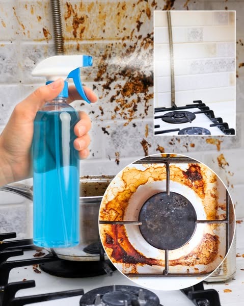
It shows an incredibly dirty, grease-stained kitchen wall and stove, forcing an absolute pattern interrupt.
The raw shock value of the image instantly grabs your eyes.
On the left is an unbranded blue spray bottle spraying to the right. It sprays toward a rectangular cutout showing a clean stove.
Inside the creative, a circular cutout of a dirty stove is placed on the lower right. Above it is the cutout with the clean stove image.
Such framing shows a stark before-and-after comparison, providing visual proof of how well the spray works on the spot. It builds awareness of the product’s effectiveness.
The blue spray bottle also provides a sharp color contrast to the brown grease in the image.
It uses our natural desire for cleanliness to create a desire for the product.
The only reason this doesn’t score full is that the bottle is unbranded and looks like a replaceable stock photo.
2. Click Score
This earns a 4 out of 5 from me.
The image creates a strong desire for anyone struggling to find an easy solution to kitchen grease stains.
It pairs well with the story in the caption.
Caption
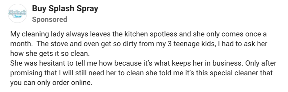
The caption is a short two-paragraph story that uses first-person narration to convey authenticity and trust.
It utilizes informal wording and emotional storytelling to read like a genuine recommendation from a friend.
By bringing up the struggle of maintaining a messy stove caused by “3 teenage kids”, it creates an authentic emotional pull for parents.
The narrative also uses the “Insider Secret” framework that keeps her cleaning lady in business, which she is “hesitant” to tell.
This keeps readers engaged because they want to know the secret that her cleaning lady doesn’t want the world to know.
Additionally, the product is also introduced as a “special cleaner you can only order online”, which further adds to the intrigue.
The caption is also very short, easy to read, and easy to skim. Breaking the text into short paragraphs prevents the reader from becoming fatigued.
Headline

The headline reads “The Queen of Household Cleaners”.
It’s a bold claim that frames the product’s value as above everything else in its niche.
This serves as a strong punchline in the caption and further encourages viewers to click the ad.
However, without a description, the headline would be stronger if it included an actual metric to back its claim.
Otherwise, it ends up looking like an ultimate solution with little branding and little proof to back it up.
3. Ugly Score
This ad earns a 3.5 out of 5.
The image is extremely messy and ugly. It stands out from the feed with visuals of a greasy brown stovetop that overwhelm any highly polished feed.
With such an unusual color scheme of brown, blue, and white, the image does a great job of being “ugly”.
However, it could have been improved upon.
Instead of using stock photos of the stove and spray, use an amateur iPhone photo of a hand holding the spray and a greasy stovetop to convey a sense of authenticity.
Moreover, a social media story or status template with emojis could’ve enhanced its feeling of nativity.
It’s a missed opportunity to use a personal Instagram Close Friends Story format to connect with the caption’s personal storytelling and the product’s secrecy.
4. Congruency Score
This earns a 5 out of 5 from me.
The landing page carries over the same messaging from the image ad. The page itself is clean and polished, with a consistent brand Identity throughout.
The first fold shows the product name with a Bestseller badge, a checklist of its benefits and a big green “Order Now and Save 60%” CTA button.
Below the CTA is a small text that reads “Over 100,000+ Happy Customers,” and on the right is the product image with clear branding.
This first fold immediately does a good job of setting up the viewer for conversion. It shows a proper benefits checklist, a small social proof text, a clean product image, and a 60% offer on the CTA to create urgency.
It aims to convince visitors to convert while the offer is available.
Further scrolls reveal how well thought out and informative the landing page is.
There are Before/After pictures, a features section with images, and a breakdown of their “Breakthrough Surfactant Technology”.
These sections further increase trust in the brand’s offering.
Finally, a comparison chart, a customer reviews section, and an FAQ section complete the landing page.
Despite having only images and lacking video testimonials, the landing page is overall satisfactory and checks all the boxes needed to convince a customer of the brand and its product.
How Can You Use This For Your Business?
1. Leverage Shocking Before/After Visuals
Use raw images of the problem at its worst to force a scroll-stop.
2. Use the “Insider Secret” Framework
Frame your product copy as a hidden industry trick or recommendation that insiders are “hesitant to share”. This drives up curiosity and delivers high CTRs.
3. Hook Target Audiences with a Relatable Scenario
Create captions in a storytelling format that highlight situations your target audiences can relate to, building an instant emotional bond.
Main Insights From the Ad
- Thumbnail Score: 4.5 / 5
- Click Score: 4 / 5
- Ugly Score: 3.5 / 5
- Congruency Score: 5 / 5
What Works Well
- Shocking ugly image that hints at the product’s usefulness with a Before/After segment
- Caption successfully uses the Insider Secret framework with a personal scenario to create interest and emotional connection
- Clear alignment between the headline, visual problem, and the brand’s domain
What the Ad Can Improve
- The image could use more native platform elements to make it feel more raw and relatable
- The headline can be changed to include metrics that prove the ad’s claims
Check Out the Landing Page:
https://clean.buysplashspray.com
Related Ad Breakdowns
- Ad Pulse Monday 108 – Bella Belts Hole-Less Belt
- Ad Pulse Monday 107 – Revive Essential Oils
- Ad Pulse Monday 106 – Locklab Custom Hair Regrowth
This post is packed with insights; I again recommend bookmarking it in your browser for future reference.
Well, that’s all for the post, folks!
Happy Marketing!
Pingback: Ad Pulse Monday 106 - Locklab Custom Hair Regrowth - Sannidhya Baweja