
Hey,
Welcome to the 110th edition of Ad Pulse Monday!
For those new to this series, every Monday, I select an ad or ads that have performed exceptionally well. I’ll break down their success factors, key takeaways, and how you can apply these insights to your business.
If you’re already familiar with Ad Pulse Monday, welcome back!
Consider bookmarking these posts, creating a handy repository right in your browser.
Without further ado, let’s dive in
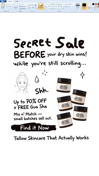
Breaking Down the NX1 Project Skincare Ad
1. Thumbnail Score
I give this a 4.5 out of 5.
The thumbnail is highly attention-grabbing as it is weird and unconventional.
Using the Windows Paint interface as the background and writing the copy in Paint makes it feel very native.
The Secret Sale hook is large and catches your eye.
It uses a personal pain point, “before your dry skin wins while you’re scrolling,” to force users to stop scrolling and read the ad.
After that, the product drawings and the woman’s face also help the ad look raw and authentic.
But there’s too much text on the screen competing for attention. While the text is readable enough, it feels crowded besides the big “Secret Sale” at the top and the “Find it Now” CTA.
2. Click Score
This earns a 5 out of 5 from me.
It pulls your attention effortlessly and creates a genuine curiosity gap that makes you want to click through.
Caption:
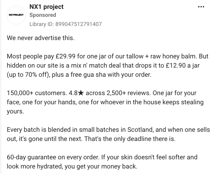
The hook is an immediate scroll stopper. Saying “We never advertise this” leverages scarcity and curiosity.
By claiming a product or offer is unadvertised, it immediately lowers the user’s natural defenses. It creates a curiosity gap and makes the user wonder why the supposed offer or product isn’t advertised.
Moreover, it uses the “insider secret” trick, which makes them feel like they have insider knowledge, unlike a normal sales pitch. It clearly mentions normal pricing, sale pricing, and free gua sha.
The pricing is very attractive, as paying £12.90 a jar for something “worth” £29.99 feels like a genuine steal.
It also adds review scores and uses casual, conversational language about the brand’s small-batch production to build authenticity and relatability.
Saying that the jar can be given to the “one for whoever in the house keeps stealing yours” also increases the product’s perceived value, because it hints that the product is so good that someone keeps stealing it.
Finally, having the product made in small batches creates urgency. It creates a feeling of limited time availability and scarcity that drives users to order fast.
Overall, it’s an excellent caption that builds on the ad creative.
Headline:
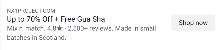
The headline is short and direct. It centers the 70% sale and the free gua shua as the main incentive.
It creates urgency and pushes the user to click the CTA button.
Description:
The description supports the headline by adding review scores. Pointing out its small batches also adds authenticity and creates urgency to buy while supply lasts.
It does its job, though a small personal angle could’ve increased the chances of users clicking.
3. Ugly Score:
I give this a 4.5 out of 5.
The ad uses Microsoft Paint as a background. It’s something you don’t see every day and gets your attention.
Moreover, the product photos are mixed with a doodle of a woman that matches the Microsoft Paint background.
Using a real photo of the jars with a doodle makes it feel trustworthy, since users can see what the jars look like in person.
The text also looks like it was written in Paint itself, which makes it feel native.
And the doodle of the old woman with sparkles hints at how the product changed her life.
Though there is no real image, the brand communicates a lot of useful information upfront while still using a scroll-stopping visual that you don’t normally see on Meta Ads.
4. Congruency Score
I give this a 3.5 out of 5.
The landing page continues from the ad. It shows the product image along with the USPs.
Moreover, the money-back guarantee and the sale from the ad are directly shown. The prices also match the ad copy and caption, which builds user trust.
However, it should’ve been visible the moment the page loaded, not two scrolls down. Sale prices and bundles should always be immediately visible, since the ad itself uses the “Secret Sale” tactic.
The UI/UX is also clean, fast, and easy to navigate. The branding is consistent, and the page does a good job of citing research articles to back up its claims.
Then, there’s a long user review section, which boosts credibility and makes the brand seem open and confident in its offering by showing the reviews so openly.
Finally, there’s an FAQ section and a results section. However, it should’ve been put earlier because the user reviews section is quite long and seems like the end of the page.
The page doesn’t really have much else going for it. It’s short and sweet, but it lacks before-and-after, visual proof, and transformation stories that would boost the brand’s credibility.
How can you use this for your business?
- Leverage native interfaces: Make use of native platform interfaces and align the design of the copy with native platform elements to create a raw, authentic feel
- Use the “Insider Secret” Framework: Frame your product or offer as a recommendation that people don’t know about. This drives up curiosity and delivers high CTRs.
- Make the landing page more informative: A great landing page makes sure that it is not only congruent with the ad, but that it uses every tactic to convert the users with proof, visuals, and data.
Main Insights from the ad:
- Thumbnail Score: 4.5 / 5
- Click Score: 5 / 5
- Ugly Score: 4.5 / 5
- Congruency Score: 3.5 /5
What works well:
- The simple, amateur feel of the Windows Paint interface is a major pattern interrupt.
- Using a “We never advertise this” hook stops the scroll because it creates a curiosity gap
- Having a “Secret Sale” offer uses the “insider Secret” framework to drive clicks
What the ad can improve:
- The sale prices would’ve been front and center within the first fold of the page
- The page itself can be improved upon by adding more proof and reordering sections to make each fold of the scroll feel informative
Check Out the Landing Page:
Related Ad Breakdown
- Ad Pulse Monday 109 – Froya Organic Arctic Balm
- Ad Pulse Monday 108 – Bella Belts Hole Less Belt
- Ad Pulse Monday 107 – Revive Essential Oils
This post is packed with insights; I again recommend bookmarking it in your browser for future reference.
Well, that’s all for the post, folks!
Happy Marketing!