
Hey,
Welcome to the 108th edition of Ad Pulse Monday!
For those new to this series, every Monday, I select an ad or ads that have performed exceptionally well. I’ll break down their success factors, key takeaways, and how you can apply these insights to your business.
If you’re already familiar with Ad Pulse Monday, welcome back!
Consider bookmarking these posts, creating a handy repository right in your browser.
Without further ado, let’s dive in
Breaking Down the Bella Belts Hole-Less Belt Ad
1. Thumbnail score:
I’m giving it a 5 out of 5.
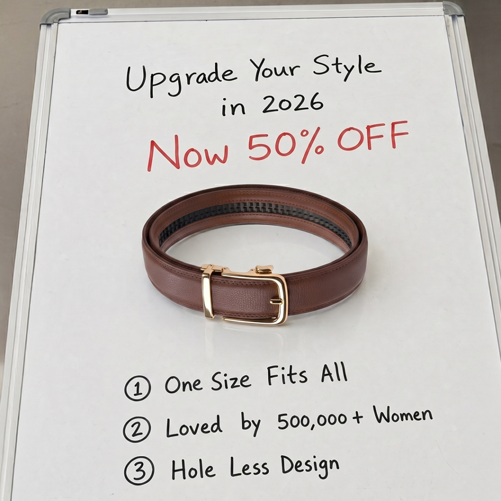
The main image acts as an immediate pattern interrupt. It features a plain whiteboard with handwritten marker text surrounding a brown leather belt.
The handwritten hook “Upgrade Your Style in 2026” sets a clean, relevant angle for the viewer. And the red “Now 50% OFF” text draws immediate focus to the offer.
Below the product, three handwritten bullet points lay out the value propositions: “One Size Fits All”, “Loved by 500,000+ Women”, and “Hole Less Design”.
It combines social proof, simplicity, and clear product utility into one raw visual frame.
2. Click score:
This earns a 4 out of 5 from me.
The thumbnail sets up immediate curiosity around how a “hole-less design” functions. The caption also promises an end to “annoying belt holes”.
A steep discount offer (50%-55% off) creates immediate purchasing urgency for BOFU.
It drives a strong CTR by providing a direct solution to a common daily frustration, and the clear “Shop Now” CTA button guides users to the shop.
Caption:
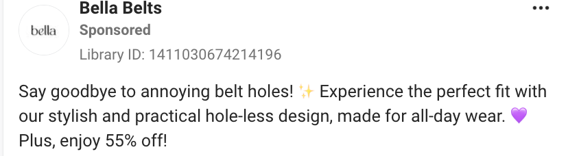
The hook is simple and direct. It immediately targets a daily consumer pain point without fluff.
The body copy clearly introduces the core benefit. It uses simple emojis to match standard social media formatting, keeping it native to Meta feeds.
It concludes with a clear discount: “Plus, enjoy 55% off!” The text layout is short, highly scannable, and gets straight to the point.
As a retargeting ad for BOFU, it works, but it could benefit from more benefit pointers or a few selected reviews in the caption.
Headline:

The headline reinforces the main angle used in the caption.
The phrase “The only belt you’ll ever need” positions the product as a permanent solution.
It again highlights the 55% discount offer to push last-click conversions.
Description:
There is no description in the ad. The “Shop Now” CTA is the only button that pushes users to click on the ad.
The ad could’ve used a short description line with a curiosity gap to further incentivize potential clicks.
3. Ugly score:
I give it a 4.5 out of 5.
It uses a completely raw, whiteboard-style look with the belt on top.
The marker handwriting feels simple and completely unpolished.
This raw aesthetic helps the ad bypass traditional feed blindness across platforms. It feels organic and native to personal feeds, making users pause out of genuine curiosity.
It misses a 5 only because the whiteboard layout feels slightly organized and polished.
4. Congruency Score:
I give this a 2 out of 5.
The landing page is an immediate failure. There is zero mention of the hole-less design, one of the main USP of the entire ad.
There’s a video showing the belt being used in the header, but it’s just there to show off the belt. It doesn’t explain anything regarding the design itself.
All the brand products are listed in a grid format, with product images and their prices and configurations listed in one line. The original price and the discounted price are also given with a strikethrough line.
The layout is clean and easy to scan. It also creates immediate urgency and purchase intent for the sale.
As a landing page, it lacks many elements that would actually drive conversions beyond just the discount numbers.
There’s no review section, no FAQ section, no further explanation of how the belts work, and barely any photos of the belts being in use.
At the very end, there is a “Follow us” section with photos of women wearing the belts, but it comes as too little and too late.
Overall, it is clean and easy to scroll through, but it is missing many sections that would create meaningful sales rather than sales driven by discounts.
How can you use this for your business?
- Test Whiteboard Creatives: Write your core benefits or offers on a whiteboard for a low-cost, high-CTR pattern interrupt.
- Highlight social proof numbers: Include specific numbers, like “Loved by 500,000+ Women,” directly in the image to build trust.
- Make the landing page more informative: A bare-bones product page won’t land you as many leads as a landing page with a more information-focused approach.
Main insights from the ad
What works well:
- The whiteboard template serves as an effective, low-budget pattern interrupt on social feeds.
- Clean feature presentation using simple, handwritten bullet points.
- A clear social proof number is visible directly in the image, along with a photo of the product itself.
What the ad can improve:
- The headline and description could use more elaboration.
- The landing page should be less focused on making the discount sales the main driving factor of the page.
Check Out the Landing Page:
This post is packed with insights; I again recommend bookmarking it in your browser for future reference.
Well, that’s all for the post, folks!
Happy Marketing!