
Hey,
Welcome to the 101st edition of Ad Pulse Monday!
For those new to this series, every Monday, I select an ad or ads that have performed exceptionally well. I’ll break down their success factors, key takeaways, and how you can apply these insights to your business.
If you’re already familiar with Ad Pulse Monday, welcome back!
Consider bookmarking these posts, creating a handy repository right in your browser.
Without further ado, let’s dive in
Breaking Down the Bevel Health Calorie Tracker Ad
1. Thumbnail Score
I give this a 5 out of 5.
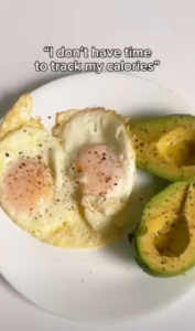
The visual is very simple and grounded, making it relatable.
Instead of a polished plate arrangement with a model eating the food, the plate is presented as messy and something anyone can make within minutes.
The unedited iPhone camera shot of the eggs and the avocado conveys a messy authenticity that doesn’t feel like an ad.
Moreover, the thumbnail stands out because the food is arranged oddly. The lack of cleanliness stands out in the feed.
The text overlay “I don’t have time to track my calories” also creates interest in the video.
It connects with the target audience who feel the same way, tapping into the shared anxiety about not having enough time to get things done.
Viewers are made to keep on watching the ad to find the resolution to the statement.
2. Hook Score
This earns a 4 out of 5.
The text overlay hook serves well as an opening that articulates the target audience’s internal thoughts.
It perfectly introduces a pain point that many might not have been aware of.
However, there is no voiceover to actually voice out the line.
This costs the creative a point because voice-overs create a much more personal connection with the viewer than a text overlay alone.
And there are no other background sound effects except the music, which would’ve helped as well.
As the creative is a bumper ad, it has only 6 seconds of runtime and must convey sufficient product information within that timeframe.
The first 3 seconds of the bumper ad are edited quickly to maintain the viewer’s attention.
By the third second, the caption has already resolved the hook with another text overlay saying “Until you find Bevel”.
This introduces the brand naturally, with the background changing to an actual hand holding a phone.
The product app is open on the phone, and its camera is pointed towards the plate shown in the thumbnail.
This immediately shows the product and visually communicates the app’s main offering: taking pictures to get instant calorie counts.
By also connecting the salad plate in the thumbnail to the app’s visual depiction, the ad establishes causality and creates a realistic, grounded flow.
Overall, the hook is strong, but it could be made stronger with a voiceover and some background sound effects.
3. Retention Score
I give this a 5 out of 5.
As this is a 6-second bumper ad, no second is wasted.
It is extremely easy to watch more than once because of the runtime and the fast editing.
Because the creative has a really short runtime, viewers are forced to watch it multiple times to comprehend the product and its offering.
The transition from the problem shot to the app interface is fast, helping maintain a high hold rate.
4. Click Score
This scores a 3 out of 5.
There is a clearly defined problem-solution dynamic, a good hook and thumbnail, and a short runtime to create interest.
Showing the app interface capturing food demonstrates the “how” and encourages downloads.
Caption
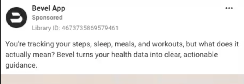
The caption is short like the creative. It targets the audience through a broad personal lens, making the hook about their pain point.
But the hook itself isn’t good. It doesn’t create a strong feeling of connection and sounds like a generic ad hook.
Additionally, the second line is generic and doesn’t highlight the app’s use case.
It only vaguely hints at the app’s feature. There is nothing that clearly tells you what the app is for.
While TOFU audiences don’t need a list of features like MOFU audiences do, they still need convincing copy that tells them why they’ll click the ad.
Only the creative’s visuals are doing all the work.
Heading

The heading is the app name.
It is basic and does not feel as authentic as the bumper ad itself.
A better heading would have framed the pain point as a question, such as “Tired of counting calories every meal break?”
Description
The description is a generic “Free download” line that doesn’t do anything to interest the viewer.
A good description would have continued from the heading pain point to a line that hints at the answer.
Putting “This free app does the job for you” would have incentivized viewers to click on the Download CTA button on the right.
5. Ugly Score
This gets a 5 out of 5.
Everything in the creative feels authentic, casual, and relatable.
The messy salad is something that viewers can make by themselves, unlike a highly organized salad plate.
Its presentation as an iPhone video with native text overlay makes it feel like a genuine video rather than one with forced product placement.
Additionally, the lack of professional lighting enhances the creative’s homemade feel.
6. Congruency Score
I give this a 0 out of 5.
The landing page is extremely dissonant from the ad creative.
The creative shows a phone with an app interface, so you expect the same on the page, but the first image is an Apple Watch.
Also, the headline on the image is “Over 1,000,000 Downloads, 4.8 Stars on iOS” which doesn’t say anything about the product itself.
The CTA Download button is designed to look like it’s part of the watch, but it doesn’t stand out and is easy to miss.
Without any contrasting colors, the CTA button just fades into the image.
This is why clarity ranks higher than creativity in both marketing and design: there is no point in designing a fancy button if no one can see it.
The second line of the copy text also doesn’t mention any calorie tracking, offering a vague “AI-powered insights for Strain, Recovery, Sleep, Nutrition and more” instead.
A “Scan to download” button is highlighted right below the image, with the words “Activate your free trial with Bevel for 7 days”.
This is a better CTA than the first one because it is actually visible and offers a free trial.
But further scrolling down the page keeps diminishing its score.
The first three to four sections focus on the app’s intelligence and privacy features, which aim to build trust but ultimately fail because TOFU won’t know the brand.
It takes around five more scrolls to reach the “Take care of your nutrition” section, where the calorie tracking from the original bumper ad is mentioned.
Anyone who clicked on the page out of curiosity would have already clicked away because the ad’s point of interest is buried far down the page.
There is no image of food either, to maintain consistency with the ad creative.
If the ad copy hinted at the app being more than just calorie tracking, it would’ve been fine, but it doesn’t.
Until the end of the page, there are no customer testimonials, customer reviews, comparison charts, video demonstrations, or medical recommendations.
It is all section after section of vague features and promises, with no immediate solid proof.
It is only at the end that there are App Store reviews, which is already too late.
All in all, the page feels like it’s promoting a watch brand in the vein of Apple Watch rather than a calorie-tracking app.
How Can You Use This For Your Business?
1. Target TOFU with a Fast-paced Bumper Ad
Quick bumper ads can create strong awareness campaigns thanks to their hook-heavy design and short runtime.
2. Create Causality to Keep Viewers Hooked
Make sure your copy introduces a pain point and creates interest with a hint at the solution. A problem-solution copy will always work. Even better when you don’t reveal the answer directly.
3. Don’t Waste the Landing Page on Nonsensical Design
A terrible landing page can completely stop conversions. Make sure your ad is congruent with the landing page, no matter how polished the design is.
Main Insights From the Ad
- Thumbnail Score: 5 / 5
- Hook Score: 4 / 5
- Retention Score: 5 / 5
- Click Score: 3 / 5
- Ugly Score: 5 / 5
- Congruency Score: 0 / 5
What Works Well
- The hook perfectly introduces the pain point
- A short 6-second runtime is highly efficient by eliminating fluff and triggering repeat watches
- Visual transition from the plate to the app interface smoothly provides context and introduces the product without breaking flow
- The ad is highly scalable because of its simplicity
What the Ad Can Improve
- The caption, headline, and description should actually create interest in the product rather than being generic
- The landing page must be heavily edited to actually be congruent with the original ad creative
- Moreover, the landing page lacks credibility and testimonials. No amount of good design can overthrow a positive customer testimonial in actually creating conversions
Check Out the Landing Page:
https://www.bevel.health/watch-4
Related Ad Breakdowns
- Ad Pulse Monday 108 – Bella Belts Hole-Less Belt
- Ad Pulse Monday 107 – Revive Essential Oils
- Ad Pulse Monday 106 – Locklab Custom Hair Regrowth
This post is packed with insights; I again recommend bookmarking it in your browser for future reference.
Well, that’s all for the post, folks!
Happy Marketing!