
Hey,
Welcome to the 99th edition of Ad Pulse Monday!
For those new to this series, every Monday, I select an ad or ads that have performed exceptionally well. I’ll break down their success factors, key takeaways, and how you can apply these insights to your business.
If you’re already familiar with Ad Pulse Monday, welcome back!
Consider bookmarking these posts, creating a handy repository right in your browser.
Without further ado, let’s dive in
Breaking Down the Barkwell Dog Toys Ad
1. Thumbnail Score
I’ll give this a 4.5 out of 5.
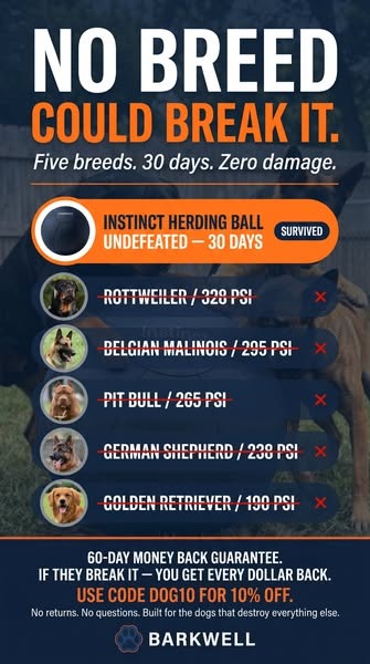
The large, bold headline text immediately catches the viewer’s attention. Saying “No breed could break it” frames the product’s durability as the ultimate solution.
Under the headline, the lines “Five breeds. 30 days. Zero damage” further lend credibility by providing specific metrics that support the headline’s claim.
The use of contrasting colors is also well thought out.
Using orange and white against a dark blue background cuts through feed noise easily.
The bright orange badge serves as a strong visual anchor for the upper half of the image. It includes the product image and its name – “Instinct Herding Ball”.
The badge clearly indicates to the viewer that the product is “undefeated” after “30 days,” providing further reassurance that the product has undergone testing and “survived.”
Including the breed-specific bite forces (measured in PSI) provides credible, solid evidence supporting the claim.
Below is a crossed-out list of popular dog breeds with their pictures.
It emotionally connects dog owners to the pictures and makes them curious to see how these powerful breeds failed to break the ball.
Moreover, there is a money-back guarantee and a 60% discount code at the bottom of the image.
So the viewer will be prompted to visit the landing page after seeing the offer.
The ad layout is also clean and structured. The font is bold and easy to read.
The image also resembles a checklist, making it easy to scan.
It could be a bit better by resembling a native platform post, like an Instagram story.
Overall, the static image hits all the right points to create curiosity and desire and to make the viewer pause.
2. Click Score
This earns a 4 out of 5 from me.
The ad poses a clear challenge to its target audience of dog owners and promises a bold solution.
It successfully creates interest and gives a bold claim that pauses the scroll.
Caption
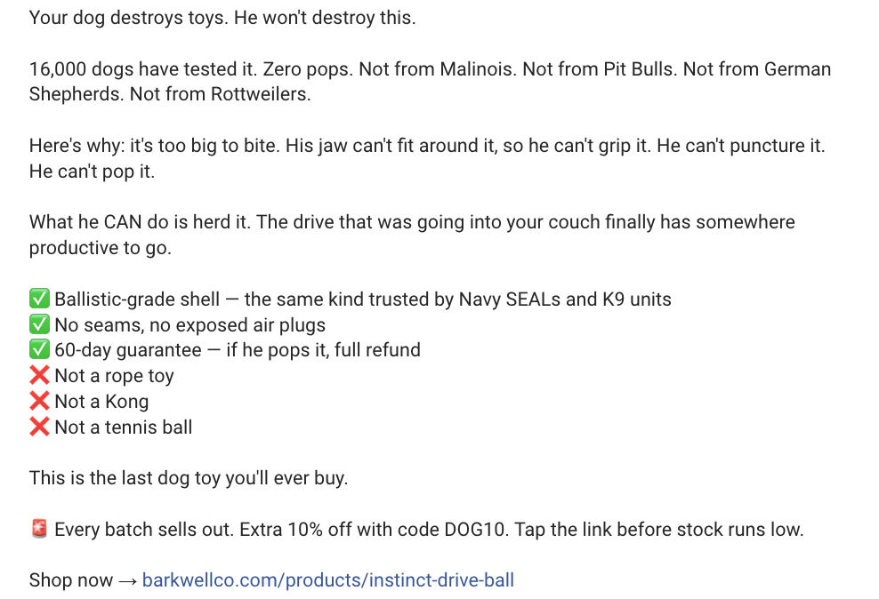
The hook is great. It appeals to dog owners’ personal frustrations while remaining short and emotionally resonant.
The caption includes many metrics that elaborate on the product’s claim.
Dog breeds are also mentioned directly, indicating that they’re among the “16,000 dogs” tested and unable to break the ball.
Moreover, the caption presents the product features as negatives rather than positives, such as “It’s too big to bite” and “He can’t grip it.”
This heightens the perception of the product features as unmistakably durable and worth the money.
A checklist of the product’s benefits further locks the viewer into the claim, with the offer highlighted to drive conversions.
The last line of the caption is strong, effective copy that further sells the brand’s story by saying it’s “the last dog toy you’ll ever buy.”
Finally, the viewer’s eye is drawn to the discount code and the CTA link. The CTA is a basic Shop Now, but everything else in the ad is strong and effective.
The entire caption is clear, to the point, has strong messaging, and has an offer to create clicks and conversions.
Heading
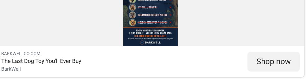
The heading is the same claim of “the last dog you’ll ever buy” from the caption.
It’s strong and effective at creating curiosity about the product.
It lacks a bit in creating an emotional connection. Adding a small line like “for your best buddy” would have helped create a stronger effect.
Description
The description is disappointing. It’s only the brand name.
While it’s not anything that will detract from clicks, the post could have gotten more clicks by using a small headline that builds on personal storytelling.
Emotional appeals always connect with viewers more than brand names do.
3. Ugly Score
I give it a 2 out of 5.
What Works
The ad uses straightforward fonts, bold colors, and a simple checklist format rather than a polished photo shoot.
It feels like an informational graphic you might see shared in a dog-owner community, which makes it seem more like a genuine recommendation.
Why It Scores Low on “Ugly”
However, the overall image is still too polished and designed.
How to Make It Perform Better
Using a casual iPhone photo would have captured the raw, unpolished feel that the best ugly ads have.
It could be made uglier by using native platform text overlays or a real video screenshot.
4. Congruency Score
I give this a 5 out of 5.
What Aligns Well
The landing page immediately follows from the ad’s claims. It presents the product photos, benefits, and the Add to Cart button right from the opening.
The branding is consistent and uses the same dark blue and orange colors from the ad.
What the Landing Page Does Well
Product features are clearly displayed on the right, while the first photo in the carousel on the left appeals emotionally by featuring a happy dog alongside the product.
Scrolling down, the “As Featured On” banner adds credibility to the product.
Lots of short video clips of dogs are used throughout the page, anchoring the viewer and appealing to their emotions with every scroll.
There are video testimonials as well as a comparison table that builds upon the brand’s authenticity and claims.
Not only that, there are additional sections featuring a “How to use” list, an FAQ section, a few customer reviews, and a quote from a medical professional.
The discount offer is also mentioned to further drive urgency.
Each scroll of the page is full of information, visuals, and clear branding with professional copy that legitimizes the brand and its product.
The page ticks all the boxes and is highly effective at converting viewers into potential customers.
How Can You Use This For Your Business?
1. Present Data as a Checklist
Presenting data, proof or challenges as a list makes your creative highly scannable.
2. Call Out the Target Audience Directly
Target the product audience with a direct call-out. It instantly catches their attention and increases conversion rates.
3. Keep the Landing Page Consistent
A great ad is half the journey. Make the landing page congruent with the ad while expanding on the brand, product, and message with testimonials, reviews, quotes, sources, and lists.
Main Insights From the Post
- Thumbnail Score: 4.5 / 5
- Click Score: 4 / 5
- Ugly Score: 2 / 5
- Congruency Score: 5 / 5
- Landing page: ticks all the boxes and converts effectively
What Works Well
- The bold headline and colors create an instant pattern interrupt in the feed.
- Listing breed bite forces (PSI) adds hard, believable data to the claim.
- Using a scoreboard format makes it scannable.
- The offer and risk-free guarantee are highly prominent and enticing.
What Can Be Improved
- Making the creative look more like a native user post could improve the ad’s relatability.
- The ad description can be used to provide emotional storytelling rather than just the brand name.
- Adding a brief customer review could strengthen the emotional storytelling element.
Check Out the Landing Page:
Related Ad Breakdowns
- Ad Pulse Monday 91 – The Chase Buddy Interactive Dog Toy
- Pet Meal Box – Ad Pulse Monday 63
- Ad Pulse Monday 14 – Ready-To-Eat Dog Food
This post is packed with insights; I again recommend bookmarking it in your browser for future reference.
Well, that’s all for the post, folks!
Happy Marketing!