
Hey,
Welcome to the 98th edition of Ad Pulse Monday!
For those new to this series, every Monday, I select an ad or ads that have performed exceptionally well. I’ll break down their success factors, key takeaways, and how you can apply these insights to your business.
If you’re already familiar with Ad Pulse Monday, welcome back!
Consider bookmarking these posts, creating a handy repository right in your browser.
Without further ado, let’s dive in
Breaking Down the Ionix Labs Shapewear Ad
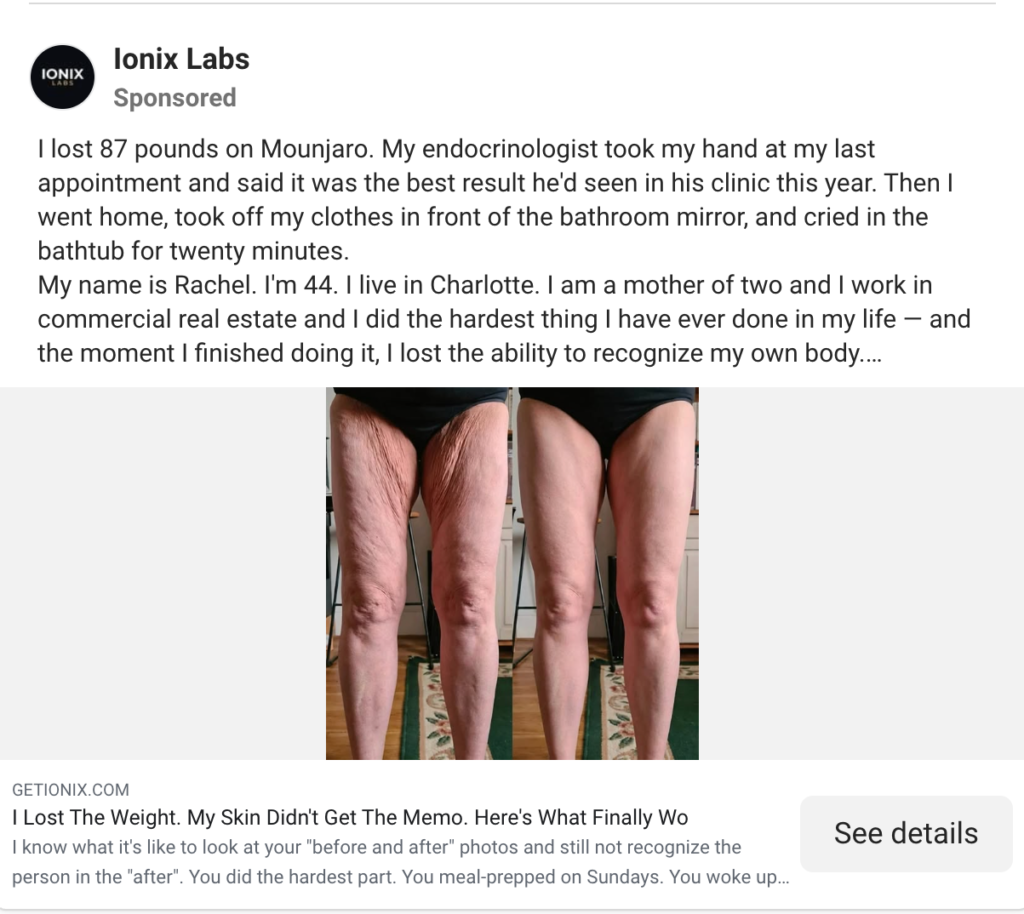
1. Thumbnail Score
I give the thumbnail a 4 out of 5.
It’s an immediate scroll stopper.
By using ugly aesthetics, the ad stands out from the hyper-polished ads in the feed.
There is no doubt that it will make a viewer pause and give the ad a brief overlook.
The ad is also formatted as a Before/After comparison. This appeals directly to the viewer’s emotions and provides proof of the product’s effects.
And it creates a desire in the viewer to achieve the same results, compelling them to take action.
Along with the amateur iPhone photography and lighting, the image looks like a genuine customer testimonial.
However, the product itself is not there in the image. Ideally, the product should be depicted in the after section to increase the believability of the results.
Also, a few textual pointers highlighting the product’s benefits would have increased the ad’s credibility.
2. Click Score
The ad’s click score is a 4 for me.
It does not show the product, which is a big drawback, but it successfully encourages clicks by creating curiosity and an emotional connection.
Caption
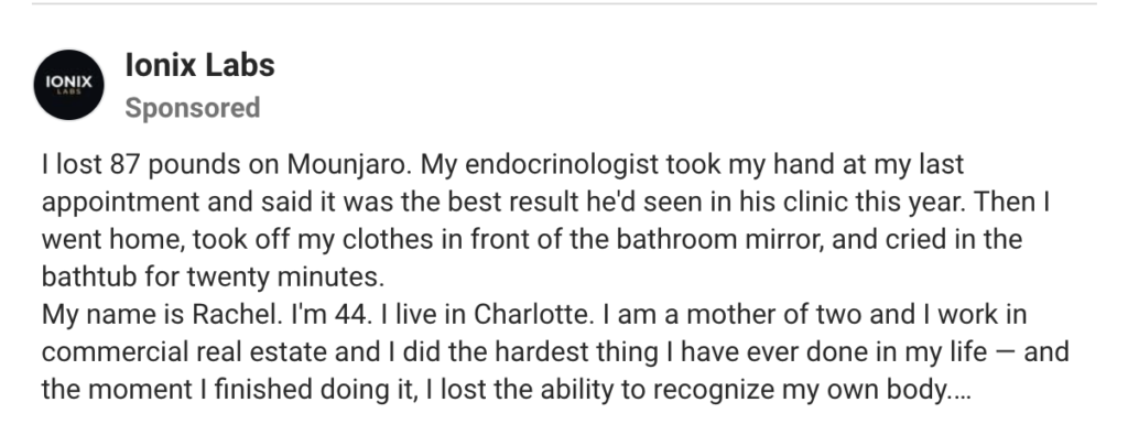
The caption is a long copy that details a customer’s journey while using the product.
The hook is an engaging read that immediately appeals to the product’s target audience. It is an ad targeting Mounjaro GLP-1 users who feel unfulfilled with the side effects of the drug.
By starting with “I lost 87 pounds on Mounjaro” and ending with “cried in the bathroom for twenty minutes”, the viewer is pulled into the story of the ad.
It immediately creates an emotional storytelling window that keeps the viewer interested.
Moreover, the mention of the customer’s gender, occupation, and family all provide a realistic customer testimonial for the brand.
The copy is very thorough and covers everything from the difficulties she faced while trying to lose the redundant skin after losing weight with Mounjaro to the $ 3,000 she lost on other remedies.
The caption also provides her personal experiences with trying to get rid of the redundant skin.
When the product recommendation is brought into the caption, it reads much more naturally and flows with the copy’s voice because of the context that comes before it.
The product’s main features are also clearly explained and compared with costly alternatives.
Even more, the product testimonial includes a short Weekly Results list, price, money-back guarantee, and a few metrics that effectively interest the viewer.
However, the caption is High Risk, High Reward due to its length and descriptions.
Most people will scroll past if they are not interested in the caption’s hook, and the remaining few may get annoyed by its length.
But those who are emotionally invested in the caption will definitely click through to the landing page.
Headline:
Headline
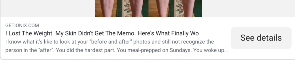
The headline is a great Contrast & Solution format that follows the Achievement, Contrast, Solution template.
It states the achievement (“I Lost The Weight”), gives the contrasting result (“My Skin Didn’t Get The Memo”), and finally teases the solution (“Here’s What Finally Worked”).
It successfully draws interest and aligns with both the caption and the image.
Description
The description is another long piece of copy that addresses the viewer personally in the second person.
It is effective as it emotionally connects with the viewer’s personal problems and hints at the solution.
Though it is the same as the caption, just from a second-person viewpoint, it still works because it makes the viewer bond with the problem’s difficulties and the desire to fix that pain point.
3. Ugly Score
This ad scores 5 out of 5.
The ad is shocking and interrupts the feed with an image that is not normally seen.
Given how amateurish it looks with the lighting and lack of touch-up, it feels like a real, raw testimonial comparing the Before/After looks of her legs.
4. Congruency Score
I will give this a congruency score of 5 out of 5.
The landing page aligns with the ad. It is presented as a storytelling advertorial, with a detailed storytelling section with images.
Advertorials blend educational storytelling with a soft-sell approach. They educate viewers on a pain point while also detailing a product’s benefits.
They present promotions as valuable content, building trust and engaging high-intent buyers before a purchase.
Traffic for advertorials is 90% from mobile, so the mobile landing page is prioritized over the desktop landing page.
On mobile, the page runs smoothly and is well-formatted. The header is a CTA that reads “Warning: High Demand. Claim 50% OFF Today Only.”
It uses urgency and scarcity tactics to make the viewer feel FOMO (Fear Of Missing Out), driving them to act quickly before the discount expires.
After the header, the ad’s storytelling section begins, with detailed copy that articulates the target audience’s pain point in a personal voice.
There is an explanatory image showing how the leggings work on the skin, along with another CTA before a section of positive customer reviews.
A Common Questions section and a “What to expect” image are available in the latter half of the page.
Finally, the third CTA is given in a large green button with “90-Day Money-Back Guarantee”, enticing the customer to purchase the product.
On desktop, the product is shown in the site’s right column as a permanent image ad with a link to the product page.
The right-column ad is a product image with a list of benefits and the discount CTA button.
It successfully creates urgency and provides the viewer with a brief overview of the product image and its benefits.
All in all, it is a very effective landing page that uses the advertorial format and provides a product image, a testimonial, and offers to get CTA clicks.
How Can You Use This For Your Business?
1. Customer Testimonials Create Emotional Connections
Use a customer testimonial template to create a strong emotional bond with your target audience. It doesn’t have to be very long. Create a strong customer persona and engaging story to keep your audience interested.
2. Use Comparisons to Visually Show Product Advantages
a Before/After image can significantly increase the ad’s CTR. It creates a desire for the product’s benefits in the viewer and makes them curious enough to click on the ad.
3. Ugly Ads All the Way
The uglier the ad, the more someone will click on it. Always try to make the ad look unpolished and as close to a casual customer recommendation as possible.
4. Educate and Promote with Advertorials
Advertorials pre-educate and warm up cold traffic by presenting products with a storytelling approach. They lead to much higher AOV and conversion rates.
Main Insights From the Ad
- Thumbnail Score: 4 / 5
- Click Score: 4 / 5
- Ugly Score: 5 / 5
- Congruency Score: 5 / 5
- Landing page: a very effective, congruent post-click experience
What Works Well
- Uses ugly ad aesthetics to create attention to the ad image immediately
- Employs emotional storytelling to draw in MOFU audiences and convert them
- The landing page advertorial is well-organized and informative, creating trust and credibility
- Uses FOMO and discount CTAs to create urgency for the product
What the Ad Can Improve
- The caption is too long and can alienate a lot of potential customers
- The image can include benefits to further showcase the benefits of the product
- The lack of the product in the static image is a big drawback. The product should be incorporated into the image.
Check Out the Landing Page:
https://getionix.com/pages/looseskin-adv-v3
Related Ad Breakdowns
- Ad Pulse Monday 92 – Bear Balanced Creatine Gummies
- Ad Pulse Monday 95 – Natrava Beets+Gummies
- Ad Pulse Monday 97 – Only What’s Needed Whey Concentrate
This post is packed with insights; I again recommend bookmarking it in your browser for future reference.
Well, that’s all for the post, folks!
Happy Marketing!