Hey,
Welcome to the 91st edition of Ad Pulse Monday!
For those new to this series, every Monday, I select an ad or ads that have performed exceptionally well. I’ll break down their success factors, key takeaways, and how you can apply these insights to your business.
If you’re already familiar with Ad Pulse Monday, welcome back!
Consider adding a label to these emails for easy access, just like Shailendra did, creating a handy repository right in your inbox.
To view the ad, register on Minea using this affiliate link (and get a flat 20% discount on paid plans):
https://app.minea.com/ads/facebook?ref=k63dd
Then, you can click on this link:
https://app.minea.com/en/ads/facebook/676451191150827/details?ref=k63dd
1. Thumbnail Score:
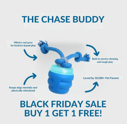
I give the thumbnail a score of 1.5 out of 5.
The white background does create strong contrast and makes the product easy to see. The arrows and callouts clearly explain what the Chase Buddy does:
- Mimics real prey for instinct-based play
- Built to survive chewing and rough play
- Keeps dogs mentally and physically stimulated
- Loved by thousands of pet parents
From a clarity standpoint, it’s solid. A dog owner can understand the product without reading any body copy.
However, this style typically doesn’t perform well. It feels overpolished and too text-heavy, more like a product diagram than a native feed ad. There’s no dog, no owner interaction, no movement, and no emotional hook to stop the scroll.
Because it lacks human relatability and UGC-style authenticity, I’m not a fan of this format for cold traffic. Real-world pet moments tend to outperform visuals like this. I’d rate it a 1.5 to 2 at best.
2. Click Score:
I’d give a click score of 5 out of 5.
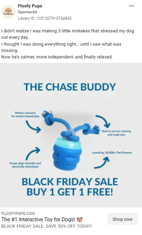
Caption
“I didn’t realize I was making 3 little mistakes that stressed my dog out” works as a powerful scroll-stopper. It feels personal and honest, creates a curiosity gap around the “3 mistakes,” and subtly taps into pet-owner guilt without sounding accusatory. It positions the product as an eye-opening solution rather than a pushy sale.
Headline
“The #1 Interactive Toy for Dogs” instantly establishes authority. Calling it “THE #1” signals social proof and leadership, triggering FOMO for dog owners who want the best for their pet, not just another toy.
Description
“BLACK FRIDAY SALE. Save 50% off” delivers maximum urgency and perceived value. The Black Friday framing leverages cultural urgency, making hesitation feel expensive.
The entire ad experience removes friction at every step. From curiosity-driven headline to clear value prop to urgent offer to simple CTA—this is a conversion funnel in static image form.
3. Ugly Score:
I’m giving this a 1 because it doesn’t feel ugly at all. It looks polished, planned, and clearly designed as an ad.
What works
- The product is clearly visible and well presented
- Visual hierarchy is neat and deliberate
- Colors are consistent and brand-safe
Why it scores low on “ugly”
- The background may appear simple, but here it feels overly smooth and polished, not raw or casual
- The infographic format makes it look unmistakably like an ad. While some infographics can feel native, this one clearly does not
- The text layout feels designed and structured, not spontaneous or functional in a feed environment
- The product shot looks studio-grade and highly controlled
- No real dogs, no real environment, and no real reactions
- Zero UGC energy or “someone filmed this on their phone” feel
This creative prioritizes clarity and control over relatability. As a result, it reads as an advertisement immediately, which is why it lands at a 1 on the ugly scale.
How to make it perform 2-3x better:
Swap the infographic for a raw, phone-shot image of a dog mid-chaos at home. Remove arrows and feature text. Add one casual IG-style overlay: “Ignored every toy. This one? Obsessed 😂”
Or: A simple before/after split screen. Left side: dog destroying couch cushions with text “Before Chase Buddy.” Right side: dog fully engaged with the toy, owner relaxing with coffee, text “After Chase Buddy.”
The product works—now show it in action with real dogs and real pet owners. That authenticity would skyrocket CTR and conversion.
4. Congruency Score:
I give a congruency score of 4 out of 5. The congruency between the ad and the landing page is strong. What you see in the ad is largely what you get after the click, with only minor optimization gaps.
What aligns well
Visual continuity
The product imagery carries through cleanly from ad to page. The blue color palette and overall polished, modern aesthetic remain consistent, which helps reduce friction and reassures the user they landed in the right place.
Offer consistency
The BUY 1 GET 1 FREE banner and 50% OFF messaging reinforce the value promised in the ad, with no bait-and-switch behavior.
Message alignment
The ad’s “3 mistakes” hook is supported by the page’s education-first approach. The landing page explains why the Chase Buddy works by tying it to dog behavior and instinct, then backs it up with feature explanations like touch responsiveness, multi-surface use, and battery-powered play. The arrows and claims from the thumbnail are directly expanded on post-click.
Where it loses one point
The page is information-dense before the first strong Add to Cart moment. For high-intent, sale-driven traffic, especially during a Black Friday BOGO, the primary CTA should appear much earlier, ideally above the fold or directly within the offer banner.
In addition to congruency, here’s what the landing page does well to increase conversion rate
Beyond message match, the page does a solid job reducing hesitation:
- Strong social proof with a 4.8 rating and thousands of reviews
- Embedded product demo video to show real-world use
- Multiple testimonials woven throughout the page
- A dedicated section explaining why dogs get addicted to the toy
- Clear stats tied to behavior outcomes, not vanity claims
- Robust FAQ addressing safety, noise, size, surfaces, and charging
- 30-day free returns and transparent shipping timelines
However, adding urgency elements like a countdown timer, stock indicators, or a more aggressive above-the-fold CTA could easily push this to a full 5 out of 5 and meaningfully lift conversions.
How Can You Use This For Your Business?
1. Turn Problems into Curiosity Gaps
“I didn’t realize I was making 3 little mistakes that stressed my dog out” is pure copywriting genius.
This framework works for ANY niche:
- Fitness: “I was making 4 tiny mistakes that killed my metabolism”
- Skincare: “3 shower habits that were aging my skin by 10 years”
- Productivity: “The 5 morning mistakes keeping you broke and tired”
- Parenting: “I was doing 3 things that made my toddler’s tantrums worse”
The psychology is simple:
- Specificity (“3 mistakes”) creates credibility
- “Little” or “tiny” makes it feel fixable
- Personal framing (“I didn’t realize”) makes it relatable
- Negative outcome creates urgency to learn more
Test this headline structure across your ads and watch your CTR increase by 30-50%.
2. BOGO Beats Percentage Discounts
“BUY 1 GET 1 FREE” psychologically outperforms “50% OFF” even though the math is identical.
Why it works:
- FREE triggers a stronger emotional response than savings
- It feels like gaining something rather than spending less
- Perfect for gifting angle (keep one, gift one)
- Creates higher AOV because customers buy more units
If you’re selling physical products, test BOGO offers:
- Buy 2 Get 1 Free
- Buy 3 Get 2 Free
- Buy 1 Get 1 Free + Free Shipping
Especially powerful for consumables, gifts, or items people need multiples of.
3. Social Proof Should Be Specific and Statistical
The landing page doesn’t just say “customers love it.” It quantifies the love:
- 4.8/5 stars with 4,393 reviews
- 98% said dogs played longer
- 97% noticed less destructive behavior
- 99% felt more relaxed
Vague social proof (“thousands of happy customers”) is weak. Specific numbers build exponentially more trust.
For your business:
- Show exact review count, not just star rating
- Convert feedback into percentages: “87% saw results in 2 weeks”
- Display “Based on feedback from [X] customers”
- Use survey data to create compelling stats
People trust numbers more than adjectives.
4. The Biggest Opportunity: Show It in Action
While this ad is solid, it’s missing the ONE thing that would make it 10x more effective: video of dogs absolutely loving this toy.
Here’s what would crush:
- Owner filming their dog’s first reaction on iPhone
- Split screen: before (bored dog) vs after (engaged dog)
- Compilation of different breeds playing with it
- Owner testimonial: “I finally got to finish my Zoom call in peace”
Dog owners don’t need to see a pretty product photo. They need to see their future—a calm, happy, entertained dog.
If you’re selling ANY product where the transformation is visual, show that transformation. Raw, authentic, user-generated content will outperform polished creative every single time.
Check out their Landing Page:
Here’s the landing page for this product:
This post is packed with insights; I again recommend bookmarking it in your browser for future reference.
Well, that’s all for the newsletter, folks!
Finally, I would like to add that I will continue sending you these ads every Monday, but they alone may not be sufficient for your success as you would want more concepts under your belt.
Therefore, if you are a Facebook ads marketer and want more ads like these for yourself, then go ahead and check out Minea.
Here is the promo code offering you 20% off for 3 months: SANNIDHYA20
And here is my affiliate link: [https://app.minea.com/find-winning-product?ref=k63dd]
Also, let me know which niche’s ad I should pick up next for you. I would love to hear from you.
DISCLAIMER: This post contains affiliate links, which means that if you click on one of the product links, I’ll receive a small commission.
Happy Marketing!