
Hey,
Welcome to the 111th edition of Ad Pulse Monday!
For those new to this series, every Monday, I select an ad or ads that have performed exceptionally well. I’ll break down their success factors, key takeaways, and how you can apply these insights to your business.
If you’re already familiar with Ad Pulse Monday, welcome back!
Consider bookmarking these posts, creating a handy repository right in your browser.
Without further ado, let’s dive in
Breaking Down the Prequel Skin Ugly Ad
1. Thumbnail score:
I’m giving it a 5 out of 5.
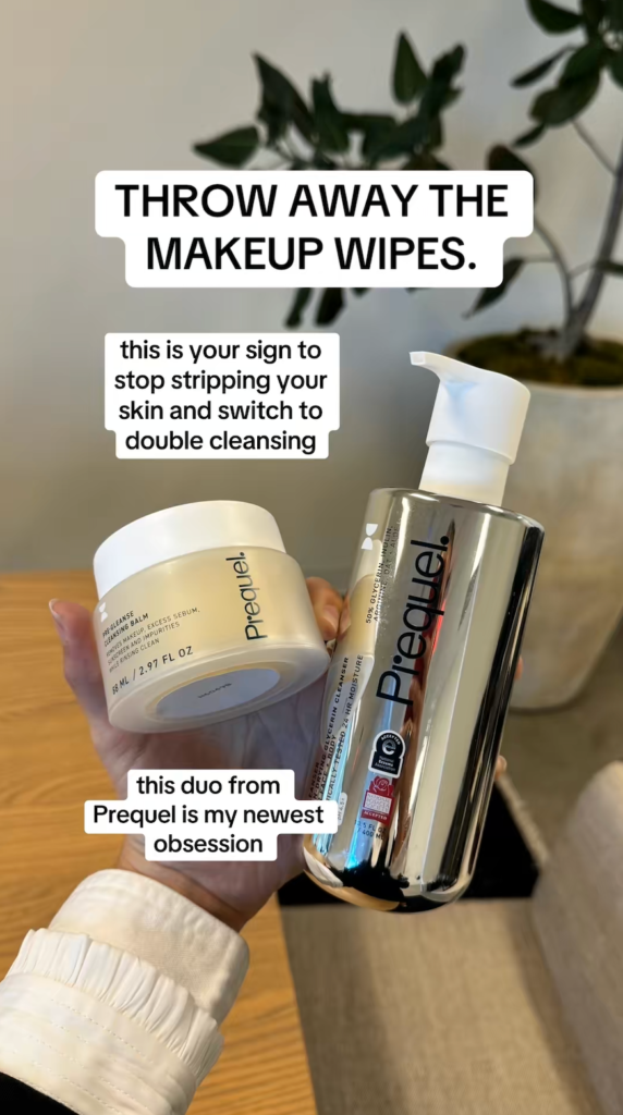
The thumbnail is highly attention-grabbing. It uses the format of a native Instagram story post to feel authentic and relatable.
Moreover, the text overlay says, “Throw away the makeup wipes”. It’s a bold hook that immediately catches your eye and makes users curious.
Showing the products in hand also increases the image’s credibility.
It’s a great way to create transparency without feeling like the brand is forcing the products on the feed with a polished ad.
2. Click score:
This earns a 3 out of 5 from me.
While it pulls your attention, the ad copy needs some tweaking to make you want to click.
Caption:
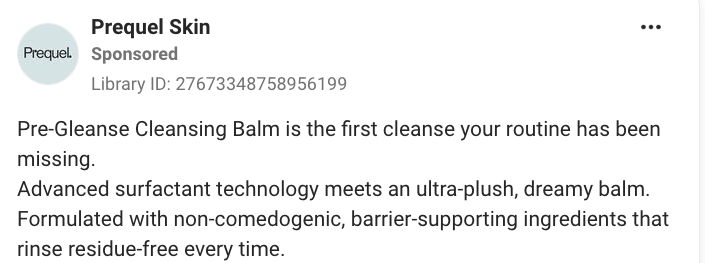
The caption tries to hook the reader by saying it’s “the first cleanse your routine has been missing.”
But it’s bogged down by too many terms, most of which most people, except BOFU, won’t care about.
Moreover, the caption sells a different product than the ad. It mentions only the balm, but not the second product from the creative.
Even more, makeup wipes are the primary hook, but the caption doesn’t mention them.
So there’s no reason to care: it doesn’t match the ad creative, and it doesn’t offer an emotional story to connect with.
Headline:

The headline is short and direct. It tries to assure readers it’s a great product because dermatologists developed it.
But it could be worded better. “Dermatologist-Developed Skincare” is too clunky. Saying “Developed by Dermatologists” would’ve worked better.
3. Ugly Score
I give this a 4 out of 5.
The ad is extremely simple and feels raw.
The text overlay hook calls the products the “newest obsession,” which is the ad’s strongest selling point because it feels authentic.
Using Instagram’s native fonts makes it feel like an Instagram Story from a trusted peer making a genuine recommendation.
Showing the product in hand also further increases its credibility. Moreover, the unpolished photo looks like it was taken straight from a phone camera, which feels authentic.
But it could be improved by adding actual UI elements from Instagram and other native phone elements, like the Battery Indicator. Adding those elements would have enhanced the creative’s rawness.
4. Congruency Score
I give this a 4 out of 5.
The actual landing page matches the ad very well. It directly shows the product from the ad creative.
The creative’s product wording also appears in the landing page’s first fold.
The Add-to-cart button is also clearly presented, and the entire page looks consistent and easy to skim.
Right after the Add-to-cart button, the product benefits are listed along with details, ingredients, and a How to Use section.
The key ingredients are also expanded to add credibility. Right below that is an FAQ section to help cold leads, along with recommendations for other products.
The final fold includes a full section of reviews and ratings, which boosts the brand’s authenticity and credibility.
The page is missing some more information on the product’s key value propositions.
Adding a few images or videos with a side-by-side before-and-after comparison will help users trust the brand more.
How can you use this for your business?
- Keep it native to stay relatable: Design ad creatives that match the platform to increase engagement.
- Use a bold text hook to stop scrolls: Make your text hooks immediate scroll-stoppers with bold callouts.
- Make your captions congruent: A good ad creative is only half the job. A sub-par caption with a weak headline won’t get you consistent clicks.
Main Insights from ad
- Thumbnail Score: 5 / 5
- Click Score: 3 / 5
- Ugly Score: 4 / 5
- Congruency Score: 4 /5
What works well:
- Native visuals using a raw phone photo with the product in hand
- The hook is attention-grabbing and makes you pause
- The landing page continues very well from the initial ad.
What the ad can improve:
- The entire caption needs to be changed to match the ad
- The headline needs more work to be more convincing
Check Out the Landing Page:
Related Ad Breakdown
- Ad Pulse Monday 110 – NX1 Project Skincare
- Ad Pulse Monday 109 – Froya Organic Arctic Balm
- Ad Pulse Monday 108 – Bella Belts Hole Less Belt
This post is packed with insights; I again recommend bookmarking it in your browser for future reference.
Well, that’s all for the post, folks!
Happy Marketing!