
Hey,
Welcome to the 104th edition of Ad Pulse Monday!
For those new to this series, every Monday, I select an ad or ads that have performed exceptionally well. I’ll break down their success factors, key takeaways, and how you can apply these insights to your business.
If you’re already familiar with Ad Pulse Monday, welcome back!
Consider bookmarking these posts, creating a handy repository right in your browser.
Without further ado, let’s dive in
Breaking Down the Easy Digital Insurance Policy by Solvable Ad
1. Thumbnail Score
I rate this a 4 out of 5.
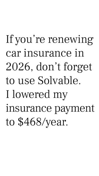
This is an eye-catching creative that presents hard data without any graphics. It forces viewers to pause with its bareness.
As a Bottom-Of-The-Funnel creative, it works surprisingly well because it knows its audience and doesn’t add extra fluff.
The current year, 2026, is called out to stop the scroll, and the specific price of $468 after using the service entices viewers to click the ad.
BOFU customers don’t need additional information or designs. They need a reminder that pushes them to convert.
The creative is good. But it could be improved by presenting it in a Notes app format or as an emoji checklist.
The lack of a CTA also drops the points. A clear, actionable CTA in the same format as the image will drive conversions in this funnel.
2. Click Score
This earns a 4 out of 5 from me.
The copy leverages clear financial metrics to prompt users to take action.
When they see the metrics, it forces them to rethink their options in the moment.
The downside of the image is a lack of visual urgency and a CTA.
While the text-only format keeps your ad highly efficient, an extra line of urgent copy could maximize click volume.
Caption
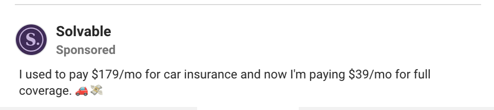
The caption is a single line with a comparison metric.
It gives viewers an exact figure showing how much they can save with the service.
This speaks to a universal pain for consumers – overpaying for insurance bills, while also targeting BOFU with an exact before-and-after result.
The use of the car and money bill emoji adds a bit of a casual, native-platform feel to an otherwise direct ad.
Headline

The headline “Switch and Save” does a good job of reminding BOFU of the service’s value proposition.
Despite its simplicity, it misses an opportunity to build on the specific metrics used in the main image.
A more effective copy would use a percentage that proves the claim in the ad image and caption.
Something like “Switch and Save 78.21% every month” would work better, as it builds on the caption and directly points to the “Get Quote” CTA button.
3. Ugly Score
I am giving this a 4 out of 5.
This creative represents the most minimalist an “ugly” ad can be as a format.
It strips away every single element of corporate branding, polished templates, and even visual elements.
There is nothing except the text in a plain, native font. It looks like it was written on Instagram Stories or Apple Notes without any edits.
This unpolished structure gives it a feeling of authentic recommendation, though it is not clear from whom.
The reason the ad doesn’t score higher is that it misses many opportunities to maximize the sense of being native.
Using an actual Notes app format or an Instagram Story format with everything showing would make it more “ugly” and relatable.
4. Congruency Score
I give this a 4 out of 5.
The landing page is polished, has a clear brand identity, and is easy to navigate.
The first fold of the page displays a dialog box requesting a zip code to begin the service immediately.
This is a great decision as it allows for a smooth, direct conversion from the ad to the service. High-intent buyers and warm leads can immediately convert easily with just a few clicks.
After entering the zip code, it begins a long process to calculate the insurance savings.
For this, the landing page does a great job, especially for its target BOFU audience.
However, the other folds of the page are slightly lacking.
Below the dialog box is a trust signal banner featuring well-known companies as their partners. It establishes credibility without wasting your time.
After that is a small customer review section, which does its job.
Because this is a BOFU landing page, there doesn’t need to be extra stuff like video testimonials.
A comparison chart and a graph could go a long way toward building credibility and turning a hesitant lead into converting.
How Can You Use This For Your Business?
1. Test Text-only Creatives
Drop colorful designs and complex backgrounds for a plain black-on-white text copy to surprise your audience’s feed.
2. Lead Comparisons with Quantifiable Metrics
State the exact “before” and “after” prices to give prospective buyers immediate information on mental ROI.
3. Dialog Boxes Create Instant Conversions
Make a dialog box that converts the moment a customer reaches your landing page.
Main Insights From the Ad
- Thumbnail Score: 4 / 5
- Click Score: 4 / 5
- Ugly Score: 4 / 5
- Congruency Score: 4 / 5
What Works Well
- The clean, simple layout with metrics builds immediate logic and attention
- A text-only approach acts as a low-cost way to create pattern interrupts
- Incentivize BOFU with a quantifiable Before/After result
What the Ad Can Improve
- The headline can be more specific and use percentages to build more hard data credibility
- The ad could be uglier with more native platform templates
Check Out the Landing Page:
Related Ad Breakdowns
- Ad Pulse Monday 103 – Island Recreational Pool Liner
- Ad Pulse Monday 96 – A Crohn Patient’s Story
- The System Behind Consistent Meta Ad Performance
This post is packed with insights; I again recommend bookmarking it in your browser for future reference.
Well, that’s all for the post, folks!
Happy Marketing!
Pingback: Ad Pulse Monday 103 - Island Recreational Pool Liner - Sannidhya Baweja