Hey,
Welcome to the 95th edition of Ad Pulse Monday!
For those new to this series, every Monday, I select an ad or ads that have performed exceptionally well. I’ll break down their success factors, key takeaways, and how you can apply these insights to your business.
If you’re already familiar with Ad Pulse Monday, welcome back!
Consider adding a label to these emails for easy access, just like Shailendra did, creating a handy repository right in your inbox.
To view the ad, register on Minea using this affiliate link (and get a flat 20% discount on paid plans):
https://app.minea.com/ads/facebook?ref=k63dd
Then, you can click on this link:
https://app.minea.com/en/ads/facebook/676451191150827/details?ref=k63dd
1. Thumbnail Score:
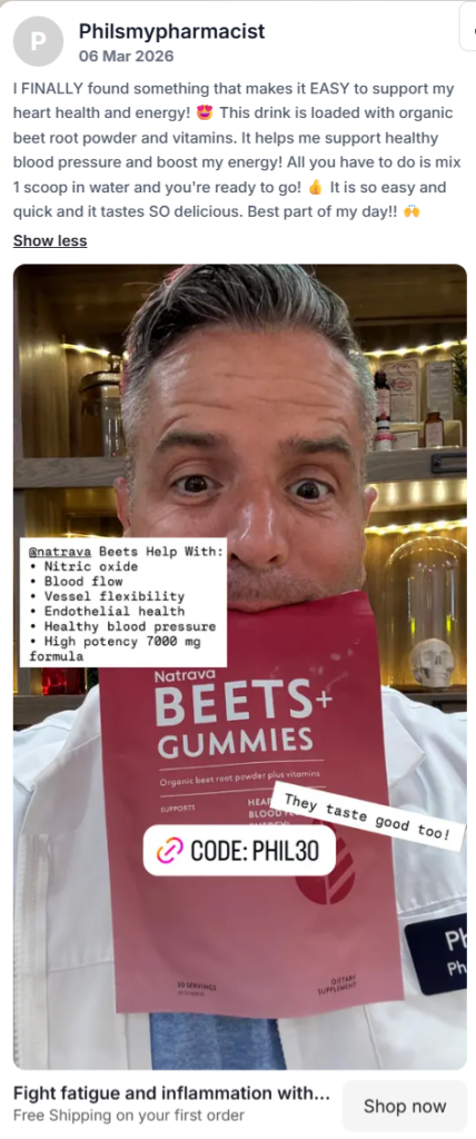
I give the thumbnail a score of 4 out of 5.
The thumbnail shows a person who is the pharmacist himself in a lab coat, which gives credibility to the product.
The image also shows product packaging. The marketer is not fooling around and is getting straight to the point.
This image ad shows a good use of Instagram native elements..Using the right fonts, adding color, and including a link with an offer can help highlight your benefits and boost your click-through rate.
The brand shows the image ad as amateur content, and it works perfectly.
The thumbnail lost one point because using the face of a client would have had more credibility. A testimonial also would have gone a long way!
The Ad doesn’t create the urgency of wanting the product. A hook such as “Struggling with low stamina? Recharge your energy without caffeine. TRY: ”
2. Click Score:
I am giving it a solid 3 out of 5. The primary content fails to do justice to the thumbnail.
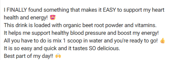
Caption
A decent opening. The caption like the thumbnail is missing a hook. The writer does try to make use of emojis and line spacing. But, the content disappoints.
This space is a missed opportunity. A testimonial or two could have built trust. Even calling out trending features like ‘gluten-free’ would’ve spoken directly to health-conscious buyers.
A stronger caption is one that uses social proof, trending features, and a clear solution. This would have boosted both engagement and conversions.
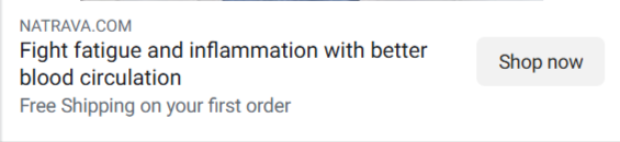
Headline
The headline supports the ad thumbnail and gives a solution to the problems faced by the target audience.
The headline highlights the solution, so viewers quickly grasp the problem the product solves. Which is crucial to capture audience attention.
Though a sense of emergency or a stronger emotional hook would have made it even more compelling.
Description
An offer is a good way to increase your CTR. Having mentioned one offer already in the thumbnail and another in the description is a good strategy to follow. Creating value propositions for viewers’ attention.
The Image ad has strong potential and with a complimenting caption would have gotten great conversions.
The thumbnail- caption- headline- description are a unit. Thus, brands must ensure to complement all these elements and create a seamless flow that will lead to turning curiosity to action and improved ROI.
3. Ugly Score:
This ad is a 5 out of 5 when it comes to ugly score. The creative team embraces the “ugly ad” aesthetic, presenting it in an unpolished and raw manner.
The placements of texts on the thumbnail is in disarray. The image used is amateur. The font is native to Instagram. All these elements go perfectly well to make this an ugly ad.
The use of these elements makes it seem more like a genuine recommendation than an ad.
4. Congruency Score:
I will give this a congruency score of 3 out of 5.
When directed to the product site, one is left looking for the product checkout.
While the webpage features testimonials from individuals and health experts, its layout appears disorganized.
The product’s benefits, features, and unique selling points are clearly presented.
BUT you have to scroll more than half way down to see your product. I was left wondering whether it is the check out page or just the information page.
The current landing page layout feels unorganised. Adding items to the cart requires unnecessary effort.
Most users are accustomed to a seamless and intuitive layout. Adopting a generic and structured layout will be more beneficial.
The content of the page is top notch but the alignment can make the brand lose customers. The customer shouldn’t be left wondering.
The landing page does build up on the ad, gives it credibility, elaborates on the benefits and answers the question as to why this brand specifically.
A good alignment and flow in the landing page would have given the brand a home run.
How Can You Use This For Your Business?
1. Amateur Content
Don’t be afraid to embrace the raw, unpolished look in your creatives. An overly polished ad can sometimes turn off audiences while ads like these with candid photos, real people or simple alignment can grab attention and feel authentic.
Use this to make your brand relatable and approachable.
2. Expert validation
Incorporating credible voices, such as experts or professionals, can immediately establish trust with the audience.
A pharmacist wearing a lab coat or testimonials from health experts both add authority.
3. Native elements
Design your ads so they naturally fit into the platform they appear. Use fonts, colours, and layouts that match the platform’s native style.
This will help the ad blend into the feed.
Make your ads feel like less of an interruption and more like regular content. Thus, improving engagement.
4. Answer the question: “Why You?”
People’s attention span are shrinking.
Your audience should immediately understand why your brand is a better choice.
Clearly communicate what makes your solution different, more effective or more valuable than the alternatives.
Main Insights from the ad
What works well:
- Use credible faces to build trust: this helps strengthen audience confidence in the message
- Highlight Benefits: communicate a clear understanding of the product or service
- Use platform native elements: this helps the ad to blend in and perform better
- Strategically place offers to increase clicks: well positioned deals increases engagement
- Incorporate testimonials for added proof: this helps validate the claim and build credibility
- Make authentic and relatable content: viewers are looking for authentic and easy to connect content
Areas of Improvement:
- Lack of a strong opening hook: support your ad with a compelling hook to immediately capture attention
- Underutilized caption space: use your primary text to reinforce your brand message or provide additional value
- Landing page flow feels confusing and not optimised: to increase your conversion rate, keep your landing page experience seamless for the customers
- Missed opportunity to lead with customer’s core problem: pressing on pain points can make the message more impactful.
Check out their Landing Page:
https://natrava.com/pages/shop-beets-phil-cowley
This post is packed with insights; I again recommend bookmarking it in your browser for future reference.
Well, that’s all for the newsletter, folks!
Finally, I would like to add that I will continue sending you these ads every Monday, but they alone may not be sufficient for your success as you would want more concepts under your belt.
Therefore, if you are a Facebook ads marketer and want more ads like these for yourself, then go ahead and check out Minea.
Here is the promo code offering you 20% off for 3 months: SANNIDHYA20
And here is my affiliate link: [https://app.minea.com/find-winning-product?ref=k63dd]
Also, let me know which niche’s ad I should pick up next for you. I would love to hear from you.
DISCLAIMER: This post contains affiliate links, which means that if you click on one of the product links, I’ll receive a small commission.
Happy Marketing!