
Hey,
Welcome to the 97th edition of Ad Pulse Monday!
For those new to this series, every Monday, I select an ad or ads that have performed exceptionally well. I’ll break down their success factors, key takeaways, and how you can apply these insights to your business.
If you’re already familiar with Ad Pulse Monday, welcome back!
Consider bookmarking these posts, creating a handy repository right in your browser.
Usually, I go with ads for this newsletter. But for this post, I’m making an exception and will break down an organic post instead.
The organic post I’ll be reviewing is an Instagram carousel for a health supplement store called Only What’s Needed. It’s a post that I would want to run as an ad.
The world of paid and organic content has merged quietly over the last few years.
Organic posts can be run like ads to create purchase intent, with a button or overlay. It creates a more natural, seamless experience.
As Alex Hormozi said, “If you can make all of your ads look organic, the platform loves you. The one thing ads give you that organic won’t is reach. You pay for the reach.”
Breaking Down the Only What’s Needed Organic Post
1. Thumbnail Score
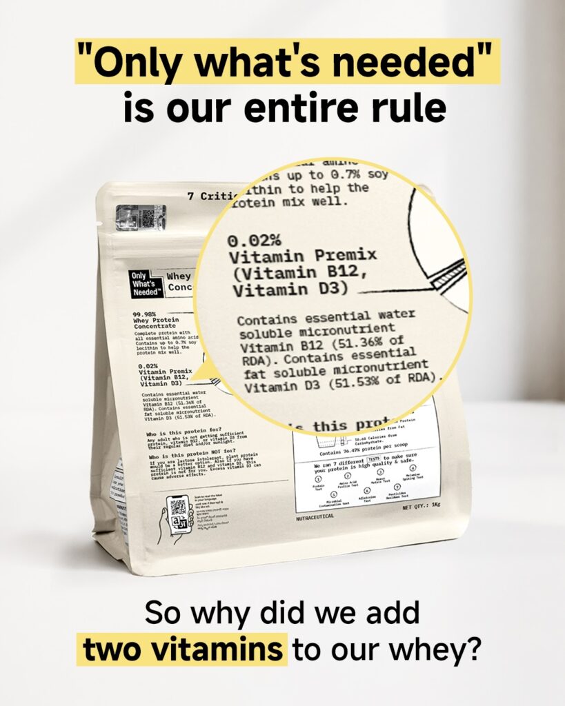
I’m giving it a 4 out of 5.
The first image is simple, with only three colors: white, yellow, and beige.
It could benefit from more vibrant colors to truly capture the viewer’s attention.
Also, it immediately draws your attention to the headline “Only What’s Needed is our entire rule”, with the brand name “Only What’s Needed” highlighted in yellow.
With the highlighted brand name and the headline, it instantly familiarises you with the brand’s concept and what it offers.
The yellow highlight stands out against the white background, drawing your eye to the product image.
In the product image, there’s a circle that magnifies the product label to draw attention to the Vitamins.
The information is presented without extra graphics and uses technical data to build awareness of their offering.
Moreover, the bottom text ends with a question, “So why did we add two vitamins to our whey?” which makes viewers curious about the brand’s decision.
The two vitamins are also highlighted in yellow, which means that the two highlighted sections in the ad are the brand name and the product offering.
This clearly shows the product’s value proposition.
It is an information carousel meant to convert MOFU audiences to BOFU.
2. Click Score
This earns a 4 out of 5 from me.
The first slide immediately creates interest in the product. It builds enough curiosity to make the viewer see the full carousel post.
Each slide corresponds to the question on the first slide, providing metrics and explaining the product and the brand’s decision to add Vitamin.
Every slide in the carousel increases viewer interest, encouraging continued engagement with the post.
The post gets a high CTR this way and holds the viewer’s attention longer.
The end slide CTA asks for questions that the brand can answer.
It drives engagement by allowing comments and positions the brand as open and trustworthy.
Caption
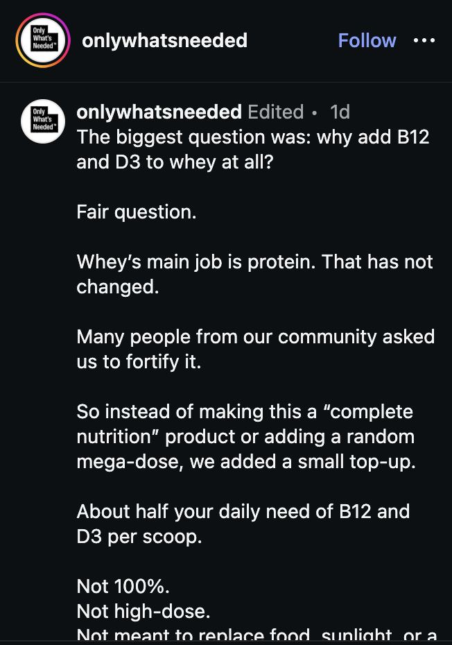
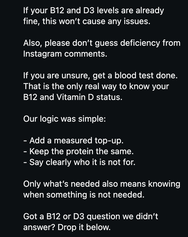
The hook is good. It catches your attention by asking you a question.
The caption focuses on answering questions from their community.
This builds trust and credibility for the brand among its audience.
The caption’s wording and flow are simple and easy to follow.
It breaks down medical knowledge and brand decisions into a readable format, presented as short lists.
Using paragraph breaks also makes it easy to skim.
Readers can jump straight to the pointers to get the information they need quickly.
3. Ugly Score
I’m giving this a 3 out of 5.
The ad uses basic fonts, and there are no graphic designs to elevate the product.
It looks clean without feeling too polished.
Only the facts and the product packaging are displayed, creating interest for the viewer.
Despite this, the ad still could be made more ‘ugly’.
It could have been even better if it had been presented as an Instagram Story with native elements, such as a Questions sticker.
As it stands, it doesn’t look as ugly as it could be.
4. Congruency Score
As this is an organic post, there is no direct link to the storefront. So we cannot rate its congruency.
But based on the product page linked in the bio, the post would have earned a 4 out of 5.
The product page itself is very organized and aligns with the design of the original ad.
The main message about the product’s inclusion of Vitamins is clearly communicated, even though it is not the main point of the post.
All the necessary information is displayed in clear wording.
There’s no confusion regarding the product’s selling points.
The images on the page are also packed with information without overwhelming the customer.
Scrolling the page, the ‘View results for every test’ section gives further insight into the product’s credibility.
The FAQ section at the bottom of the page also adds further trust to the brand’s commitment to its customers.
Finally, the Order Now button is clear and easily accessible from the moment the landing page opens.
While the data is good, it doesn’t make us care for the product. For that, we need to be engrossed in a story or a testimonial.
A few testimonials could have validated the brand’s effectiveness. Without any testimonial, there’s no chance for the viewer to connect emotionally with the product.
How can you use this for your business?
1. Lead with Data Transparency
Make your product information itself your main creative asset to build credibility and trust.
2. Answer Common Doubts Early
Address the most common doubts regarding the product in the images themselves.
3. Use Highlights on Important Text
Emphasize the most important parts of the ads by using bold colors.
4. Integrate Brand Message with the Copy
Use the copy to always point towards the brand’s overall aim and message.
Main Insights From the Post
- Thumbnail Score: 4 / 5
- Click Score: 4 / 5
- Ugly Score: 3 / 5
- Congruency Score: not rated — this is an organic post with no direct storefront link
What Works Well
- The visuals are simple and clean without feeling too polished.
- The way the data is presented creates trust within viewers.
- Making sure the ad highlights the brand’s message.
- Creating trust and loyalty by answering consumer doubts.
- Using simple language to break down scientific proof
What the Post Can Improve
- The ads’ ugliness can be improved by adding more native elements. The ‘uglier’ the ad, the more people will relate to it and click on it.
- If you’re turning the post into an ad, make sure there’s a clear headline, a CTA, and a landing page link to ensure a smooth customer journey.
- Do try to incorporate storytelling and testimonials to create a stronger emotional connection and brand trust from the get-go.
Check Out the Product Page:
https://onlywhatsneeded.in/product/whey-unflavoured-1kg
Today’s post was a different venture from our previous APM newsletters. Don’t worry, we’ll resume with the ads next week.
Related Ad Breakdowns
- Ad Pulse Monday 92 – Bear Balanced Creatine Gummies
- Ad Pulse Monday 95 – Natrava Beets+Gummies
- Ad Pulse Monday 98 – Ionix Labs Shapewear
This post is packed with insights. I recommend bookmarking it in your browser for future reference.
Well, that’s all for the newsletter, folks!
Happy Marketing!