Hey,
Welcome to the 21th edition of Ad Pulse Monday!
For those new to this series, every Monday, I select an ad or ads that I believe have performed exceptionally well. I’ll break down their success factors, key takeaways, and how you can apply these insights to your business.
If you’re already familiar with Ad Pulse Monday, welcome back!
Consider bookmarking these posts, creating a handy repository right in your browser.
Without further ado, let’s dive in
Weight Loss Supplement Showdown

To view the ad, register on Minea using this affiliate link (and get a flat 20% discount on paid plans):
https://app.minea.com/ads/facebook?ref=k63dd
And then click on this link:
https://app.minea.com/en/ads/facebook/951846330274276/details?ref=k63dd
1. Thumbnail score:
I’m giving this a 5 out of 5.
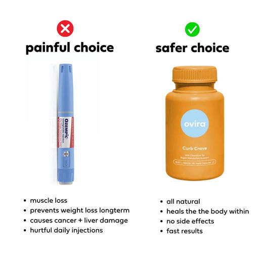
Many brands feel that using the ‘us vs. them’ strategy in their ad creatives is unethical or not allowed on Facebook. However, if you’re not using this strategy, you’re missing out a lot.
This ad creative we are discussing has been running since March, close to 100 days, indicating that it is performing very well. This ad picks a specific competitor and outlines the key benefits of their product compared to their competitor.
This is a great way to hook your target audience and get them to consider switching their loyalty. The best part is the ad doesn’t tell you what to buy; it simply states the benefits of the product using bullet points, which is an excellent way to highlight specific customer pain points.
2. Click Score:
This earns a 5 out of 5 from me.
The ad catches your attention well, and the headline appeals to a common pain point that people are worried about in the contemporary world.
The relatability of the headline here is going to enhance the click rate. Plus, to top it all off, the ad has been running for a long time and has garnered enough social proof, which works in its favor.

3. Ugly Score:
This is a good 4.5 out of 5.
I love that the comparison ad has been created with basic tools. It definitely looks like someone with zero design skills made the ad, and that works in their favor.
People are fatigued by polished ads, so ugly ads can really work for brands right now. The 0.5 deduction is only for the product’s branding used here. However, the overall look and feel really hit it out of the park.
4. Congruency Score:
This ad’s congruency score is a solid 5 out of 5.
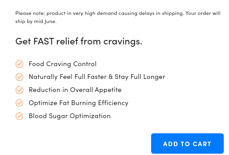
You’re redirected to the supplement’s product page, where you will find the exact same benefits (i.e., natural, zero side effects, etc.) listed in the ad.
I also like the landing page design. It’s easy to navigate and has customer testimonials and CTAs placed perfectly.

Caption:
This caption gets a 4 out of 5. I love that it begins with a customer testimonial.
Customer testimonials are highly effective for driving purchase decisions. However, I’m not the biggest fan of using testimonials as long as three paragraphs.
Apart from that, I like the use of bullet points to highlight product benefits and the clear, directed CTA that gives the reader a straightforward next step.
How can you use this for your business?
- Don’t shy away from a direct comparison if it’s done tastefully and factually. Highlighting your strengths over your competitors can clarify choices for consumers who are on the fence.
- Incorporate powerful customer testimonials into your ad campaigns. Use snippets that pack a punch, address common pain points, or highlight specific benefits.
- When detailing the benefits of your product or service, use bullet points to break down information into digestible pieces. This helps viewers quickly grasp the value proposition without getting overwhelmed by text.
Check Out the Landing Page:
Here’s the landing page for this product:
https://ovira.com/products/curb-crave
This post is packed with insights; I again recommend bookmarking it in your browser for future reference.
Well, that’s all for the post, folks!
Finally, I would like to add that I will continue sending you these ads every Monday, but they alone may not be sufficient for your success as you would want more concepts under your belt.
Therefore, if you are a Facebook ads marketer and want more ads like these for yourself, then go ahead and check out Minea.
Here is the promo code offering you 20% off for 3 months: SANNIDHYA20
And here is my affiliate link: [https://app.minea.com/find-winning-product?ref=k63dd]
Also, let me know which niche’s ad I should pick up next for you. I would love to hear from you.
DISCLAIMER: This post contains affiliate links, which means that if you click on one of the product links, I’ll receive a small commission.