Hey,
Welcome to the 94th edition of Ad Pulse Monday!
For those new to this series, every Monday, I select an ad or ads that have performed exceptionally well. I’ll break down their success factors, key takeaways, and how you can apply these insights to your business.
If you’re already familiar with Ad Pulse Monday, welcome back!
Consider adding a label to these emails for easy access, just like Shailendra did, creating a handy repository right in your inbox.
To view the ad, register on Minea using this affiliate link (and get a flat 20% discount on paid plans):
https://app.minea.com/ads/facebook?ref=k63dd
Then, you can click on this link:
https://app.minea.com/en/ads/facebook/676451191150827/details?ref=k63dd
1. Thumbnail Score:
I give the thumbnail a score of 3 out of 5.
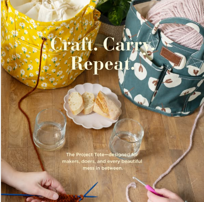
The thumbnail immediately shows lifestyle imagery that’s warm, inviting, and relatable. The yellow project tote bag pops against the neutral, cozy background featuring crafting materials, yarn, and a creative workspace setting. This creates an instant emotional connection with crafters and creative individuals.
The “Craft. Carry. Repeat.” text overlay is brilliant – it’s short, memorable, and captures the entire value proposition in three words. The use of period punctuation adds rhythm and makes it feel like a lifestyle mantra rather than just product copy.
The composition works beautifully. You can see hands actively engaged with crafting supplies, which adds authenticity and shows the product in real-world use. The scattered materials (yarn balls, fabric, crafting tools) suggest organization meets creativity – exactly what the target audience craves.
However, it loses one point because the text placement could be slightly more prominent. In a fast-scrolling feed, some users might miss the headline at first glance. A bolder or slightly larger font would’ve made this a perfect 5/5. Using native Instagram fonts and styles would have helped accentuate it.
The warm, inviting aesthetic feels native to Pinterest or lifestyle Instagram feeds, which is exactly where this audience lives. It doesn’t scream “ad” – it screams “inspiration.”.
2. Click Score:
I’d give a click score of 3.5 out of 5.
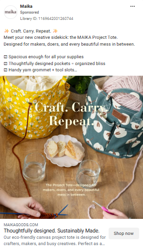
Caption
The caption as a whole is concise, warm, and clearly tailored to a creative audience. Opening with “Craft. Carry. Repeat.” sets a rhythmic, lifestyle-led tone, while introducing the MAIKA Project Tote as a “creative sidekick” personifies the product and builds an emotional connection rather than pushing a hard sell. The supporting lines reinforce utility with specifics like spacious pockets, thoughtful design, and handy tool slots, balancing aspiration with function. Emojis are used sparingly and appropriately, adding charm without clutter. Overall, it feels inviting and brand-aligned, though it leans more toward inspiration than directly addressing a clear problem or pain point.
Headline
The headline lacks hooks that drive immediate action. Something like “Every Crafter Needs This $38 Organization Hack” or “The Tote That Keeps My Creative Chaos Under Control” would’ve been more curiosity-driven and benefit-focused. It doesn’t create urgency, curiosity, or a clear benefit. There’s no reason for a crafter to stop scrolling unless they already want a project tote. A stronger headline could call out organization, portability, or creative chaos to drive immediate interest.
Description
The description focuses on thoughtful design and sustainability, which builds brand trust, but it avoids specific pain points. It doesn’t directly address common problems like tangled yarn, lost tools, or carrying multiple bags. Lastly, the ad relies on aesthetics rather than click motivation with no urgency cues.
The language in the visible description is aspirational but doesn’t address specific pain points directly. What problem does this solve? Tangled yarn? Lost supplies? Lugging multiple bags to craft classes? The ad assumes viewers already know they need a project tote rather than educating them on why.
To improve this to a 4.5 or 5, they should add:
- A specific benefit callout (“Fits 3+ Projects + All Your Tools”)
- Social proof (“Join 10,000+ Happy Crafters”)
- A time-bound offer (“Flash Sale: Free Shipping This Week Only”)
3. Ugly Score:
I’d give an ugly score of 3 out of 5.
This ad scores a 3 out of 5 on the “ugly” scale — not because it’s visually weak, but because it’s platform-mismatched. The photography is polished, color-coordinated, and beautifully styled, which makes it strong for brand perception, retargeting, or Pinterest-style discovery environments.
However, for cold in-feed Meta traffic, that same polish works against it. It feels art-directed and intentional — like a catalog spread — rather than something a real person casually shared.
In craft-heavy niches especially, authenticity and lived-in context often outperform perfection.
A stronger “ugly” version would show the tote in real use: inside a cluttered car trunk, on a messy workspace, or in a before-and-after comparison that highlights practical organization.
The current creative builds aesthetic trust, but it lacks the raw relatability that typically drives scroll-stopping performance with new audiences.
4. Congruency Score:
I’ll give this ad a congruency score of 2.5 out of 5.
The alignment works at a basic structural level — the ad promotes project totes and the click leads to a project tote collection. However, there is a noticeable experiential mismatch between what the ad emotionally promises and what the landing page delivers.
Messaging continuity:
The ad positions the tote as a creative companion — something integrated into a maker’s daily flow (“Craft. Carry. Repeat.”). That framing suggests a focused, story-driven product experience.
The landing page, however, functions primarily as a product grid. While the category matches, the narrative tone from the ad is not strongly reinforced. There’s minimal expansion of the “creative sidekick” concept, and no immediate storytelling that deepens the emotional positioning introduced in the ad.
Visual alignment:
Product category remains consistent (project totes).
However, the visual transition feels disjointed.
The ad uses styled, Pinterest-like lifestyle photography.
The landing page shifts to standard collection thumbnails without reinforcing the same lifestyle context.
There’s limited immersive, in-use imagery above the fold to maintain the aesthetic momentum built in the ad.
This visual drop-off creates subtle discontinuity rather than seamless flow.
Where the landing page can improve:
The page underdelivers on lifestyle reinforcement. It lacks strong real-world crafter context, UGC, or setup-based imagery showing how the tote integrates into actual creative routines.
Key practical details — compartments, capacity, what fits inside, use-case breakdown — are not immediately emphasized in a way that matches the intent triggered by the ad.
Additionally, directing cold traffic to a collection grid rather than a focused product story weakens the emotional bridge built in the creative.Overall assessment:
The funnel is structurally aligned but experientially inconsistent. The ad builds an aspirational, lifestyle-driven expectation, while the landing page delivers a functional inventory view. There is no bait-and-switch, but the depth of storytelling and visual reinforcement falls short of the promise set by the creative. Strengthening narrative continuity and real-world context would elevate this to a true 4.5–5/5 congruency experience.
How Can You Use This For Your Business?
1. Lead with lifestyle transformation, not product features.
People don’t buy project totes. They buy the feeling of being an organized, productive crafter who shows up to classes prepared. They buy the version of themselves who doesn’t frantically search for scissors in three different bags.
Instead of focusing on “multiple pockets” or “durable canvas,” test angles like:
- “Finally, a bag that keeps my creative chaos under control”
- “I used to show up to craft night with 4 bags. Now it’s just one.”
- “The bag that makes me look like I have my life together”
The emotional outcome always wins over functional specifications.
2. Create relatable, native content from real customers.
Create relatable, native image-based content from real customers.
This polished ad is visually strong, but it lacks feed-level authenticity. To improve performance, shift from styled brand photography to contextual, real-world stills.
Here’s what would likely outperform it:
Ask real customers to send unfiltered photos of:
- Their old system of carrying supplies (messy trunk, overflowing tote, scattered tools)
- Everything laid out on a table before organizing
- The same supplies neatly packed inside the tote compartments
- The bag sitting inside a real craft class, sewing circle, or knitting group setting
- A mid-use shot on a lived-in desk with active projects around it
These should be shot casually on phones with natural lighting. No heavy staging. No flat-lay perfection. Let the environment feel real — slightly imperfect framing is fine.
Still images that feel observational — as if someone documented their own setup — blend into the feed as personal discoveries rather than brand assets. That reduces ad resistance, increases scroll-stopping power, and often improves CTR because the product feels encountered organically, not professionally presented.
Remember:
- Polished builds brand.
- Native drives clicks.
- Use the right tool for the traffic stage.
3. Speak directly to specific pain points in specific sub-niches.
The craft world is massive and varied. Instead of one generic ad, create multiple angles targeting specific pain points:
- For knitters: “Tired of yarn rolling all over your car? This tote has dedicated yarn holders.”
- For sewers: “Fits your fabric, patterns, thread, and scissors – with room to spare.”
- For crocheters: “Keep all your WIPs organized in one place (finally!).”
- For multi-crafters: “One bag for knitting, sewing, and everything in between.”
Each micro-niche has slightly different frustrations. Address them directly rather than speaking generally.
4. Add urgency that makes people act NOW.
“Shop Now” is passive. It doesn’t create any FOMO or reason to click immediately. Test these instead:
- “Limited Edition Colors Selling Out Fast”
- “Free Personalization Ends Friday”
- “Over 500 Sold This Week – Join the Creative Movement”
- “Spring Craft Season Sale: 20% Off Today Only”
Give people a compelling reason to click now rather than save it for later. Later almost never comes.
5. Leverage community and social proof aggressively.
The craft community is tight-knit, active, and influenced heavily by peer recommendations. Your ads should reflect this:
- “Why 8,000+ crafters are obsessed with this tote”
- “The bag taking over craft circles nationwide”
- Feature a carousel of real customer photos with their totes
- Show the product at real craft events, classes, and maker spaces
If you have a strong community, flaunt it. Nothing sells to crafters better than seeing other crafters genuinely loving something.
Check out their Landing Page:
Here’s the landing page for this product:
https://www.maikagoods.com/collections/project-totes
This post is packed with insights; I again recommend bookmarking it in your browser for future reference.
Well, that’s all for the newsletter, folks!
Finally, I would like to add that I will continue sending you these ads every Monday, but they alone may not be sufficient for your success as you would want more concepts under your belt.
Therefore, if you are a Facebook ads marketer and want more ads like these for yourself, then go ahead and check out Minea.
Here is the promo code offering you 20% off for 3 months: SANNIDHYA20
And here is my affiliate link: [https://app.minea.com/find-winning-product?ref=k63dd]
Also, let me know which niche’s ad I should pick up next for you. I would love to hear from you.
DISCLAIMER: This post contains affiliate links, which means that if you click on one of the product links, I’ll receive a small commission.
Happy Marketing!