Hey,
Welcome to the 59th edition of Ad Pulse Monday!
For those new to this series, every Monday, I select an ad or ads that I believe have performed exceptionally well. I’ll break down their success factors, key takeaways, and how you can apply these insights to your business.
If you’re already familiar with Ad Pulse Monday, welcome back!
Consider bookmarking these posts, creating a handy repository right in your browser.
Without further ado, let’s dive in
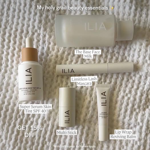
Holy Grail Beauty
To view the ad, register on Minea using this affiliate link (and get a flat 20% discount on paid plans):
https://app.minea.com/ads/facebook?ref=k63dd
And then click on this link:
https://app.minea.com/en/ads/facebook/938222630994170/details?ref=k63dd
1. Thumbnail score:
I’m giving this a solid 4 out of 5. Most people think that to create an ugly ad, you need to completely strip away branding or keep the product out of focus.
But this ad is proof that you can nail an ugly ad even when your product is front and center.
This looks more like a Pinterest board than an ad, which is a huge win. It uses native Meta fonts to explain the product features, making it feel like a natural part of someone’s feed rather than a hard sell.
That said, I would have loved to see the benefits listed instead of just features. Also, the background and color choices could have been better.
White text on a white background? Too much, even for an ugly ad. A little more contrast would have made it more readable without losing its organic feel.
One thing I really love is how this ad encourages a higher AOV by selling a skincare routine instead of just a single product.
Think of it like selling a full outfit instead of just the pants—it makes the purchase feel incomplete without the rest.
2. Click Score:
This gets a 4 out of 5 from me. The creative grabs attention, and the 15% off offer is a solid way to increase CTR and get people interested.
Plus, free shipping and returns add another huge incentive for people to click. Small tweaks, like making the offer more prominent in the creative, could have made it even stronger.

3. Ugly Score:
This scores a strong 4.5 out of 5. The products and branding are visible, and it follows branding guidelines, but the format is refreshing.
It doesn’t feel like a conventional ad—it looks like an Instagram infographic or a Pinterest board. This is key because ads that blend into organic content tend to perform better.
It doesn’t scream “Buy this now!” Instead, it positions the product naturally, which reduces ad fatigue and makes people more likely to engage.
4. Congruency Score:
This is a perfect 5 out of 5. When you click through, you land on a product page featuring the exact product from the ad.
The page is clean, easy to navigate, and well-structured, with CTAs, customer reviews, and related products placed exactly where they should be. No friction, no disconnect—just a seamless experience.

Caption:
The caption is a total missed opportunity. It starts strong with a review, but that’s all there is. One line is not enough to convince users to buy. A good testimonial needs context.
Why does this person love the product? What pain point did it solve? Build a mini-story around the review. Then, highlight the offer, and guide users to click.
How can you use this for your business?
1. If you sell skincare, bundle products together and showcase how they work as a set instead of selling individual items. This encourages higher AOV and better conversions.
2. Discounts and free shipping increase CTR, but they work best when they’re visibly highlighted. Make them stand out.
3. Ugly ads work, but bad contrast hurts engagement. Keep the messy, organic vibe, but make sure the text is easy to read.
Check Out the Landing Page:
Here’s the landing page for this product:
https://iliabeauty.com/collections/best-sellers
This post is packed with insights; I again recommend bookmarking it in your browser for future reference.
Finally, I would like to add that I will continue sending you these ads every Monday, but they alone may not be sufficient for your success as you would want more concepts under your belt.
Well, that’s all for post, folks!
Therefore, if you are a Facebook ads marketer and want more ads like these for yourself, then go ahead and check out Minea.
Here is the promo code offering you 20% off for 3 months: SANNIDHYA20
And here is my affiliate link: [https://app.minea.com/find-winning-product?ref=k63dd]
Also, let me know which niche’s ad I should pick up next for you. I would love to hear from you.
DISCLAIMER: This post contains affiliate links, which means that if you click on one of the product links, I’ll receive a small commission.