Hey,
Welcome to the 20th edition of Ad Pulse Monday!
For those new to this series, every Monday, I select an ad or ads that I believe have performed exceptionally well. I’ll break down their success factors, key takeaways, and how you can apply these insights to your business.
If you’re already familiar with Ad Pulse Monday, welcome back!
Consider bookmarking these posts, creating a handy repository right in your browser.
Without further ado, let’s dive in
Before we dive into this week’s review, I want to introduce a new metric I’ve added to my ad reviews – the congruency score.
The congruency score measures the synergy between an ad creative and its landing page. When someone clicks on an ad, they expect to land on a page that’s relevant to what they saw in your ad.
This relevancy is what I measure with the congruency score. Congruence is a high-level, conversion-centered metric. If an ad creative isn’t aligned with your landing page, it’s going to cause friction and hurt your conversion rate.
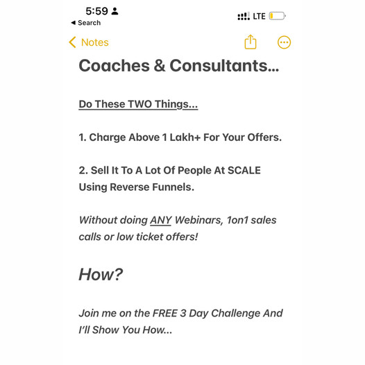
Challenge For Coaches

To view the ad, register on Minea using this affiliate link (and get a flat 20% discount on paid plans):
https://app.minea.com/ads/facebook?ref=k63dd
And then click on this link:
https://app.minea.com/en/ads/facebook/199559556412437/details?ref=k63dd
1. Thumbnail score:
I’m giving this a good 4 out of 5.
Piggybacking on the branding and UI of known apps or platforms ensures your target audience engages with your ad. This ad creative stands out because of its familiar and native interface.
However, tweaking the size and font of the text might not significantly reduce their CPM. Nonetheless, it’s still effective in grabbing attention.
Additionally, the first two points effectively hook the user by setting a clear goal and then clearly positioning the challenge as the way to reach that goal.
2. Click Score:
This earns another 4.5 out of 5 from me.
The ad catches your attention well, and the headline creates a sense of FOMO by stating “closed-door event.” It has been running for over eight months, gathering lots of positive feedback, which helps encourage more people to click.
Additionally, using “FREE” in the description clearly drives more people to click on the ad.

3. Ugly Score:
This ad is trying to be ugly and does a decent job at it. I’d give it a 3.5 out of 5.
I’m a fan of ads that leverage native UI to boost brand recall in their ads—I’ve used this strategy in many of my successful ads.
The only downside here is that the ad we’re discussing hasn’t perfectly matched the UI, which, unfortunately, lowers its ugly score.
4. Congruency Score:
The congruency score for this is a full 5 out of 5. The challenge mentioned in the ad creative matches exactly with the landing page. If you click on the ad, you will feel validated with your choice.

Caption:
This caption gets a 5 out of 5. In the very first line, it explains who the target audience for the ad is.
It does an excellent job of inducing FOMO using phrases like “not for beginners.” The caption effectively uses emojis, bullet points, and proper paragraph spacing to make the text more consumable and readable.
For me, it ticks all the right boxes. It even has one clear CTA and mentions FREE multiple times, which is sure to drive people to click on the ad.
How can you use this for your business?
- Use interfaces familiar to your audience to capture attention and convey familiarity.
- Incorporate phrases like “enroll now” in your creatives to encourage clicks and direct traffic to your landing page.
- Start your captions with a strong hook and use strategic repetition of keywords like “free” to pique interest and drive action. Use emojis and clear formatting to make your captions more engaging and easy to read.
Check Out the Landing Page:
Here’s the landing page for this product:
https://launchatscale.com/event-reg-page
This post is packed with insights; I again recommend bookmarking it in your browser for future reference.
Well, that’s all for the post, folks!
Finally, I would like to add that I will continue sending you these ads every Monday, but they alone may not be sufficient for your success as you would want more concepts under your belt.
Therefore, if you are a Facebook ads marketer and want more ads like these for yourself, then go ahead and check out Minea.
Here is the promo code offering you 20% off for 3 months: SANNIDHYA20
And here is my affiliate link: [https://app.minea.com/find-winning-product?ref=k63dd]
Also, let me know which niche’s ad I should pick up next for you. I would love to hear from you.
DISCLAIMER: This post contains affiliate links, which means that if you click on one of the product links, I’ll receive a small commission.