Hey,
Welcome to the 29th edition of Ad Pulse Monday!
For those new to this series, every Monday, I select an ad or ads that I believe have performed exceptionally well. I’ll break down their success factors, key takeaways, and how you can apply these insights to your business.
If you’re already familiar with Ad Pulse Monday, welcome back!
Consider bookmarking these posts, creating a handy repository right in your browser.
Without further ado, let’s dive in
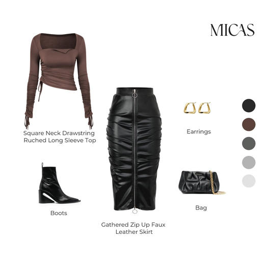
Outfit Of The Day

To view the ad, register on Minea using this affiliate link (and get a flat 20% discount on paid plans):
https://app.minea.com/ads/facebook?ref=k63dd
And then click on this link:
https://app.minea.com/en/ads/facebook/234745938939547/details?ref=k63dd
1. Thumbnail score:
I’m giving this a solid 5 out of 5.
I love that this ad looks like a Pinterest outfit look rather than an ad—it’s a huge win. The thought behind pitching the whole outfit instead of just one piece is brilliant.
It’s going to boost your conversion rate because seeing the complete package makes the overall value more attractive to the target audience.
Also, pitching a combo nudges people to spend more per purchase, increasing your AOV.
Finally, it addresses the issue of cart abandonment by presenting those missing pieces upfront, leading to a smoother checkout process and fewer abandoned carts.
2. Click Score:
This earns a 3.5 out of 5 from me.
The unique design catches your attention. However, the headline and description don’t support the creative well.
Highlighting the sale is good, but using a specific number or discount would increase the CTR more effectively.

3. Ugly Score:
This is a 5 out of 5 for me.
The ad masterfully replicates a Pinterest pin and moves away from conventional advertising. This significantly reduces CPM and boosts CTR.
4. Congruency Score:
The congruency score is 2.5 out of 5 for me.
I like the landing page’s minimalist design and easy-to-navigate structure, but I had to take time to find the outfits highlighted in the ad.
This reduces congruency and might lower conversion rates. A better strategy would be to provide the complete outfit on the landing page and showcase other items from the collection.

Caption:
This caption gets a 3 out of 5.
While it uses emojis and bullet points, it doesn’t add enough value to the ad.
A better description of the offer, highlighting the sale and a good CTA, could have done wonders for the caption.
How can you use this for your business?
- Aim for thumbnails that resemble organic content. This approach can attract more clicks by blending seamlessly into the user’s browsing experience.
- Improve your ad’s headline and description to better align with the creative. While the unique design catches attention, incorporating specific discounts or quantifiable offers can increase click-through rates (CTR) significantly.
- Maintain consistency between your ad creative and landing page to optimize conversion rates. Make sure all featured products are easily accessible on the landing page to reduce friction and support a smooth purchasing journey.
Check Out the Landing Page:
Here’s the landing page for this product:
https://shopmicas.com/collections/micas-new-season-sale
This post is packed with insights; I again recommend bookmarking it in your browser for future reference.
Well, that’s all for post, folks!
Finally, I would like to add that I will continue sending you these ads every Monday, but they alone may not be sufficient for your success as you would want more concepts under your belt.
Therefore, if you are a Facebook ads marketer and want more ads like these for yourself, then go ahead and check out Minea.
Here is the promo code offering you 20% off for 3 months: SANNIDHYA20
And here is my affiliate link: [https://app.minea.com/find-winning-product?ref=k63dd]
Also, let me know which niche’s ad I should pick up next for you. I would love to hear from you.
DISCLAIMER: This post contains affiliate links, which means that if you click on one of the product links, I’ll receive a small commission.