Hey,
Welcome to the 15th edition of Ad Pulse Monday!
For those new to this series, every Monday, I select an ad or ads that I believe have performed exceptionally well. I’ll break down their success factors, key takeaways, and how you can apply these insights to your business.
If you’re already familiar with Ad Pulse Monday, welcome back!
Consider bookmarking these posts, creating a handy repository right in your browser.
Without further ado, let’s dive in!
Creative Homebuyers

Watch the complete ad here: https://app.minea.com/en/ads/facebook/713973577490270/details?ref=k63dd
1. Thumbnail score:
I’m giving this a solid 5 out of 5.
I absolutely love ads that connect deeply with their target audience and address their specific needs.
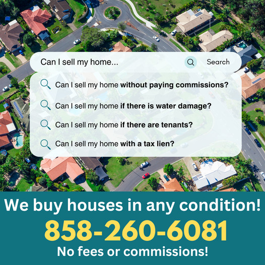
This ad nails it by using the Google search UI to highlight the major questions and concerns someone has while looking for a homebuyer. It’s spot-on in engaging its audience right off the bat.
2. Click Score:
This earns a 3.5 out of 5 from me.
The claim of “no fees or commission” is a powerful draw that will undoubtedly get a lot of clicks. However, including a phone number might confuse the audience a bit and potentially lower the click-through rate.
3. Ugly Score:
This is a 4.5 out of 5. The ad cleverly uses the native Google search UI to craft an ‘ugly’ look.
The use of basic fonts for the bold offer at the bottom of the image reinforces the impression that it was created by someone with minimal design expertise, which can actually enhance its authenticity in a sea of polished ads.
Caption:
The caption gets a 2 out of 5 from me.
It’s a missed opportunity—using just one line and failing to expand on the ad’s creative is a letdown. The caption lacks detail about the ad or the offer, missing a chance to sway the consumer further.
How can you use this for your business?
- Address the pain points of your target audience. This draws them in because you’re speaking their language and offering solutions right away.
- Avoid cluttering your ad with unnecessary information like phone numbers unless it’s a direct call to action.
- Use simple design elements and interfaces familiar to your audience to keep the ad relatable.
- Don’t waste the space. Use your caption to bolster the message of your ad. Provide additional information, reinforce your offer, and include a clear call to action.
Check Out the Landing Page:
Here’s the landing page for this product:
https://www.ibuysd.com/get-offer
This post is packed with insights; I again recommend bookmarking it in your browser for future reference.
Well, that’s all for the post, folks!
Finally, I would like to add that I will continue sending you these ads every Monday, but they alone may not be sufficient for your success as you would want more concepts under your belt.
Therefore, if you are a Facebook ads marketer and want more ads like these for yourself, then go ahead and check out Minea.
Here is the promo code offering you 20% off for 3 months: SANNIDHYA20
And here is my affiliate link: [https://app.minea.com/find-winning-product?ref=k63dd]
Also, let me know which niche’s ad I should pick up next for you. I would love to hear from you.
DISCLAIMER: This post contains affiliate links, which means that if you click on one of the product links, I’ll receive a small commission.