Hey,
Welcome to the 17th edition of Ad Pulse Monday!
For those new to this series, every Monday, I select an ad or ads that I believe have performed exceptionally well. I’ll break down their success factors, key takeaways, and how you can apply these insights to your business.
If you’re already familiar with Ad Pulse Monday, welcome back!
Consider bookmarking these posts, creating a handy repository right in your browser.
Without further ado, let’s dive in
Seamless Website Auditor

To view the ad, register on Minea using this affiliate link (and get a flat 20% discount on paid plans):
https://app.minea.com/ads/facebook?ref=k63dd
And then click on this link: https://app.minea.com/en/ads/facebook/796788929131168/details?ref=k63dd
1. Thumbnail score:
I’m giving this a solid 5 out of 5.
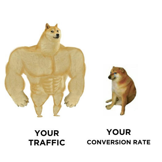
Meme ads are crushing it these days. I’ve personally leveraged them in my Facebook campaigns and saw a 30% conversion boost.
If you cleverly use a well-known meme to address a pain point or showcase your product’s utility, you’re almost guaranteed to stop the scroll and ramp up engagement. I’d wager this ad scored them a low CPM and a high CTR.
2. Click Score:
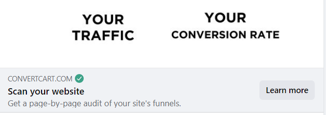
The ad nails communicating the pain point, and the headline effectively spotlights the offer. However, adding some solid social proof or a specific benefit could have pushed the click-through rate even higher.

3. Ugly Score:
This is a no brainer 5 out of 5. Meme ads excel because they blend in—they don’t scream “ad” yet deliver the message powerfully and directly to your audience.
Caption:
This caption gets a 3.5 out of 5.
It starts off strong, providing credible social proof that establishes trust with the brand. The benefits are clearly laid out in bullet points, which I appreciate.
What’s missing, though, is a compelling call to action. The absence of a CTA here is a significant missed opportunity. Including one could have enhanced the caption’s impact and guided customers towards the next step.
How can you use this for your business?
- Use memes in your ads to increase engagement, grab attention, and present a human side of your product or service.
- Use your ad creatives to highlight customer pain points. This approach not only captures attention but also positions your product as the solution.
- Always include a clear and compelling call to action in your captions.
Check Out the Landing Page:
Here’s the landing page for this product:
https://www.convertcart.com/lp/free-audit?Placement=%7B%7Bplacement%7D%7D
This post is packed with insights; I again recommend bookmarking it in your browser for future reference.
Well, that’s all for the post, folks!
Finally, I would like to add that I will continue sending you these ads every Monday, but they alone may not be sufficient for your success as you would want more concepts under your belt.
Therefore, if you are a Facebook ads marketer and want more ads like these for yourself, then go ahead and check out Minea.
Here is the promo code offering you 20% off for 3 months: SANNIDHYA20
And here is my affiliate link: [https://app.minea.com/find-winning-product?ref=k63dd]
Also, let me know which niche’s ad I should pick up next for you. I would love to hear from you.
DISCLAIMER: This post contains affiliate links, which means that if you click on one of the product links, I’ll receive a small commission.