Hey,
Do you know what the one common element of all successful Facebook advertising campaigns (apart from a solid ad strategy) is?
A compelling and high-converting landing page!
Without a landing page that directly communicates what you have to offer, drives your target audience to take action, and is user-friendly, you’re basically throwing your advertising money down the drain.

The median landing page conversion rate across industries ranges from 2.4% to 9.8%. Meanwhile, the benchmark for a good conversion rate is 10%.
All of that is to say that landing pages must do their job—convert.
To boost your conversion rates, you need to craft a product landing page tailored to your audience’s interests and drive traffic toward it.
But, creating a high-converting landing page can be straight-up HARD.
You might not know what your audience wants to see, what words will make them click, or where to even begin.
The internet is full of mixed advice on landing pages, and successful ones can look totally different.
So, what’s the secret formula?
Short answer: There isn’t one perfect formula.
But there are some key elements you need to check off every time.
And I promise that these 10 great landing page examples will spark your creativity and inspire your design, copy, and images.
So, let’s dive in!
1. Recess

Why I love this landing page:
- Visually appealing pastel color palette and tagline “We canned a feeling” create a relaxing and inviting atmosphere.
- Clearly defines USP with motion graphics showcasing soft drinks infused with hemp and natural ingredients.
- Subtle yet easily found “shop” link at the top left and a floating discount code offer for joining the mailing list.
- Detailed product line and reviews from leading outlets further down the page.
- Minimalistic but clear copy extolls the virtues of the drinks.
2. Shopify
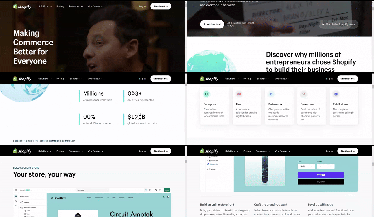
Why I love this landing page:
- This landing page maintains simplicity with minimal text yet effectively communicates key points about its product.
- Emphasizes Shopify as an all-in-one platform that is easy to use and trusted by many.
- A clean interface with a user-oriented headline and simple graphics facilitates an easy understanding of trial details and benefits.
- A concise call-to-action (CTA) with minimal fields required for sign-up streamlines the process of getting started selling online using Shopify’s tool.
3. Copper Cow Coffee

Why I love this landing page:
- Showcase beautiful product photos to enhance visual appeal and encourage visitors to start a subscription.
- Curated color schemes and eye-catching fonts create brand associations and highlight relevant offers, such as discounts.
- The inclusion of customer testimonials adds credibility to the brand’s messaging, reinforcing the quality of their coffee.
- Streamlined navigation with all CTAs leading to the same exit point for creating a subscription box.
4. Mark Manson

Why I love this landing page:
- Mark’s upfront and relatable tone immediately grabs attention and builds a sense of trust.
- By mentioning “potentially life-changing ideas,” he piques curiosity and prompts visitors to learn more about what he offers.
- Placing the subscription option above the fold makes it convenient for visitors to engage and increases the likelihood of a subscription.
5. Squarespace
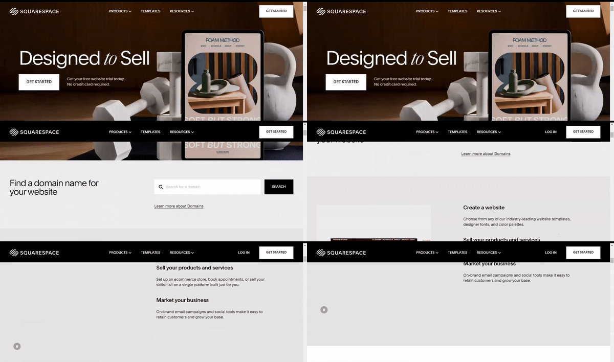
Why I love this landing page:
- Bold typography, customized copy, and interactive elements are seamlessly integrated to showcase Squarespace’s expertise in website design.
- Examples of website templates scrolling through on the right side draw attention without overshadowing CTAs.
- Prominent CTAs (“See Templates” and “Get Started”) reassure visitors they can start a free trial without a credit card.
- A short and concise layout leaves little room for distraction, encouraging immediate action.
6. Hubspot
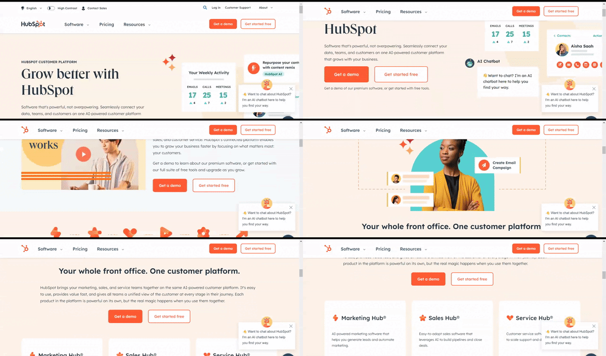
Why I love this landing page:
- Immediate clarity: “Free CRM software” is the first thing users see, simplifying the decision-making process.
- CTA reinforces the USP with a short message, encouraging action.
- Utilizes white space effectively, ensuring a clean and easy-to-read layout.
7. Bellroy
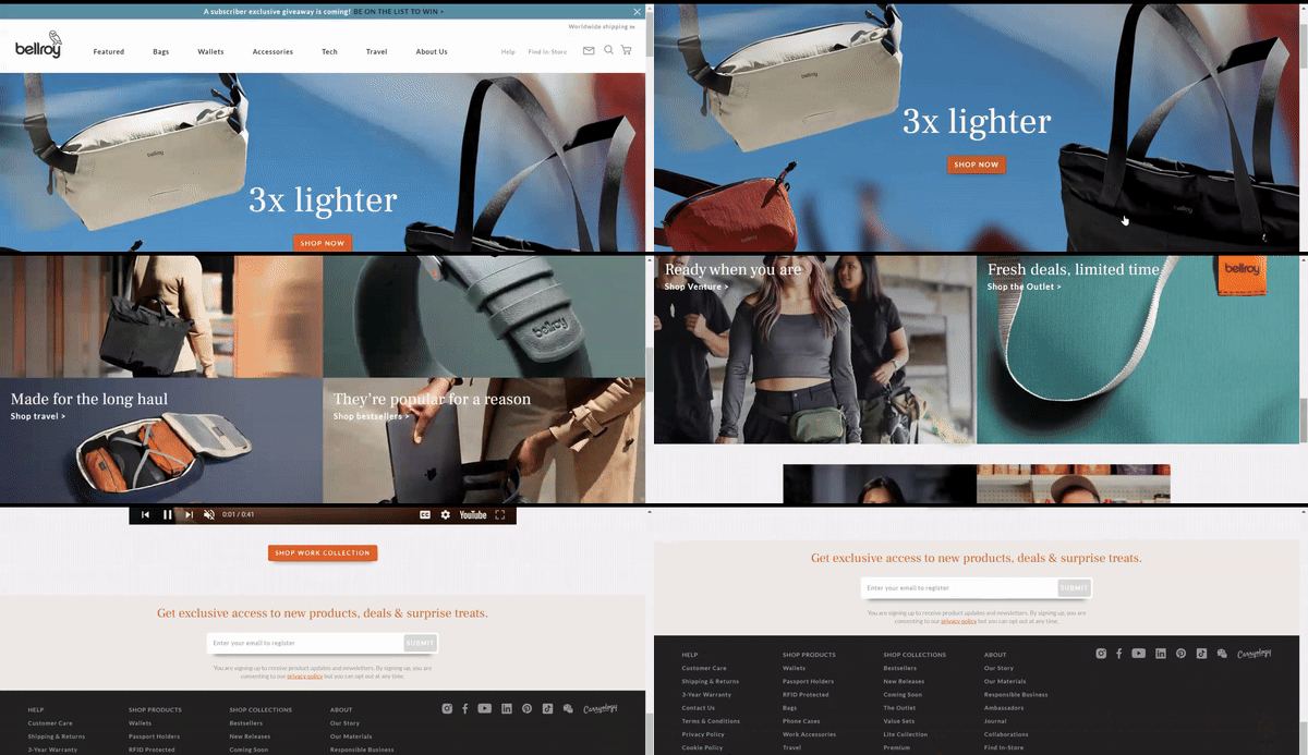
Why I love this landing page:
- Bellroy showcases thinner-than-typical wallets, emphasizing their value proposition.
- The product page is divided into three stages of the buyer’s journey: understanding the problem, how to fix it, and how Bellroy resolves it.
- An interactive section visually demonstrates the problem solved by Bellroy’s skinny wallet, comparing it to standard wallets as users move a slider back and forth.
8. Jasper AI
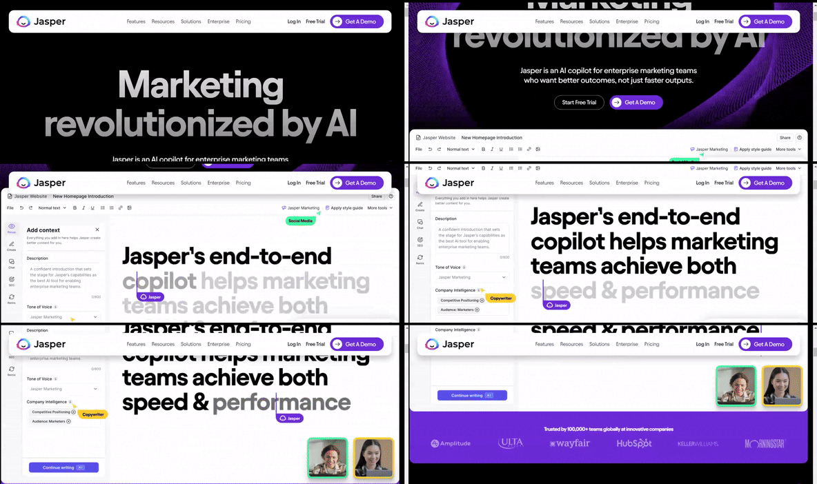
Why I love this landing page:
- Jasper’s landing page boldly presents its AI for writing website copy, with animated and colorful graphics summarizing use cases like “Product Listings” and “SEO Copy.”
- A bold and engaging video clip showcases Jasper’s main features, demonstrating its ability to write in various tones.
- A cute robot avatar personifies Jasper, possibly easing concerns about using an algorithm for creative copywriting.
- The “Sign Up Now” button remains prominent, ensuring easy access to sign up.
9. Thinx Leggings

Why I love this landing page:
- The product page showcases a wide range of body shapes and sizes, helping customers choose products that suit them best and indicating which garments are suitable for different flow and activity levels.
- An interactive 360-view feature allows customers to spin models of different dimensions, providing a reliable online shopping experience that sets Thinx apart from competitors.
10. Airbnb
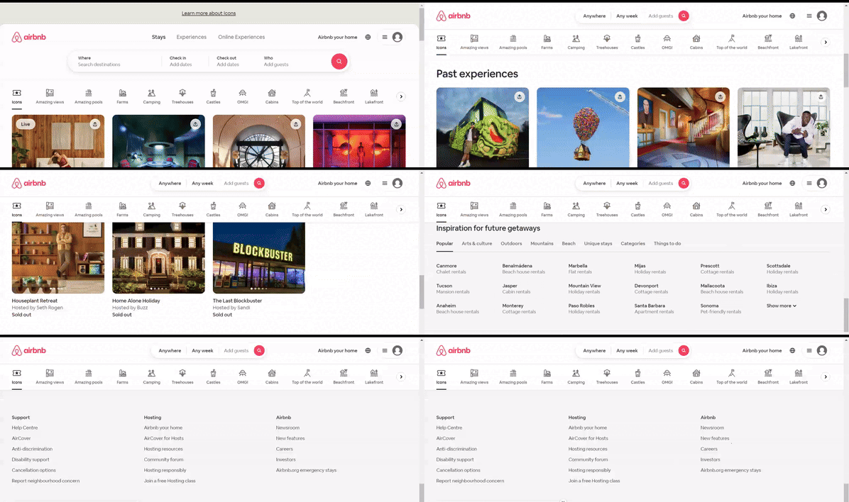
Why I love this landing page:
- Airbnb’s dynamic landing page automatically adjusts content based on the user’s location, providing a personalized and interactive experience that enhances user engagement and conversion.
- The CTA to create an Airbnb account is positioned in the right-hand corner of the page, maintaining visibility without overwhelming the user interface.
- An interactive slider bar allows users to visualize potential earnings by renting out their property for longer periods, enticing them to take action and create an account.
Remember, the way you present your product or service can be crucial in winning over customers.
These examples should give you plenty of ideas on how to design your own high-converting landing page.
Excited to start designing your landing page that converts?