Hey,
Welcome to the 13th edition of Ad Pulse Monday!
For those new to this series, every Monday, I select an ad or ads that I believe have performed exceptionally well. I’ll break down their success factors, key takeaways, and how you can apply these insights to your business.
If you’re already familiar with Ad Pulse Monday, welcome back!
Consider bookmarking these posts, creating a handy repository right in your browser.
Without further ado, let’s dive in!
Refreshing Power Drink

Watch the complete ad here: https://app.minea.com/en/ads/facebook/706524918174671/quickview?ref=k63dd
1. Thumbnail score:

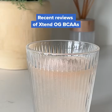
I’m giving this a 3.5 out of 5. Using an overlay headline to set expectations is a smart move. However, a visual of the product itself would have been a stronger choice than just a glass.
2. Hook Score:
This gets a 4 out of 5 from me. The ad throws you right into the action with jump cuts, product visuals, and upbeat music that grab your attention.
It cleverly uses social proof to pinpoint the target audience’s pain points and showcase the product’s benefits.
3. Retention Score:
This is a solid 4.5 out of 5. The ad is just 17 seconds long and I bet people will watch it more than once.
With so much going on—product visuals and reviews popping up—you’ll likely need a second look to catch all the details.
Plus, the feel-good vibe and lively music only boost the retention rate.
4. Click Score:
This gets a 3.5 out of 5 from me.
The headline does a good job of building further social proof and creating a sense of urgency and FOMO.
However, the lack of a clear call to action (CTA) is a missed opportunity.
5. Ugly Score:
This is a no-brainer 5 out of 5. There’s no flashy branding here.
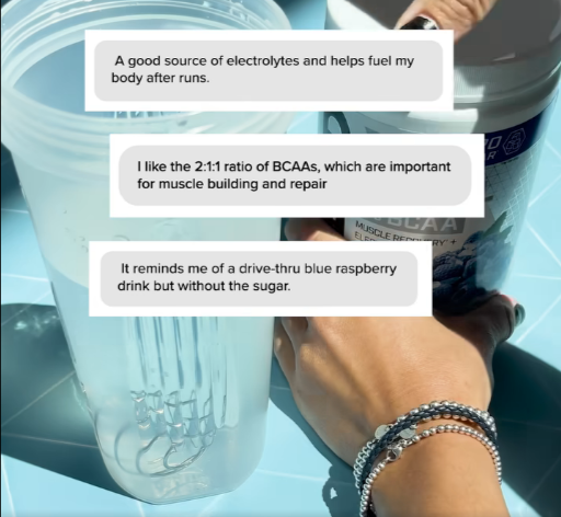
The product is shown from various angles, but the shots and edits aren’t polished, keeping it from feeling like a typical ad.
The use of Instagram messages for reviews adds a layer of authenticity to the testimonials used.
Caption:
I appreciate the use of paragraph spacing to make the caption more readable.
It does a good job of listing numerous product features in an organized way.
A bit more streamlining in the bullet points would have been the cherry on top.
How can you use this for your business?
- Just like in the ad, use social proof to address your target audience’s pain points and showcase your product’s benefits.
- Make sure your ad has a clear call to action. Tell your viewers exactly what you want them to do next, whether it’s visiting your website, signing up for a newsletter, or making a purchase.
- In your captions, focus on how your product can make your customers’ lives better rather than just listing its features. This can help convert interest into action.
Check Out the Landing Page:
Here’s the landing page for this product: https://cellucor.com/products/xtend-original?variant=39940909203518
This post is packed with insights; I again recommend bookmarking it in your browser for future reference.
Well, that’s all for the post, folks!
Finally, I would like to add that I will continue sending you these ads every Monday, but they alone may not be sufficient for your success as you would want more concepts under your belt.
Therefore, if you are a Facebook ads marketer and want more ads like these for yourself, then go ahead and check out Minea.
Here is the promo code offering you 20% off for 3 months: SANNIDHYA20
And here is my affiliate link: [https://app.minea.com/find-winning-product?ref=k63dd]
Also, let me know which niche’s ad I should pick up next for you. I would love to hear from you.
DISCLAIMER: This post contains affiliate links, which means that if you click on one of the product links, I’ll receive a small commission.