
Hey,
Welcome to the 102nd edition of Ad Pulse Monday!
For those new to this series, every Monday, I select an ad or ads that have performed exceptionally well. I’ll break down their success factors, key takeaways, and how you can apply these insights to your business.
If you’re already familiar with Ad Pulse Monday, welcome back!
Consider bookmarking these posts, creating a handy repository right in your browser.
Without further ado, let’s dive in
1. Thumbnail score:
I’m giving it a 3 out of 5.
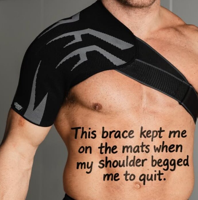
The static image features a well-lit shot of a man’s torso wearing the product – shoulder brace.
It does a good job of depicting the product and its use case.
However, the photography and lighting are professional, so they do not really stand out in the feed.
What really stands out is the text overlay on the man’s torso.
By using a casual, handwritten font that disrupts the stock-photo look, the image contrasts sharply with the polished photo.
The text also immediately speaks to the target audience and the MOFU funnel.
It brings focus to the pain point: athletes being unable to be on the mats.
“My shoulder begged me to quit” also conveys the intensity of the pain point, underlining the importance of how the product “kept him on the mats.”
Because the text clashes so much with the polished shot, it is the main driver of curiosity and clicks in the campaign.
2. Click score:
This earns a 3 out of 5 from me.
As a static image creative, nothing really stands out besides the image itself.
The entire ad feels quite easy to scale but lacks a punch to truly set it apart from the crowd.
Caption:
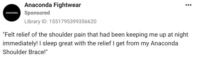
The hook is decent. It immediately highlights the audience’s pain point in the lead line.
By using a strong emotional pain point, it immediately builds empathy within the target audience.
After that, the second line suggests the product as a solution, emphasizing the relief that the braces gave.
This creates interest in the product and its benefits, making the audience more willing to give it a chance.
It makes the copy read like a customer testimonial, making it appear more convincing to MOFU audiences.
Headline:
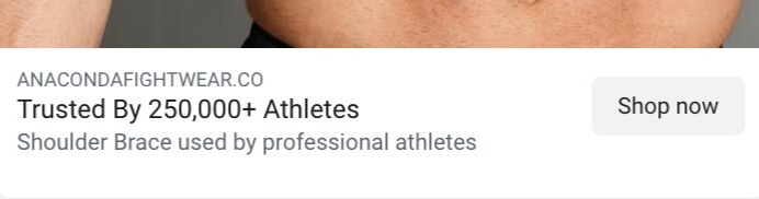
The headline is good. It builds credibility by claiming it is “trusted by 250,000+ athletes”.
The use of a number also validates the claim at first glance, making the viewer curious about the product’s promise and whether it delivers on that promise.
Description:
In the description, a short line expands on the headline, stating that the shoulder brace is “used by professional athletes”. This assures readers of its quality, implying that professionals trust and use their product.
It’s a basic but effective way to use authority, creating brand trust within a short period of time.
A more personal angle could have driven more clicks by leveraging storytelling and empathy.
Using a line like “I felt lost when I was out of the pro mat. Then I found this” uses a personal struggle to convey the pain point and introduces the product as the solution.
It directly taps into the audience’s vulnerability and creates curiosity for how the product changed the situation, which drives more clicks.
3. Ugly score:
I give this a 2 out of 5.
The main ugly point is the handwritten text overlaid directly on the skin that makes it look raw and imperfect.
However, the photo itself is polished. It could have been taken with an iPhone to feel more authentic.
Moreover, the creative could be made to look like an actual Instagram story and use native fonts for the text.
Overall, the image isn’t really as ugly as it could be.
4. Congruency Score:
This earns a 4 out of 5.
The landing page flows very well from the ad. It is presented with simple, legible text and a monochrome color scheme.
On the page, the ad image appears in the left column as part of an image carousel.
It creates continuity from the ad to the page.
Additionally, the carousel prominently features the product, with a size chart on the second slide and photos of men wearing it from different angles.
This immediately provides enough information for high-intent buyers to make a purchase.
The left column is the product name, a 5-star graphic with “1810 reviews” and a medical recommendation saying “Clinicians’ Choice” and “625 clinicians share this on FrontrowMD without compensation”, with a link to the testimonials.
Right below are the sizing options, the Spring Sale offer selection, and the Add to Cart button in blue.
From just this first fold, the page does its job of providing the basics to create conversions.
Further scrolls reveal the page having video testimonials, a “Featured On” section and multiple photos of the barce’s benefits in athletic contexts.
Along with this, a Comparison Chart, a small FAQ section, a Clinician Review section, and a lengthy Customer Reviews section with photos make up the rest of the page.
The only reason this doesn’t score perfectly is that it lacks emotional pull, and the brand design feels basic and forgettable.
It doesn’t stand out amongst other competitor brands
Otherwise, it’s a great landing page that continues smoothly from the ad.
How can you use this for your business?
- Target niche pain points: Narrowing down to a specific niche and its pain points can give you more advantage. Address specific problems, like being unable to participate in athletics due to an injury, to create an emotional pull.
- Show the product even in an ugly creative: This ensures your brand and product become mentally connected to the visual depiction of the pain point in the ad.
- Eliminate buyer doubt with social proof: A simple line saying “Trusted by 250,000+ athletes” can do wonders in creating immediate credibility and curiosity.
Main insights from the ad
What works well:
- The handwritten text overlay works well as an imperfect contrast to the polished photoshoot and stops scrolls.
- Targeting the physical pain and emotional frustration of a niche audience brings you more high-intent MOFU buyers
- Social proof in the headline can help maximize CTRs
What the ad can improve:
- A bit of personal storytelling in the caption or description could have enhanced brand recall and connection to the ad
- The brand identity feels a bit replaceable. Using bolder colors and a stronger graphic identity would make it stand out.
Check Out the Landing Page:
This post is packed with insights; I again recommend bookmarking it in your browser for future reference.
Well, that’s all for the post, folks!
Happy Marketing!