Hey,
Welcome to the 96th edition of Ad Pulse Monday!
For those new to this series, every Monday, I select an ad or ads that have performed exceptionally well. I’ll break down their success factors, key takeaways, and how you can apply these insights to your business.
If you’re already familiar with Ad Pulse Monday, welcome back!
Consider adding a label to these emails for easy access, just like Shailendra did, creating a handy repository right in your inbox.
To view the ad, register on Minea using this affiliate link (and get a flat 20% discount on paid plans):
https://app.minea.com/ads/facebook?ref=k63dd
Then, you can click on this link:
https://app.minea.com/en/ads/facebook/676451191150827/details?ref=k63dd
1. Thumbnail Score:
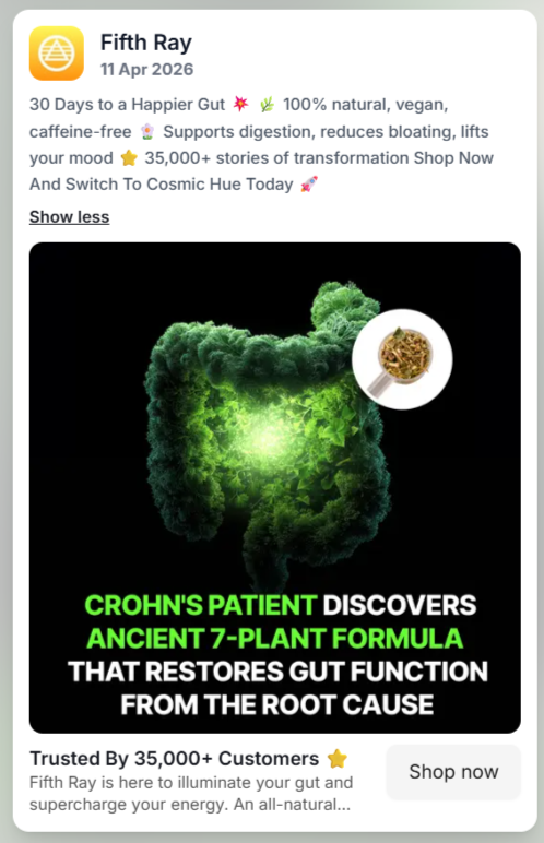
The thumbnail deserves a 4/5 for its strong execution of proven creatives.
It closely follows a high-performing “native post” format, similar to what viral media brands like Pubity use.
The typography mimics organic platform content with key phrases highlighted for emphasis.
So increasing the likelihood of stopping the scroll.
The product is depicted subtly without aggressive branding.
By doing so the ad maintains a low-friction, content-first feel, which is critical for improving thumb-stop rate and early-stage engagement.
Visually, the glowing colon graphic acts as a powerful pattern interrupt.
The contrast between the dark background and neon green illumination creates an impact.
Making the creative stand out in a crowded feed.
Beyond just aesthetics, the imagery also reinforces the ad message.
The colon covered in algae-like texture serves as a representation of poor gut health.
This improves message decoding speed, which is crucial in fast-scroll environments.
However, while the visual is effective, it leans on a commonly used imagery within the gut health niche.
Which slightly limits novelty.
But overall, the thumbnail performs well.
Thus making it a highly functional creative, even if not entirely unique.
2. Click Score:
The ad earns a solid 4/5 in terms of click potential.
It starts strong by highlighting the problem directly in the thumbnail text, which immediately grabs the attention of the audience.
This is followed by introducing a solution-driven angle, making the user curious to learn more.
The mention of a “Crohn’s patient” adds a layer of specificity, which helps in targeting a more relevant audience.
This can improve CTR, as people dealing with similar issues are more likely to click.
Another strong point is that anything that was not fully explained in the thumbnail,
Is expanded through the other elements of the ad (caption, headline, description).

Caption
The caption is a good 3.5 out of 5.
It does a decent job overall. It clearly lists the key benefits of the product, which helps users quickly understand what they’re getting.
The use of terms like “caffeine-free,” “natural,” and “vegan” is a smart move.
Since they are high-demand features right now and help position the product as healthy and lifestyle-friendly.
While improving appeal and relevance, especially for health-conscious audiences.
It also includes social proof (35,000+ users), which adds credibility.
However, this same point is repeated in the headline, making it feel slightly redundant.
What’s missing is a specific testimonial or real user outcome.
Even one proof (e.g. a one line testimonial) could have made the caption more persuasive and improve conversion intent.
Another area where the caption could improve is the CTA.
Right now, it feels quite simple and doesn’t push the user to take the next step.
Including an action-driven CTA like “Start your journey today” or “See how it works,” could increase CTR by giving users a clear direction.
Headline
The headline is strong and earns a 5/5.
It is simple, short and conveys the point.
It highlights social proof, which is important for building trust. And it’s placed in a way that naturally draws attention.
This helps reinforce credibility right after the user sees the creative.
Description
The description positions the brand as a solution provider for gut health.
It tries to present the brand as kind of a “hero” coming in to solve the gut problem, which works well in DTC storytelling.
However, the main issue is that the text gets cut off due to character limits, which reduces its impact.
Some important information could be missed by the user over here.
Keeping it shorter and more direct would improve clarity and readability.
Thus, I will score this a 3 out of 5.
3. Ugly Score:
This ad sits in the middle ground when it comes to ugly ads. Thus a 3.5 out of 5.
On the positive side, it uses a native-style format, with text that feels organic to the platform.
The thumbnail follows a familiar, high-performing visual style, and the hook is curiosity-driven.
It also avoids heavy branding, which keeps it from feeling like a traditional ad and reduces initial resistance.
However, the main limitation is that the ad still feels visually polished.
The graphic design is clean and intentional, which takes away from the raw, unfiltered feel that top-performing ugly ads usually have.
Another key gap is the absence of a human element.
There’s no face, creator, or real person involved. A before-state visual:
- Person holding their stomach
- Slight discomfort expression
- Casual setting (bedroom, kitchen or even the washroom)
This could have helped users see themselves in the situation
Creating a strong problem identification.
Overall, this makes it a “safe” ugly ad as it borrows some elements of the format.
But doesn’t fully lean into the authenticity and rawness of an ugly ad.
4. Congruency Score:
I am giving this a score of 4.5 out of 5.
Once the user clicks on the “Shop Now” button, they are taken to a landing page that tells an inspiring founder story, supported by before-and-after visuals.
This narrative helps build credibility and emotional connection, making the product feel more trustworthy.
Even though landing pages are generally more effective when they follow a familiar, user-friendly structure similar to platforms like Amazon.
This is a single-product focused website.
And the founder has done a very good job at covering the story of himself and the product.
Sentences like, “I was left weighing just 5 stone” and “30cm of my intestine was removed” carry high emotional intensity and at the same time give credibility to the product’s effectiveness.
The landing page has also uses:
- Text hierarchy
- Heading structure
- Pointers
- Highlighted key lines
So even though the story is long, it doesn’t feel tiresome.
This keeps the user engaged.
The landing page also has a before and after transformation which is very inspiring as well.
Further on they have also provided buttons which direct you to the product in two of the five folds to make the purchase easier.
However, the only issue is that the page feels like too much is happening at once.
Multiple elements compete for attention, which can reduce clarity and overwhelm the user.
Therefore creating an overload of information and leading to drop off.
A slightly tighter structure would make the user experience conversion focused.
How Can You Use This For Your Business?
There’s a lot to learn from this ad and landing page not just in what works, but in how it all comes together as a funnel.
1. Use of a well known creative.
Such as that of Pubity.
As it draws attention quickly and readability increases.
Your creative should also answer three things instantly:
“Who is this for? What problem does it solve? Why should I care?”
2. Create a specific persona (like mentioning a “Crohn’s patient”)
This helps you narrow down your audience and attracts people who will have a higher intent to buy.
Thus increasing your CTR and conversion rate as well.
3. A story-driven approach
Which is extremely effective for building trust.
A founder story and a before and after transformation could build a strong credibility for your brand.
However, the key is balance.
The story should support the sale, not delay it.
4. Layered Information
Do not try and tell everything in one place.
Do this instead:
- Thumbnail- hook
- Caption- educate
- Headline- Testimonial
- Landing page- complete story
This reduces overwhelm and keeps the user moving step by step.
Main Insights from the ad
While there are strong elements, there are also clear mistakes you should avoid.
1. Relying on a single type of social proof.
In this case, the focus is mostly on the founder’s story.
Instead, you should also include:
- Multiple customer testimonials
- Short, skimmable proof points
- Visual UGC (user-generated content)
2. Strong CTA and offer strategy.
Not guiding the user clearly can reduce conversions.
So Avoid:
- Passive or generic CTAs
- Not giving users a reason to act now
Final Thought
A good funnel is not just about grabbing attention it’s about guiding the user smoothly from curiosity to conversion.
If you can combine:
- Clear messaging
- Strong visuals
- Authentic storytelling
- Low-friction buying experience
you’ll have a much higher chance of turning clicks into actual revenue.
Check out their Landing Page:
https://fifthray.co.uk/pages/fifthray-lp?fbclid=fbclid&sort_by=-publication_date
This post is packed with insights; I again recommend bookmarking it in your browser for future reference.
Well, that’s all for the newsletter, folks!
Finally, I would like to add that I will continue sending you these ads every Monday, but they alone may not be sufficient for your success as you would want more concepts under your belt.
Therefore, if you are a Facebook ads marketer and want more ads like these for yourself, then go ahead and check out Minea.
Here is the promo code offering you 20% off for 3 months: SANNIDHYA20
And here is my affiliate link: [https://app.minea.com/find-winning-product?ref=k63dd]
Also, let me know which niche’s ad I should pick up next for you. I would love to hear from you.
DISCLAIMER: This post contains affiliate links, which means that if you click on one of the product links, I’ll receive a small commission.
Happy Marketing!