Hey,
Welcome to the 93rd edition of Ad Pulse Monday!
For those new to this series, every Monday, I select an ad or ads that have performed exceptionally well. I’ll break down their success factors, key takeaways, and how you can apply these insights to your business.
If you’re already familiar with Ad Pulse Monday, welcome back!
Consider adding a label to these emails for easy access, just like Shailendra did, creating a handy repository right in your inbox.
To view the ad, register on Minea using this affiliate link (and get a flat 20% discount on paid plans):
https://app.minea.com/ads/facebook?ref=k63dd
Then, you can click on this link:
https://app.minea.com/en/ads/facebook/676451191150827/details?ref=k63dd
1. Thumbnail Score:
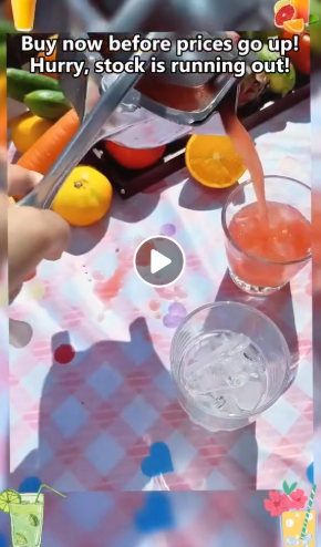
I would rate the thumbnail a 3.5 out of 5.
The visual shows the juicer mid-squeeze with fresh juice flowing into a glass container. The elegant table setting with wine glasses in the background creates an aspirational, lifestyle-focused context that elevates this beyond a typical kitchen gadget ad.
What works:
- Product in action: The juicer is shown doing exactly what it promises—extracting juice effortlessly. This immediate clarity helps viewers understand the product function in under 2 seconds.
- Strong visual contrast: The golden-bronze juicer against the white surface and clear juice creates eye-catching color contrast that makes the product pop in the feed.
- Strategic fruit choice: Pomegranate halves are visible in the frame. This is brilliant—pomegranates are notoriously difficult to juice by hand, immediately signaling “this solves a hard problem.”
Why it loses 2 points:
The thumbnail feels too polished and catalog-like. There’s no text overlay, no pattern interrupt, and no human element. For cold traffic scrolling quickly, this looks like a professional product photo rather than a native social post someone shared because they were genuinely excited.
How to improve: Add a simple text overlay like “This changed everything 😍” or “No more sticky hands!” to create a pattern interrupt. Or better yet, show a person’s hands using the juicer with natural kitchen lighting instead of this studio-perfect setup..
2. Hook Score:
The hook score is a solid 4.5 out of 5.
This ad does something brilliant: it hooks you with sound first, visuals second.
The video opens with satisfying ASMR sounds of juice flowing and the mechanical press working. Within the first 3 seconds, you hear the squeeze, the drip, the pour—it’s oddly satisfying and almost hypnotic. This taps into the massive “oddly satisfying content” trend that dominates social media.
What makes this hook exceptional:
- Sound-first strategy: Most people think visual hooks matter most, but this ad proves audio can be equally powerful. The ASMR quality makes viewers pause mid-scroll.
- Immediate product demonstration: No logo splash screen, no slow build-up. Within 3 seconds, you understand exactly what this product does.
Why it’s not a perfect 5:
For the 60%+ of users who scroll with sound off, there’s no text overlay in the opening frame to stop them. A simple “Listen to this 🔊” or “Turn sound on!” overlay would capture the sound-off scrollers and push this to a perfect score.
3. Retention Score:
I give the retention score a 4 out of 5.
The ad holds attention beautifully through the classic demonstration format: show the problem (manual juicing is messy and wasteful), show the solution (effortless pressing), show the results (perfect juice every time).
What drives retention:
- Variety in demonstration: The video cycles through multiple fruits—oranges, lemons, pomegranates—proving versatility and keeping visual interest high. Each squeeze shows that satisfying juice flow, reinforcing effectiveness.
- Pacing perfection: Not too fast that you miss details, not too slow that you get bored. Each shot serves a clear purpose: ease of use, juice extraction, quality construction.
- Aspirational presentation: The elegant table setting, clear glassware, and natural lighting make viewers think “this is something I’d be proud to own,” not just another gadget.
- The satisfying loop: Watching fresh juice pour into a glass hits the same dopamine trigger as watching soap cutting videos or kinetic sand—it’s genuinely satisfying to watch.
Why it loses 1 point:
The ad would benefit from subtle text overlays highlighting key benefits throughout the video. Remember, 60%+ of users watch with sound off. Text like “No hand strain,” “Get every drop,” or “Works on any fruit” would ensure sound-off viewers get the full value proposition and would significantly boost retention for that audience.
4. Click Score:

I would give a click score of 3 out of 5.
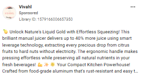
The description “🍹 Unlock Nature’s Liquid Gold with Effortless Squeezing! Try this brilliant” is decent – it’s benefit-focused and uses sensory language (“Liquid Gold”) that makes the juice feel valuable and desirable. The emoji adds visual interest and immediately signals what category this product falls into.
The “Shop Now” CTA is clear and functional, but it’s not creating any urgency or exclusivity. There’s no limited-time offer, no social proof, no scarcity element pushing viewers to click immediately versus bookmarking for later.
What’s missing that would significantly boost clicks:
- Social proof: “15,000+ home chefs upgraded their kitchens.
- Price anchor: “Professional results without the $200 price tag”
- Urgency: “Holiday sale ends Friday” or “Limited stock available”
- Guarantee: “60-day satisfaction guarantee”
- Problem amplification: “Tired of wasted fruit and sore hands?”
The copy is pleasant and descriptive but doesn’t create enough emotional tension or urgency to drive immediate action.
For a product at this price point ($30-40 range based on similar items), viewers need a compelling reason to click NOW.
5. Ugly Score:
I give this a 2 out of 5.
This ad is polished, professional, and beautiful—which is both its strength and its fatal weakness for cold traffic.
What signals “this is an ad, not organic content”:
- Studio-perfect lighting: The pristine white surface, perfect shadows, and professional lighting scream “catalog shoot.”
- Staged elegance: Wine glasses artfully arranged in the background, perfectly positioned fruit, flawless table setting—this feels designed, not spontaneous.
- No human presence: No hands visibly using it (in the opening shots), no person reacting, no “someone discovered this and had to film it” energy.
- Too controlled: Everything feels deliberate and brand-safe rather than raw and relatable.
Why this matters:
For cold traffic, especially in the home goods/kitchen gadget space, UGC-style content outperforms polished brand videos by 40-60% on CTR. The target audience (busy parents, home cooks, health-conscious consumers) responds better to content that feels like a friend showing them a kitchen discovery, not a brand trying to sell them something.
How to make this “uglier” and more effective:
Replace the studio setup with:
- Someone filming in their actual kitchen with iPhone quality
- Natural morning light streaming through a window
- Real countertop clutter barely visible in the background
- Their hands actively using the juicer with visible excitement
- Casual overlaid text: “Okay I NEED to show you this—look how much juice! 😍”
- A quick before/after: hand-squeezing a lemon (struggling, sticky hands) vs. this tool (effortless, clean)
The product works—but showing it in a real kitchen with a real person would skyrocket performance.
6. Congruency Score:
I give the congruency score a 4.5 out of 5.
The landing page delivers excellent alignment with the ad promise.
What aligns perfectly:
Visual continuity:
- Product imagery matches the ad aesthetic
- Blue color palette carries through consistently
- Same polished, modern style that reassures users they’re in the right place
Message alignment:
- The ad demonstrates effortless juicing → The page opens with “🍉 Stop wasting fruit and hurting your hands”
- The ad shows multiple fruits → The page explicitly lists oranges, lemons, pomegranates, proving versatility
- The ad conveys quality → The page emphasizes “Heavy-duty aluminum alloy” and “Built To Last a Lifetime”
Strong conversion elements:
The landing page includes smart purchase motivators:
- Gift angle: “Unique gift idea for anyone who loves fresh juice”
- Social urgency: “Stock Sells Fast!”
- Risk reversal: Money-back guarantee and 24/7 support
- Quality assurance: “Built To Last” and “Heavy-duty construction”
- Trust signals: Secure checkout and quality control badges
The ad’s “effortless” promise is directly supported by the page’s benefit-driven structure:
- “Maximum Juice, Minimum Effort”
- “Smart, No-Mess Design”
- “Built To Last a Lifetime”
Why it’s not a perfect 5:
The page is information-dense before presenting a strong above-the-fold CTA. For high-intent buyers clicking from a video ad, especially during a promotional period, the primary “Add to Cart” should appear much earlier—ideally within the first screen or directly within the offer banner at the top.
Additionally, the page could benefit from:
- Customer photos showing real people using it in real kitchens
- A product demo video embedded above the fold
- More prominent display of the 4.8/5 star rating earlier on the page
- A countdown timer or stock indicator to create urgency
These additions would bridge the gap between the polished ad aesthetic and real-world proof of results, pushing this to a full 5/5.
How Can You Use This For Your Business?
👉 Show the product solving the problem in the first three seconds.
Don’t waste time with logos, intros, or slow build-ups. The Vivahl ad immediately shows juice flowing effortlessly from the press – within three seconds, viewers understand exactly what problem this solves.
For your business, lead with the transformation:
- If selling a cleaning tool, open with the before/after shot
- If selling a cooking gadget, show the finished dish being served
- If selling a fitness product, show someone easily completing the exercise
- If selling organizational tools, show the chaos transformed into order
The demonstration should answer: “What does this do for me?” before viewers have time to scroll past.
👉 Make your product demonstrations hypnotically satisfying to watch.
The Vivahl ad taps into “oddly satisfying” content – the smooth squeeze, the juice flowing, the perfect pour. These moments trigger dopamine and keep people watching even if they didn’t intend to stop scrolling.
For your product, find the satisfying moment:
- The click of a perfect fit
- The smooth glide of a quality mechanism
- The transformation from messy to organized
- The effortless completion of a difficult task
- The visual proof of effectiveness
Film these moments in slow motion, close-up, with clear visibility. Make viewers want to watch it again. The more satisfying the visual, the higher your retention rate.
👉Demonstrate versatility to justify the purchase.
Notice the ad shows multiple fruits being juiced – oranges, lemons, pomegranates. This isn’t about showing off; it’s about preventing the objection: “But I only squeeze lemons occasionally.”
By showing versatility, you:
- Increase perceived value (one tool, many uses)
- Reduce purchase hesitation (it’s not a single-purpose gadget)
- Appeal to different customer segments (citrus lovers, pomegranate fans, marinade makers)
For your product, show multiple use cases:
- Different scenarios (home, travel, work)
- Different users (kids, adults, seniors)
- Different applications (primary use + bonus uses)
- Different seasons (year-round utility)
The more ways someone can use your product, the easier it is to justify buying it.
👉Address the hidden pain point that triggers emotional purchases.
The ad copy says “Stop wasting fruit and hurting your hands.” Notice it doesn’t lead with “Get 20% more juice” or “Faster juicing.” It leads with pain: wasted fruit (guilt + money) and hurting hands (physical discomfort).
Emotional pain points convert better than functional benefits:
- ❌ “Extracts juice efficiently” → ✅ “Stop throwing away half your fruit”
- ❌ “Ergonomic design” → ✅ “No more sore hands or sticky fingers”
- ❌ “Durable construction” → ✅ “Buy it once, never replace it”
- ❌ “Easy to clean” → ✅ “No more dreading cleanup”
For your product, identify the emotional pain:
- What frustration does it eliminate?
- What guilt does it remove?
- What anxiety does it solve?
- What embarrassment does it prevent?
Lead with that pain, then show your product as the relief. People buy solutions to pain much faster than they buy “nice-to-have” improvements.
Check out the Landing Page:
Here’s the landing page for this product:
https://vivahl.com/products/hand-juicer-squeezer
This post is packed with insights; I again recommend bookmarking it in your browser for future reference.
Well, that’s all for the newsletter, folks!
Finally, I would like to add that I will continue sending you these ads every Monday, but they alone may not be sufficient for your success as you would want more concepts under your belt.
Therefore, if you are a Facebook ads marketer and want more ads like these for yourself, then go ahead and check out Minea.
Here is the promo code offering you 20% off for 3 months: SANNIDHYA20
And here is my affiliate link: [https://app.minea.com/find-winning-product?ref=k63dd]
Also, let me know which niche’s ad I should pick up next for you. I would love to hear from you.
DISCLAIMER: This post contains affiliate links, which means that if you click on one of the product links, I’ll receive a small commission.
Happy Marketing!