Hey,
Welcome to the 92nd edition of Ad Pulse Monday!
For those new to this series, every Monday, I select an ad or ads that have performed exceptionally well. I’ll break down their success factors, key takeaways, and how you can apply these insights to your business.
If you’re already familiar with Ad Pulse Monday, welcome back!
Consider adding a label to these emails for easy access, just like Shailendra did, creating a handy repository right in your inbox.
To view the ad, register on Minea using this affiliate link (and get a flat 20% discount on paid plans):
https://app.minea.com/ads/facebook?ref=k63dd
Then, you can click on this link:
https://app.minea.com/en/ads/facebook/676451191150827/details?ref=k63dd
1. Thumbnail Score:
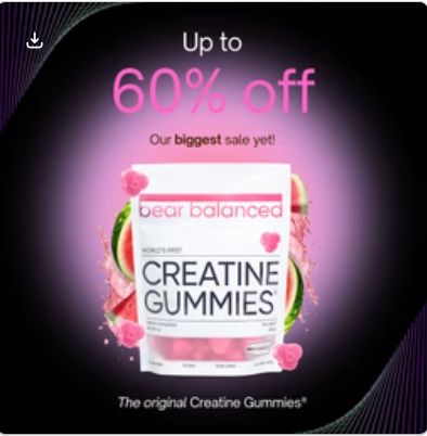
I give the thumbnail a score of 2.5 out of 5.
The dark gradient background with purple accents creates an immediate pattern interruption in the feed. The neon pink “60% off” text is impossible to miss and screams urgency.
What works brilliantly here:
- The product packaging is front and center with clean, professional lighting
- “Our biggest sale yet!” subtitle reinforces the urgency
- The gummy bears around the jar add visual appeal and clearly communicate what’s inside
- “The original Creatine Gummies” establishes authority and legitimacy
However, the execution feels overly polished and heavily branded, making it instantly recognizable as an ad. There’s no human presence, transformation, or lifestyle context to create emotional pull.
For cold traffic, it lacks relatability and organic texture — it looks designed to sell, not to stop the scroll. The creative relies entirely on discount-led urgency, which limits curiosity and memorability. not a fan of this format for cold traffic. Real-world pet moments tend to outperform visuals like this. I’d rate it a 1.5 to 2 at best.
2. Click Score:
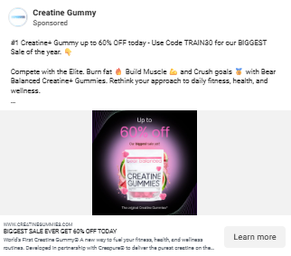
The click score here is a perfect 5 out of 5. Let me break down why this ad nails the click-through elements:
The caption: “#1 Creatine+ Gummy up to 60% OFF today – Use Code TRAIN30 for our biggest sale yet!”
This is masterclass copywriting. It hits multiple psychological triggers:
- Social proof: “#1 Creatine+ Gummy” establishes market leadership
- Massive discount: “up to 60% OFF” is compelling enough to stop anyone scrolling
- Urgency: “today” creates FOMO
- Clear action: The specific code “TRAIN30” makes it feel exclusive and easy to redeem
- Superlative: “biggest sale yet” reinforces that this is a rare opportunity
The Headline “Our Biggest Sale of the Year” reinforces urgency without distraction. It confirms the promise made in the caption and keeps the focus purely on the offer, which is ideal for driving clicks.
The description section is quick, benefit-driven lines that clarify what the product does and who it’s for. Mentions trust and limited-time savings to sustain intent and push the click forward.
The combination of urgency, specificity, and social proof makes this irresistible for anyone remotely interested in fitness supplements.
3. Ugly Score:
I’m giving this ad an ugly score of 2 out of 5. This is polished, branded, and professionally designed—which is great for brand awareness but not ideal for direct response performance on cold traffic.
Here’s what makes it too “pretty”:
- Studio-quality product photography
- Perfect gradient background
- Flawless typography and spacing
- Zero UGC (user-generated content) elements
- No real human presence or relatable moment
A truly effective “ugly” ad would feature:
- An iPhone selfie of someone showing their muscle gains after 30 days.
- A mirror selfie with text overlay: “Down 12 lbs, up 8 lbs of muscle—these gummies are LEGIT”.
- Static imperfection, not motion such as the lid placed casually next to the jar, gummies already on the surface (not mid-spill). Feels lived-in, not cinematic.
- Subtle lifestyle context instead of effects such as the product placed next to everyday items (water bottle, keys, gym gloves) to imply use without explaining it.
The current creative works well for retargeting and warm audiences who already know the brand. But for cold traffic, an authentic UGC approach would likely outperform this by 2-3x in CTR and conversion rate.
4. Congruency Score:
I give a congruency score of 4 out of 5. The congruency between the ad and the landing page is strong. What you see in the ad is largely what you get after the The congruency between the ad and landing page is exceptional—a perfect 4 out of 5.
The congruency between the ad and the landing page is strong, but not perfect.
What aligns well
👉Offer continuity
The “up to 60% OFF” promise shown in the ad is clearly honored on the landing page, reinforced by the New Year sale banner and discount callouts. There is no disconnect between the click promise and the checkout reality, which is critical for trust and conversions.
👉Brand and tone consistency
Even though the exact product packaging differs, the overall brand feel stays consistent. Both the ad and the landing page position the product as premium, modern, and performance focused rather than gimmicky or mass market.
👉Message alignment
The landing page immediately reinforces the core intent behind the ad. It frames the product around convenience, performance, and daily use creatine, which matches why someone would click a creatine gummies ad in the first place. There is no shift in audience, promise, or product category post click.
Where congruency breaks slightly
👉Packaging mismatch
The product packaging shown in the ad is visually different from what appears on the landing page. While this does not feel deceptive, it can create a brief moment of hesitation for first time visitors who expect to see the exact same pack they clicked on.
👉Urgency carryover
The ad heavily leans into the sale angle, but the landing page relies more on banners than embedded urgency. Adding a visible countdown or reinforcing scarcity below the fold would strengthen the continuity.
In addition, why the landing page works well on its own
Beyond congruency, the landing page does a solid job building trust and reducing friction:
- Clear product explanation with simple benefit led copy
- Strong social proof through reviews and ratings
- Scientific credibility via ingredient transparency and formulation details
- Multiple reassurance cues like guarantees, FAQs, and dietary badges
- Easy comparison through flavor selection and bundle options
The page does not feel like a hard sell. It feels informative, credible, and conversion ready.
How Can You Use This For Your Business?
1. Make Your Discount Unmissable
Don’t bury your offer. The “60% OFF” in massive neon text is the first thing anyone sees. Your discount should be the hero of your creative, not a footnote.
Test these approaches:
- Use high-contrast colors (neon pink on dark backgrounds)
- Make the percentage at least 3x larger than other text
- Add temporal urgency: “60% OFF – Today Only”
- Include the discount code directly in the headline
If you’re offering 40%+ off, that should dominate your creative. Everything else is secondary.
2. Leverage Social Proof at Every Level
Notice how the ad says “#1 Creatine+ Gummy”—not just “creatine gummies.” This micro-positioning makes a massive difference.
Apply this to your business:
- If you have rankings: “#1 Rated,” “#1 Bestselling”
- If you have volume: “50,000+ customers,” “1M+ gummies sold”
- If you have results: “Average customer gains 8 lbs of muscle”
- If you have press: “As seen on GQ, Men’s Health, Forbes”
The landing page doubles down with athlete endorsements, scientific advisors, and media logos. Stack your credibility everywhere.
3. Create Category Differentiation
“The original Creatine Gummies™” is brilliant positioning. They’re not just selling creatine—they’re claiming ownership of the gummy format.
For your business:
- Add a unique format twist (gummies vs. powder)
- Claim innovation: “The first,” “The original”
- Create proprietary blends: Their “Creatine+™” formula with L-Theanine, L-Tyrosine, B12, Huperzine A
- Trademark your unique element
This makes you harder to compare with generic competitors.
4. Use Specificity in Your Codes and Offers
“Use Code TRAIN30” is infinitely better than “Use Code SAVE.”
Why this works:
- It’s memorable and relevant to the fitness audience
- It suggests a specific discount amount
- It feels exclusive, like it’s for “trainers” or serious fitness people
- It’s short and easy to type
Test codes that:
- Reference your audience: DADLIFE, BUSYMOM, ATHLETE
- Reference the benefit: ENERGY30, MUSCLE40
- Reference urgency: TODAY60, FLASH50
5. Make Your Benefits Crystal Clear
The landing page doesn’t make you guess. Bullet points immediately tell you:
- Build Lean Muscle
- Lose Weight & Burn Fat
- Improve Energy & Mood
- Boost Metabolism & Burn Calories
- Increase Exercise Performance
Don’t assume people know what your product does. List 3-5 specific outcomes, not features. “Creapure® Creatine Monohydrate” is a feature. “Build Lean Muscle” is a benefit.
6. Address the Skepticism Directly
Fitness supplements face massive skepticism. Bear Balanced combats this with:
- 99.99% purity testing
- GMP certification
- Cologne List® approval
- Comparison chart vs. “generic creatine”
- Scientific advisory board with actual Ph.D.s
- 30-day money-back guarantee
For your business:
- Show third-party testing
- Display certifications prominently
- Use comparison charts
- Offer risk-reversal guarantees
- Feature real experts, not just “influencers”
7. Go Bigger on UGC (What They’re Missing)
While this ad is solid, it could be 10x more effective with authentic user-generated content.
Here’s what I’d test:
- Video testimonials from real customers showing their 30-day transformation
- iPhone selfies of people taking the gummies pre-workout
- Before/after photos with authentic captions
- DM screenshots: “Bro these actually work”
- Unboxing videos shot on smartphones
The more authentic and “ugly” your creative, the more it’ll resonate with cold traffic who’s tired of being sold to.
Check out their Landing Page:
Here’s the landing page for this product:
This post is packed with insights; I again recommend bookmarking it in your browser for future reference.
Well, that’s all for the newsletter, folks!
Finally, I would like to add that I will continue sending you these ads every Monday, but they alone may not be sufficient for your success as you would want more concepts under your belt.
Therefore, if you are a Facebook ads marketer and want more ads like these for yourself, then go ahead and check out Minea.
Here is the promo code offering you 20% off for 3 months: SANNIDHYA20
And here is my affiliate link: [https://app.minea.com/find-winning-product?ref=k63dd]
Also, let me know which niche’s ad I should pick up next for you. I would love to hear from you.
DISCLAIMER: This post contains affiliate links, which means that if you click on one of the product links, I’ll receive a small commission.
Happy Marketing!