Hey,
Welcome to the 88th edition of Ad Pulse Monday!
For those new to this series, every Monday, I select an ad or ads that have performed exceptionally well. I’ll break down their success factors, key takeaways, and how you can apply these insights to your business.
If you’re already familiar with Ad Pulse Monday, welcome back!
Consider adding a label to these emails for easy access, just like Shailendra did, creating a handy repository right in your inbox.
To view the ad, register on Minea using this affiliate link (and get a flat 20% discount on paid plans):
https://app.minea.com/ads/facebook?ref=k63dd
Then, you can click on this link:
https://app.minea.com/en/ads/facebook/676451191150827/details?ref=k63dd
1. Thumbnail Score:
I give the thumbnail a score of 3 out of 5.
The thumbnail shows a person wearing the LED mask, which is actively glowing with red lights. The mask covers the face, neck, and chest area. The image has a dark, moody aesthetic that makes the red lights pop dramatically.
What works:
- Shows the product in use on a real person (not just a static product shot)
- The glowing red lights create curiosity and visual intrigue
- Demonstrates coverage area (face, neck, chest) immediately
- Dark background makes the LED lights stand out
- Creates a “futuristic” or “professional treatment” vibe
What doesn’t work:
- The person’s face is completely hidden—lacks human connection
- Doesn’t communicate the transformation or result
- Looks intimidating or clinical rather than inviting
For a high-ticket item ($400+), this thumbnail needs more context. Something like “10 Minutes = $300 Facial Results” or a before/after split-screen would perform significantly better. The image alone doesn’t answer “Why should I care?” or “What’s in it for me?”
2. Click Score:
I’d give a click score of 2 out of 5.
The ad shows the product well, but it does not give the viewer a strong reason to click through.
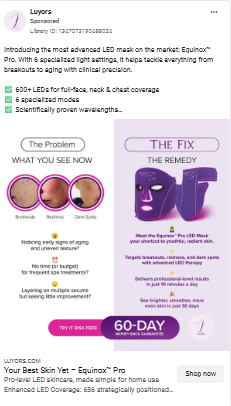
Caption
“Introducing the most advanced LED mask on the market: Equinox Pro. With 6 specialized light settings, it helps tackle everything from breakouts to aging with clinical precision.”
A solid opener, but still too feature heavy. People want to know how they will look and feel.
Headline
“Your Best Skin Yet — Equinox Pro”
This is a positive promise, yet very safe. A premium skincare device needs a bolder result or cost saving punch.
Description
“Pro-level LED skincare, made affordable for home use. Enhanced LED coverage. 656 strategically positioned LEDs.”
Again focused on specs, not transformation. Nothing speaks to confidence, compliments, or visible change.
Thumbnail
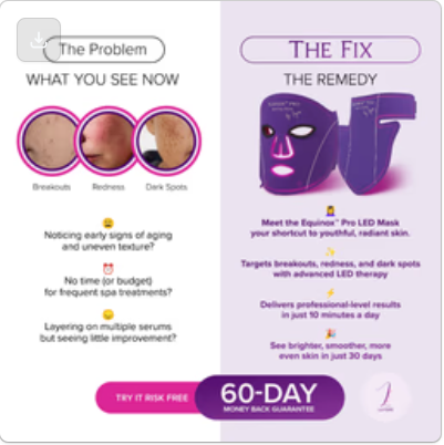
The side by side “Problem vs Fix” layout is clear, and the 60 Day Guarantee builds confidence. Still, the creative lacks emotional pull. The viewer does not see real skin improving, no social proof from users, no urgency, and no comparison to pricey facials.
The product has strong potential, but the current messaging feels too clinical and polished to convert. A beauty shopper needs to feel the transformation before they click.
3. Ugly Score:
I would give this an ugly score of 2 out of 5. The creative looks very polished and clinical, which makes it harder for viewers to see themselves in the results.
The left side shows real skin frustrations like dark spots, enlarged pores, and early aging signs. These are powerful triggers because they are familiar problems that many people quietly worry about. But the layout feels like a dermatology brochure rather than a relatable moment from someone’s real routine.
What feels too perfect:
• Studio level lighting and product rendering
• Problem images that look like stock photography
• No emotion in the transformation story
• The setup lacks personal context or skepticism
How to make it uglier and far more believable:
Picture a side by side photo taken in a regular bathroom. On the left: uneven skin tone and visible dark spots. On the right: after three or four weeks, skin looks smoother and brighter. The phone camera picks up texture, proving that the results are real. A little handwritten note stuck to the mirror reads, “Day 30. I am finally seeing the glow.”
Or a casual mirror selfie of a woman actually wearing the mask. Slightly awkward angle. She is smiling because she has noticed her pores tightening. Caption: “Not filters. Not Botox. Just ten minutes a day.”
Real world beauty sells best:
• Skin texture stays visible
• Lighting is imperfect
• Reactions feel genuine
• Results feel earned
People struggling with dark spots and dullness want hope they can trust. Authentic UGC makes them believe it is possible for them too.
4. Congruency Score:
I will give this ad a congruency score of 4.5 out of 5.
The landing page does an exceptional job of maintaining consistency and building trust.
What works brilliantly:
- Immediate benefit statement: “Unlock visibly younger, clearer, and more radiant skin”
- Urgency message: “Only 19% of stock remaining!”
- Social proof everywhere: verified customer testimonials, media features (Elle, Glamour, L’Officiel)
- Expert endorsements from dermatologists and plastic surgeons
- Detailed comparison chart showing superiority over competitors
- Clear specifications with wavelengths and irradiance
- Before/after photos from real customers
- 2-year warranty builds confidence
- HSA/FSA eligibility reduces purchase friction
What makes this page excellent:
- Addresses skepticism head-on with science
- Shows the “why” behind the technology (Glow Core™)
- Breaks down each of the 6 modes and what they do
- FAQ section answers every possible objection
- Celebrity testimonial (Mauve, Singer-Songwriter) adds aspirational appeal
Minor improvement opportunities:
- Price isn’t immediately visible above the fold
- Could benefit from a limited-time discount for urgency
- Video testimonials would boost conversion even more
- Could add a “Try it risk-free for 60 days” guarantee more prominently
The congruency between ad and landing page is strong. Everything the ad promises (or should promise) is thoroughly explained and proven on the page.
How Can You Use This For Your Business?
1. Lead with cost comparison for premium products
At $400+, this isn’t an impulse buy. You need to justify the investment by showing what they’re saving:
The formula: “Professional treatment costs $X per session. You need Y sessions. Total: $Z. This device: one-time payment of $399.”
Apply this to your business:
- Fitness equipment: “Cancel your $200/month gym membership”
- Courses: “MBA programs cost $100K. This costs $997.”
- Software: “Agencies charge $5K/month. We charge $99.”
Make the ROI crystal clear. Show them they’re not spending—they’re saving.
2. Use expert validation for science-backed products
The landing page features four different doctors explaining why LED therapy works. This is brilliant for overcoming skepticism.
Why this works:
- Transfers credibility from the expert to the product
- Makes the science feel legitimate, not snake oil
- Gives skeptical buyers the reassurance they need
Apply this to your business:
- Get dentist endorsements for oral care products
- Nutritionist testimonials for supplements
- Accountant approval for finance software
- Industry veteran endorsements for B2B tools
If your product is based on science or methodology, find the expert who can validate it.
3. Show comprehensive comparison charts
The “Equinox Pro vs The Rest” table is incredibly effective. It shows:
- More LEDs (656 vs 108-132)
- Higher power (38mw/cm² vs 25-35mw/cm²)
- More modes (6 vs 1)
- Better coverage (face + neck + chest)
Why comparison tables work:
- Makes the choice obvious and logical
- Justifies premium pricing
- Positions you as the clear winner
- Removes doubt about “should I shop around?”
Apply this to your products:
- Feature comparison tables on landing pages
- Show specs side-by-side
- Highlight where you exceed competitors
- Make your advantages undeniabl
4. Stack credentials like armor
This brand doesn’t rely on one trust signal—they stack them:
- Medical certifications (MDSAP, CE, FCC, ROHS)
- Media mentions (Elle, Glamour, MSN, L’Officiel, LA Weekly)
- Expert endorsements (4 different doctors)
- Customer testimonials (including a celebrity)
- 5-star reviews
- 2-year warranty
The trust-building stack:
- Third-party validation (certifications, media)
- Expert opinions (professionals in the field)
- Customer results (real people, real photos)
- Guarantee/warranty (removes purchase risk)
Don’t rely on just one. Stack them so doubt has nowhere to hide.
5. Address the “Why pay this much?” objection directly
High-ticket items need to justify their price point. This landing page does it multiple ways:
- Compares to expensive dermatologist treatments
- Shows superior specs vs competitors
- Explains the proprietary technology (Glow Core™)
- Demonstrates durability with 2-year warranty
- Positions it as an investment, not an expense
For your premium products:
- Create a “Cost of alternatives” calculator
- Show long-term savings over time
- Compare to the “cheap option” that doesn’t work
- Frame it as investment in [health/career/relationships]
Check out their Landing Page:
Here’s the landing page for this product:
This post is packed with insights; I again recommend bookmarking it in your browser for future reference.
Well, that’s all for the newsletter, folks!
Finally, I would like to add that I will continue sending you these ads every Monday, but they alone may not be sufficient for your success as you would want more concepts under your belt.
Therefore, if you are a Facebook ads marketer and want more ads like these for yourself, then go ahead and check out Minea.
Here is the promo code offering you 20% off for 3 months: SANNIDHYA20
And here is my affiliate link: [https://app.minea.com/find-winning-product?ref=k63dd]
Also, let me know which niche’s ad I should pick up next for you. I would love to hear from you.
DISCLAIMER: This post contains affiliate links, which means that if you click on one of the product links, I’ll receive a small commission.
Happy Marketing!