Hey,
Welcome to the 87th edition of Ad Pulse Monday!
For those new to this series, every Monday, I select an ad or ads that have performed exceptionally well. I’ll break down their success factors, key takeaways, and how you can apply these insights to your business.
If you’re already familiar with Ad Pulse Monday, welcome back!
Consider adding a label to these emails for easy access, just like Shailendra did, creating a handy repository right in your inbox.
To view the ad, register on Minea using this affiliate link (and get a flat 20% discount on paid plans):
https://app.minea.com/ads/facebook?ref=k63dd
Then, you can click on this link:
https://app.minea.com/en/ads/facebook/676451191150827/details?ref=k63dd
1. Thumbnail Score:
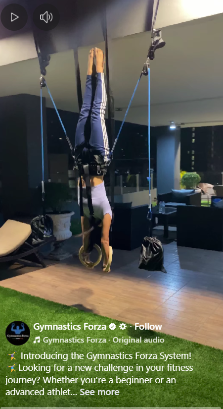
I give the thumbnail a score of 4 out of 5. The opening frame immediately shows a person hanging upside down in a harness system — it’s visually shocking, novel, and impossible to ignore. Anything that violates normal expectations tends to stop the scroll, and this does that instantly. The only reason it’s not a full 5 is because the frame is a bit dark, and the product itself isn’t immediately clear unless you look closely.
2. Hook Score:
The hook is a 4.5 out 5 for me. Starting the video with someone suspended upside down is a high-impact kinetic hook. It’s unusual, slightly extreme, and immediately makes viewers ask: “What is this system and how does it work?” The hook is physical, visual, and curiosity-driven — an excellent combination in fitness ads. It effectively creates an open loop within the first second.
3. Retention Score:
I give this a retention score of 4.5 out 5 again. The video keeps attention by showing different dynamic movements (inversions, flips, assisted swings). The variety helps retention, and the unusual equipment keeps curiosity alive. However, the pacing could be tighter and more “sequenced” — a bit of explanation or clearer progression would boost watch time even more. Still solid due to strong visual novelty.
4. Click Score:
I’d give this caption a click score of 2.5 out of 5. While it provides a clear and detailed explanation of what the Gymnastics Forza System is and appeals to both beginners and advanced athletes, it’s far too long for a Facebook ad and reads more like a product brochure than a compelling hook. The caption really misses the mark. It’s cluttered, overly verbose, lacks basic line breaks, and honestly feels copy-pasted rather than written with purpose.
The lack of urgency, scarcity, or any incentive removes the “why now?” factor, and the caption gives away so much information that there’s no curiosity gap left to motivate a click. It also doesn’t include social proof or a strong, direct CTA, both of which are crucial for driving conversions. Overall, it informs well but sells weakly, leading to a modest click score.
I’d give this headline a 2 out of 5 because, while it’s clear and correctly states the product name, it doesn’t offer any real hook or persuasive value. A strong headline should spark curiosity, communicate a benefit, or convey a reason to stop scrolling, but “Gymnastics Forza System” functions more like a label than a selling message. It doesn’t highlight what makes the product unique, who it’s for, or why someone should care. Paired with a generic “Shop now” button, it misses the opportunity to strengthen positioning or drive action. Overall, it’s functional but far from compelling.
5. Ugly Score:
I would give this an ugly score of 4 out of 5. It does the job and it looks “ugly” but it loses a point because it’s missing native Instagram elements that would make it feel more organic to the platform. The creative is intentionally ugly, and the footage is amateur, which works, but it could still be executed a bit better. Adding simple overlays to the video would’ve improved clarity and made the overall ad more engaging.
6. Congruency Score:
I give this ad a congruency score of 5 out of 5. The landing page aligns strongly with the ad’s message — it reinforces the same promise of helping beginners and advanced athletes train like gymnasts through a safe, progressive, adjustable system. The visuals, benefits, and positioning are consistent with what the ad sets up. It also uses social proof in the form of user testimonial videos. Overall, with a clear narrative match and strong social proof, it delivers a solid and convincing experience.
How Can You Use This For Your Business:
1. Lead with your most extreme or curiosity-driven moment: This ad proves that the first second must visually shock or intrigue viewers. Find the most surprising, unusual, or emotionally intense moment in your product/service and open with that.
2. Use movement to hold attention: Dynamic visuals outperform static talking-heads. Even if your product isn’t physical, show transformation, process, or action.
3. Show multiple use cases quickly: Variety builds credibility — it shows the product works for beginners and advanced users. Apply this by showcasing different customer types or scenarios fast.
4. Test UGC versions: Even if your niche is premium or technical, testing lo-fi content often boosts trust and lowers CPMs.
5. Lean into “what IS this?” energy: If your offering is unfamiliar or category-creating, embrace it. Confusion (paired with visual intrigue) is a powerful hook.
Check out the Landing Page:
Here’s the landing page for this product:
https://store.gymnasticsforza.com
This email is packed with insights; I again recommend saving these in your Gmail for future reference.
Well, that’s all for the newsletter, folks!
Finally, I would like to add that I will continue sending you these ads every Monday, but they alone may not be sufficient for your success, as you would want more concepts under your belt.
Therefore, if you are a Facebook ads marketer and want more ads like these for yourself, then go ahead and check out Minea.
Here is the promo code offering you 20% off for 3 months: SANNIDHYA20
And here is my affiliate link: [https://app.minea.com/find-winning-product?ref=k63dd]
Also, let me know which niche’s ad I should pick up next for you. I would love to hear from you.