Hey,
Welcome to the 23rd edition of Ad Pulse Monday!
For those new to this series, every Monday, I select an ad or ads that I believe have performed exceptionally well. I’ll break down their success factors, key takeaways, and how you can apply these insights to your business.
If you’re already familiar with Ad Pulse Monday, welcome back!
Consider bookmarking these posts, creating a handy repository right in your browser.
Without further ado, let’s dive in
Weight Loss Drink

To view the ad, register on Minea using this affiliate link (and get a flat 20% discount on paid plans):
https://app.minea.com/ads/facebook?ref=k63dd
And then click on this link:
https://app.minea.com/en/ads/facebook/767739772188344/details?ref=k63dd
1. Thumbnail score:
I’m giving this a 4 out of 5.
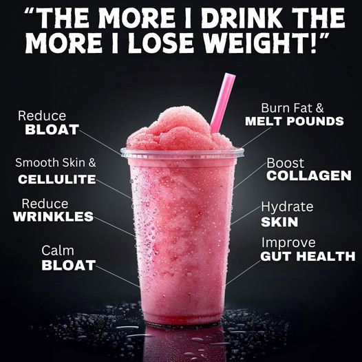
This type of creative is excellent for supplement brands. Testimonials can literally make or break your ad creative. In this one, I love the customer testimonial used.
There’s a fine line between being vague and super specific; this ad creative navigates those boundaries well. It’s enough to ignite emotion and give the testimonial a personal touch, while the pain point is generic enough to appeal to a wide audience.
Using an arrow or line to highlight the benefits of your product or service is one of the best ways to direct attention toward them. I also like that the benefits are short, punchy, and highlight specific target audience pain points. However, the issue here is that there are too many points listed.
The ideal number of bullet points in one ad is 4-5 at most. Using too many points can overwhelm the reader and take the focus away from the ad.
2. Click Score:
This earns a 4.5 out of 5 from me.
The headline does an excellent job of building up the offer. Free trials are one of the best ways to acquire new customers because they require low effort from the customer.
According to the diffusion of innovations theory in psychology (just showing off my degree here), the lower the risk of a new product, the easier it is for people to adopt it.
Besides the headline, the ad has built enough social proof over time, which also boosts its click score.

3. Ugly Score:
This is a good 3.5 out of 5.
I like that the format of the ad is basic. However, the creative still follows branding guidelines with the font, which reduces the ugly score. Plus, having the product right at the center of the ad screams advertisement.
The 3D effects used at the bottom to highlight water droplets also make it look like someone with design expertise created the ad.
4. Congruency Score:
This gets a 5 out of 5 from me.
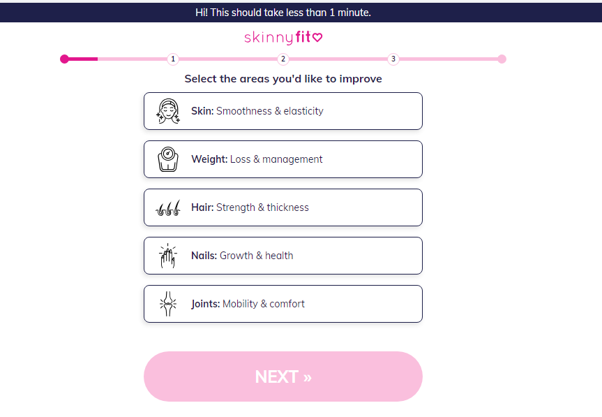
I love that this page uses a questionnaire to provide a tailored experience for their target audience. People who want to try health supplements are really conscious about what they use.
This tailored approach will definitely improve the buying experience for potential customers.

Caption:
This caption gets a 1 out of 5. It’s just a missed opportunity.
The caption does not support the creative. The one line does little to enhance the click rate or drive users to the landing page. While it uses terms like “LAST CHANCE,” there’s not enough substance in the caption to build FOMO.
How can you use this for your business?
- Utilize customer testimonials effectively. Ensure they’re relatable and highlight real benefits that resonate with your target audience.
- Reduce the perceived risk for new customers with offers like free trials. It’s a proven tactic to encourage product adoption and can be especially effective if you highlight this in your ad’s headline.
- Don’t let your captions be an afterthought. Use them to amplify your message, build urgency, and guide users toward taking action.
Check Out the Landing Page:
Here’s the landing page for this product:
https://get.skinnyfit.com/evpS
This post is packed with insights; I again recommend bookmarking it in your browser for future reference.
Well, that’s all for the post, folks!
Finally, I would like to add that I will continue sending you these ads every Monday, but they alone may not be sufficient for your success as you would want more concepts under your belt.
Therefore, if you are a Facebook ads marketer and want more ads like these for yourself, then go ahead and check out Minea.
Here is the promo code offering you 20% off for 3 months: SANNIDHYA20
And here is my affiliate link: [https://app.minea.com/find-winning-product?ref=k63dd]
Also, let me know which niche’s ad I should pick up next for you. I would love to hear from you.
DISCLAIMER: This post contains affiliate links, which means that if you click on one of the product links, I’ll receive a small commission.