Hey,
Welcome to the 48th edition of Ad Pulse Monday!
For those new to this series, every Monday, I select an ad or ads that I believe have performed exceptionally well. I’ll break down their success factors, key takeaways, and how you can apply these insights to your business.
If you’re already familiar with Ad Pulse Monday, welcome back!
Consider bookmarking these posts, creating a handy repository right in your browser.
Without further ado, let’s dive in
Weigh-loss Noodles

To view the ad, register on Minea using this affiliate link (and get a flat 20% discount on paid plans):
https://app.minea.com/ads/facebook?ref=k63dd
And then click on this link:
https://app.minea.com/en/ads/facebook/709315734638164/details?ref=k63dd
1. Thumbnail score:
I’m giving this a solid 4.5 out of 5.
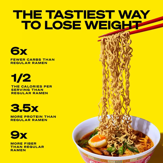
The headline grabs your attention by highlighting a relatable product benefit. It’s a great reminder that finding a unique position for your offering is key, but it also needs to be relevant to your audience.
Too often, brands focus on benefits that their audience doesn’t care about. This ad nails it by making its USP both unique and relevant.
Once the headline hooks you, the numbers detailing the product’s features speak directly to the rational side of the brain, building trust in the offer.
For the food category, visuals are everything, and this ad does it right. Instead of just showing the product in its packaging, it showcases the noodles fully prepared, which is a brilliant way to entice customers and stop the scroll.
2. Click Score:
This gets a 3.5 out of 5 from me.
The ad draws you in with a great headline, and the creative is almost spot-on. But here’s the issue: the rest of the elements don’t fully support the headline.
While the headline is strong and speaks directly to the target audience, the description repeats it unnecessarily. That’s a waste of valuable space.
They could’ve used this space to include a sales promotion, offer a better buying experience, or add something that elevates the entire offer. Right now, this feels like a missed opportunity.

3. Ugly Score:
This gets a solid 4 out of 5.
The product image and brand name are clear and prominent, but the design breaks away from conventional ads. It mimics an infographic, which gives it a fresh, engaging vibe.
This unconventional approach is what makes the ad stand out and work.
4. Congruency Score:
This ad scores a perfect 5 out of 5 on congruency.
Clicking through takes you to a product page that aligns perfectly with the ad’s message.
The benefits listed match what’s in the creative. The landing page is clean, visually appealing, and easy to navigate, with CTAs, customer reviews, and related product catalogs placed strategically.

Caption:
This caption gets a 5 out of 5.
It’s concise and clear, effectively explaining the offer with bullet points, paragraph breaks, and emojis to enhance readability. Additionally, it includes a compelling call-to-action at the end, encouraging users to click the ‘buy now’ button.
How can you use this for your business?
- When showcasing your product, focus on benefits that matter most to your audience. It’s not just about being unique; it’s about being relevantly unique. Highlight features that solve a real problem or satisfy a specific desire your target audience has.
- Incorporating data, like percentages or measurable results, speaks to your audience’s logical side. Numbers help validate your claims and make your ad more believable, which can significantly increase interest and trust.
- For food and beverage brands (or any product, really), presenting your offering in its best possible use case is crucial. Instead of just showing the packaging, depict the product in a way that triggers desire—like a steaming bowl of noodles instead of a plain packet.
Check Out the Landing Page:
Here’s the landing page for this product:
https://shop.immieats.com/pages/physical-fitness-lp-v3-ca
This post is packed with insights; I again recommend bookmarking it in your browser for future reference.
Finally, I would like to add that I will continue sending you these ads every Monday, but they alone may not be sufficient for your success as you would want more concepts under your belt.
Well, that’s all for post, folks!
Therefore, if you are a Facebook ads marketer and want more ads like these for yourself, then go ahead and check out Minea.
Here is the promo code offering you 20% off for 3 months: SANNIDHYA20
And here is my affiliate link: [https://app.minea.com/find-winning-product?ref=k63dd]
Also, let me know which niche’s ad I should pick up next for you. I would love to hear from you.
DISCLAIMER: This post contains affiliate links, which means that if you click on one of the product links, I’ll receive a small commission.