Hey,
Welcome to the 78th edition of Ad Pulse Monday!
For those new to this series, every Monday, I select an ad or ads that I believe have performed exceptionally well. I’ll break down their success factors, key takeaways, and how you can apply these insights to your business.
If you’re already familiar with Ad Pulse Monday, welcome back!
Consider bookmarking these posts, creating a handy repository right in your browser.
Without further ado, let’s dive in
To view the ad, register on Minea using this affiliate link (and get a flat 20% discount on paid plans):
https://app.minea.com/ads/facebook?ref=k63dd
Then, you can click on this link:
https://app.minea.com/en/ads/facebook/1012810207043424/details?ref=k63dd
1. Thumbnail Score:
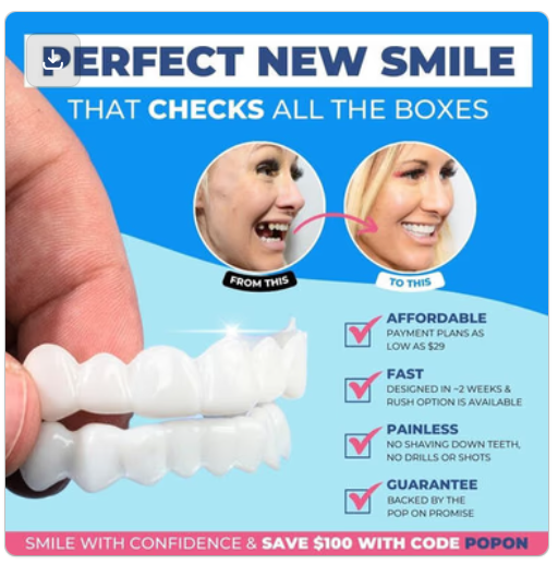
I give the thumbnail a score of 2.5 out of 5.
What works for the thumbnail is the use of before-and-after style content and a benefits checklist alongside the CTA within the thumbnail itself.
It loses out on its typical ad quality content, and the fact that the transformation photos are not clear.
There’s too much happening in the imagel which makes it lose its points.
2. Click Score:

I’d give a total of 2.5 out of 5 for the click score where the caption is doing the heavy lifting.
The CTA is good but weak. It doesn’t create a sense of urgency or provides users with enough incentive to act now.
The stronger points is that it clearly is benefit-driven but it does not address the pain points.
The overall copy is generic and looks like it’s ticking off a box on how to write ads rather than indulge in storytelling or set further context on the need of this product.
User testimonials here can do wonders for the creative.

The headline again doesn’t create a sense of urgency for users to take any sort of action immediately.
Overall, the caption, along with the headline and description, can be stronger with more focus on UGC style content like testimonials and how-to videos.
3. Ugly Score:
The ad overall looks polished and follows brand guidelines; therefore, it does not fit the “ugly” vibe. I would give an ugly score of 1 out of 5 because it’s generic and inauthentic.
It’s way too polished. Too branded. Too “professional.”
4. Congruency Score:
I give the congruency score a 3 out of 5. A lot is happening on the landing page and the actual product is advertised at the bottom of the page. Although, it’s filled with user reviews and testimonials so that might work in their favour!
How Can You Use This For Your Business?
- UGC beats polished creative every time.
If you’re running ads for clients in the health, beauty, or wellness space, ditch the professional photoshoot vibes. Shoot real people, on real phones, in real settings.
Your CPM will drop 30-50%, and your CTR will double. - Show the transformation, not just the product.
People don’t buy veneers—they buy confidence. They buy smiling in photos again. They buy feeling attractive.
This ad shows the product. A winning ad shows the transformation.
Film someone putting in the veneers, smiling for the first time, tearing up because they finally feel beautiful. That’s what sells. - Use curiosity-driven hooks, not generic headlines.
“Perfect New Smile That Checks All The Boxes” is boring.
Test these instead:
“I paid $300 for veneers instead of $15,000. Here’s how.”
“POV: You finally stop hiding your smile 😊”
“This changed my life. No dentist required.”
The hook is 80% of the battle. - Static images are dead for cold traffic.
Static images work for retargeting or remarketing campaigns where people already know your brand.
For cold traffic? Video wins. Period.
Test a 15-30 second UGC-style video against this static image, and watch your performance metrics soar.
Check out their Landing Page:
Here’s the landing page for this product:
https://poponveneers.com/pages/love-your-smile-1
This post is packed with insights; I again recommend bookmarking it in your browser for future reference.
Finally, I would like to add that I will continue sending you these ads every Monday, but they alone may not be sufficient for your success as you would want more concepts under your belt.
Well, that’s all for post, folks!
Therefore, if you are a Facebook ads marketer and want more ads like these for yourself, then go ahead and check out Minea.
Here is the promo code offering you 20% off for 3 months: SANNIDHYA20
And here is my affiliate link: [https://app.minea.com/find-winning-product?ref=k63dd]
Also, let me know which niche’s ad I should pick up next for you. I would love to hear from you.
DISCLAIMER: This post contains affiliate links, which means that if you click on one of the product links, I’ll receive a small commission.