Hey,
Welcome to the 53rd edition of Ad Pulse Monday!
For those new to this series, every Monday, I select an ad or ads that I believe have performed exceptionally well. I’ll break down their success factors, key takeaways, and how you can apply these insights to your business.
If you’re already familiar with Ad Pulse Monday, welcome back!
Consider bookmarking these posts, creating a handy repository right in your browser.
Without further ado, let’s dive in
No-budge Earbuds
To view the ad, register on Minea using this affiliate link (and get a flat 20% discount on paid plans):
https://app.minea.com/ads/facebook?ref=k63dd
And then click on this link:
https://app.minea.com/en/ads/facebook/562773813070427/details?ref=k63dd
1. Thumbnail score:
I’m giving this a solid 5 out of 5.
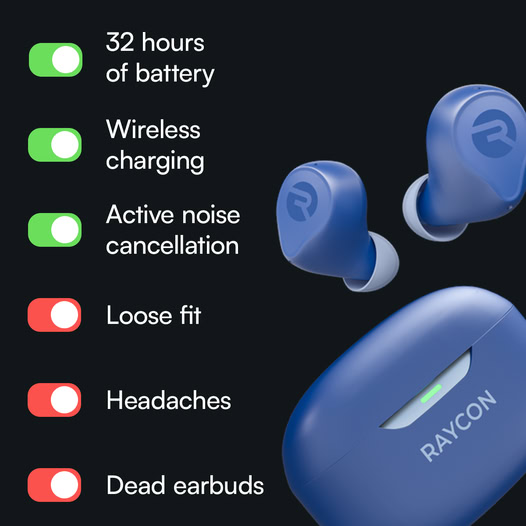
This ad creative does an awesome job of showcasing the product’s benefits. What really stands out is how it focuses on the most obvious pain points, then smoothly turns them into benefits.
That alone will resonate with the audience and lower the ad’s CPM.
Using red and green toggle buttons to highlight pain points and benefits also gives customers an “aha” moment—they feel smart for figuring it out, which keeps them hooked.
2. Click Score:
I’m giving this a 4 out of 5.
The clever positioning of the ad creative pulls you in right away. Even though the ad itself doesn’t have a CTA, the headline and description highlight a sales promotion that’s sure to boost CTR.

3. Ugly Score:
This gets a solid 4 out of 5.
The product image and brand name are front and center, but the overall design breaks away from typical ads. It’s more like an infographic, which feels fresh and engaging. That uniqueness helps it stand out.
4. Congruency Score:
I’m giving this a perfect 5 out of 5.
When you click through, you land on a product page that matches the ad’s message. The benefits listed there line up exactly with what you saw in the creative.
The page is clean, looks great, and is easy to navigate, with CTAs, customer reviews, and related products placed exactly where they need to be.

Caption:
This caption is on point. It’s well-structured with paragraph breaks and emojis that make it easy to read. It also spotlights the product benefits and ends with a strong CTA, tying everything together nicely.
How can you use this for your business?
- Think about the biggest challenges your audience faces when using products in your category. Lead with those pain points and immediately follow up with how your product solves them.
- The use of toggle buttons with red and green is not just visually appealing—it’s functional. It clearly separates the “before” (problem) and “after” (solution), creating an ‘aha’ moment for viewers. You can replicate this by using similar visual contrasts in your ads, like split screens or overlays, to help your audience instantly grasp how your product benefits them.
- For your ads, consider using infographic-inspired layouts to present product benefits, customer reviews, or comparisons. This not only grabs attention but also educates the viewer in an easily digestible format.
Check Out the Landing Page:
Here’s the landing page for this product:
https://rayconglobal.com/pages/the-everyday-earbuds-adr3
This post is packed with insights; I again recommend bookmarking it in your browser for future reference.
Finally, I would like to add that I will continue sending you these ads every Monday, but they alone may not be sufficient for your success as you would want more concepts under your belt.
Well, that’s all for post, folks!
Therefore, if you are a Facebook ads marketer and want more ads like these for yourself, then go ahead and check out Minea.
Here is the promo code offering you 20% off for 3 months: SANNIDHYA20
And here is my affiliate link: [https://app.minea.com/find-winning-product?ref=k63dd]
Also, let me know which niche’s ad I should pick up next for you. I would love to hear from you.
DISCLAIMER: This post contains affiliate links, which means that if you click on one of the product links, I’ll receive a small commission.