Hey,
Welcome to the 54th edition of Ad Pulse Monday!
For those new to this series, every Monday, I select an ad or ads that I believe have performed exceptionally well. I’ll break down their success factors, key takeaways, and how you can apply these insights to your business.
If you’re already familiar with Ad Pulse Monday, welcome back!
Consider bookmarking these posts, creating a handy repository right in your browser.
Without further ado, let’s dive in
Nickel-Thin Underwear
To view the ad, register on Minea using this affiliate link (and get a flat 20% discount on paid plans):
https://app.minea.com/ads/facebook?ref=k63dd
And then click on this link:
https://app.minea.com/en/ads/facebook/605039831826814/details?ref=k63dd
1. Thumbnail score:
I’m giving this a solid 5 out of 5.
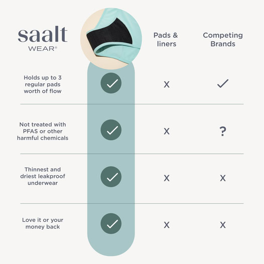
The Us vs. Them format is a proven winner for driving conversions. This ad executes the Us vs. Them strategy brilliantly by putting the direct and indirect competition to the test with clear facts.
It highlights the price USP of their product without dragging the competitor down—just enough to get the message across. The comparison chart smartly showcases the product’s features while serving multiple purposes, making it highly effective.
The best part? The ad doesn’t scream “advertisement.” I’m confident this ad has a low CPM and effectively stops the scroll.
2. Click Score:
I’m giving this a 4 out of 5.
The creative does a fantastic job grabbing attention and positioning the offer in a clear, logical way. What I love most is that it doesn’t just compare itself to direct competitors—it also highlights indirect alternatives like pads and liners.
That’s a smart play because it reaches people who may not even be considering this product category yet.
Pro tip: When analyzing your competition, don’t just think about other brands—think about what your customers are using instead of your product. Once you find the alternative they’re currently settling for, your offer will become 10x stronger.
That being said, the description runs longer than the character limit, making it partially unreadable in the preview—which is a missed opportunity.
Additionally, since this is a relatively new product category, a discount code or sales promotion would have been a great way to lower the barrier to purchase.

3. Ugly Score:
I’m giving this a 4.5 out of 5.
This ad ditches flashy branding and goes straight to what matters—solving the problem. It’s not overly salesy, which makes it feel more authentic. The infographic-style design makes it easy to digest, while the simple layout ensures the message gets across instantly.
This is exactly the kind of low-production, high-impact creative that’s crushing it right now.
4. Congruency Score:
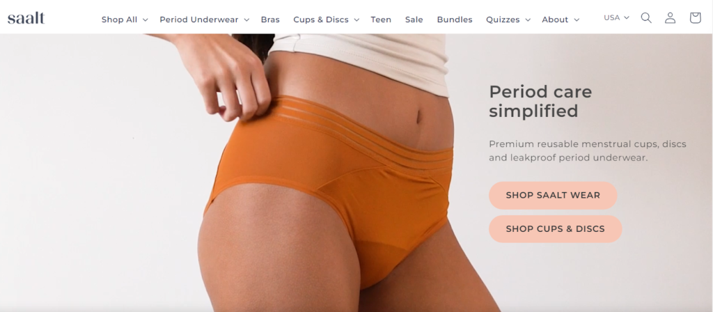
I’m giving this a 2 out of 5, and here’s why: the landing page is a disaster for conversions.
Instead of sending users directly to the product they clicked for, it dumps them onto a general homepage where they have to manually search for the item.
That’s friction. That’s lost sales. People clicked for a reason, and making them hunt for the product is a surefire way to kill their interest.
Caption:
This caption is a 5 out of 5. It’s short, structured well, and easy to skim, thanks to paragraph breaks and emojis. Plus, it wraps up with a clear CTA that nudges users toward clicking the “Buy Now” button. Simple, effective, and well-executed.
How can you use this for your business?
1. Leverage Comparison Ads – If your product is better or cheaper than alternatives, don’t be afraid to show it. Side-by-side comparisons work because they remove decision fatigue.
2. Think Beyond Direct Competitors – Identify what other solutions your target audience is using, then position your product as the better alternative.
3. Fix Landing Page Flow – If an ad promotes a specific product, make sure the landing page matches. Sending users to a general homepage is a conversion killer.
Check Out the Landing Page:
Here’s the landing page for this product:
This post is packed with insights; I again recommend bookmarking it in your browser for future reference.
Finally, I would like to add that I will continue sending you these ads every Monday, but they alone may not be sufficient for your success as you would want more concepts under your belt.
Well, that’s all for post, folks!
Therefore, if you are a Facebook ads marketer and want more ads like these for yourself, then go ahead and check out Minea.
Here is the promo code offering you 20% off for 3 months: SANNIDHYA20
And here is my affiliate link: [https://app.minea.com/find-winning-product?ref=k63dd]
Also, let me know which niche’s ad I should pick up next for you. I would love to hear from you.
DISCLAIMER: This post contains affiliate links, which means that if you click on one of the product links, I’ll receive a small commission.