Hey,
Welcome to the 79th edition of Ad Pulse Monday!
For those new to this series, every Monday, I select an ad or ads that I believe have performed exceptionally well. I’ll break down their success factors, key takeaways, and how you can apply these insights to your business.
If you’re already familiar with Ad Pulse Monday, welcome back!
Consider bookmarking these posts, creating a handy repository right in your browser.
Without further ado, let’s dive in
To view the ad, register on Minea using this affiliate link (and get a flat 20% discount on paid plans):
https://app.minea.com/ads/facebook?ref=k63dd
Then, you can click on this link: https://app.minea.com/en/ads/meta-library/lib_1117134640404072/details
1. Thumbnail Score:
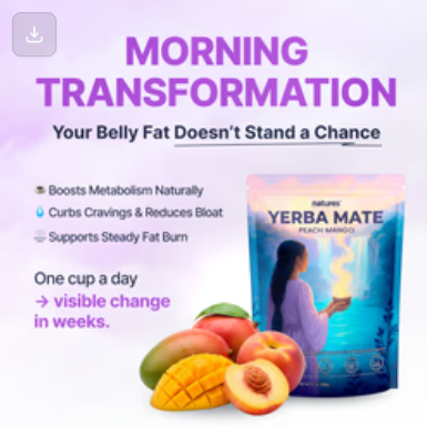
I give the thumbnail a score of 3 out of 5. The purple gradient background creates a pattern interruption and stands out in a crowded feed.
But the “MORNING TRANSFORMATION” headline isn’t strong at all. It sounds too generic and lacks emotion or curiosity. Something like “Wake Up to a Fitter, Lighter You,” “Sip Your Way to a Healthier, Happier Morning,” or “Wake Up and Slim Down” feels much more engaging and emotionally appealing.
The subheading “Your Belly Fat Doesn’t Stand a Chance” is bold and benefit-driven, directly addressing a major pain point.
The visual hierarchy works well with the product prominently displayed alongside fresh fruits (mango, peach, banana), which adds a natural, healthy vibe and suggests flavor. The three bullet points are clear and scannable:
- Boosts Metabolism Naturally,
- Curbs Cravings & Reduces Hunger,
- Supports Steady Fat Burn
However, it loses points for being slightly too polished and text-heavy. It lacks human relatability. The “One cup a day → visible change in weeks” could be more prominent. The overall composition, while professional, lacks that raw UGC authenticity that typically performs better for cold traffic.
2. Click Score:
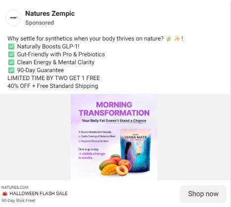
I’d give a click score of 4 out of 5.
The caption – “Why settle for synthetics when your body thrives on nature? 🌿✨✅” is short, organic, and emotion-driven. It positions the brand as clean, natural, and authentic. It taps into the growing wellness movement and positions the product as the superior, natural choice.
The checklist format makes it easy to scan: “Boosts GLP-1”, “Gut-Friendly”, “Clean Energy” – each benefit hits a pain point (metabolism, digestion, fatigue). The combination of “LIMITED TIME”, “BUY TWO GET 1 FREE”, and “40% OFF” creates a FOMO element and provides a strong push to click now rather than later. It answers the critical question: “Why should I buy this TODAY instead of tomorrow?”.
However, it could be improved slightly by adding a more emotional hook to improve the connection.
The headline “🎃 HALLOWEEN FLASH SALE” is short, seasonal, and attention-grabbing, creating both urgency and relevance.
The description “90-Day Risk-Free!” is incredibly effective. A risk-free guarantee reduces buyer hesitation, especially in wellness products where people fear ineffectiveness or side effects.
3. Ugly Score:
I’d give an ugly score of 1 out of 5, as it feels very generic.
The gradient background, 3D fruits, perfectly aligned text, and perfect packaging create a “studio aesthetic” rather than an organic one. There’s no real-life element in the ad – no authentic testimonial, no relatable face, no transformation story that feels genuine or personal.
For a product promising morning transformation and belly fat loss, one of the ways they could’ve pushed for an ugly ad is by showcasing a real person who actually experienced this. Instead of a polished product photo, imagine a simple snapshot of someone standing in front of a mirror in their kitchen, holding their morning tea with a small smile.
Maybe it’s a before-and-after moment or a casual selfie taken on an iPhone with soft morning light. Add a short, heartfelt caption in a regular Instagram font – something like “Can’t believe this tiny change made such a big difference.”
An “uglier” ad would likely outperform this creative by 2x CTR.
4. Congruency Score:
I will give this ad a congruency score of 4 out of 5. The landing page is visually consistent with the ad. The brand colors, product imagery, and copy all align seamlessly.
It does a great job of:
- Highlighting “Visible results in weeks” – consistent with the ad copy. Shows how it’s backed by real results from a 500-customer survey.
- Displaying clear benefits and flavor details.
- Provides the entire ingredient list.
- Shows deals like “Buy 2 Get 1 Free” and “Buy 3 Get 3 Free”.
- Reinforces the product’s natural metabolism support promise.
However, there’s room for improvement in terms of funnel focus as the page feels slightly long and product-heavy before nudging users to checkout.
How Can You Use This For Your Business?
1.Lead with transformation, not product features.
People don’t buy yerba mate tea. They buy the feeling of fitting into their jeans again. They buy confidence. They buy the version of themselves they see in their mind.
Instead of “Boosts Metabolism Naturally,” test “I dropped 18 pounds in 6 weeks drinking this every morning.”
The emotional outcome always beats the functional benefit.
2.Use real people, real phones, real stories.
Ditch the stock imagery and professional photoshoots. Get your actual customers to film themselves on their iPhone:
- Making their morning tea
- Showing their before-and-after photos
- Talking about how it changed their routine
- Getting emotional about their transformation
Raw UGC will crush this polished creative 9 times out of 10. Your CTR will improve by 40-60%, and your CPM will drop significantly.
3.Create urgency that actually matters.
“Shop Now” is weak. Test these instead:
- “Flash Sale: 40% off ends tonight”
- “Only 147 units left in stock.”
- “Join 50,000+ who transformed their mornings”
- “Try it risk-free for 60 days or get your money back”
Give people a reason to act NOW, not “someday.”
4.Address the elephant in the room.
The product name “Zempic” is clearly referencing Ozempic, the weight-loss drug. This is smart positioning: you’re tapping into massive search intent and cultural awareness.
But you need to address this directly in the ad:
“The natural alternative to Ozempic without the price tag or side effects”
“Ozempic costs $1,000/month. This costs $39 and works naturally.”
Don’t be subtle. Call it out. That’s what will make people stop scrolling.
Check out their Landing Page:
Here’s the landing page for this product:
https://natures.com/products/zempic-yerba-mate-sub
This post is packed with insights; I again recommend bookmarking it in your browser for future reference.
Well, that’s all for the newsletter, folks!
Finally, I would like to add that I will continue sending you these ads every Monday, but they alone may not be sufficient for your success as you would want more concepts under your belt.
Therefore, if you are a Facebook ads marketer and want more ads like these for yourself, then go ahead and check out Minea.
Here is the promo code offering you 20% off for 3 months: SANNIDHYA20
And here is my affiliate link: [https://app.minea.com/find-winning-product?ref=k63dd]
Also, let me know which niche’s ad I should pick up next for you. I would love to hear from you.
DISCLAIMER: This post contains affiliate links, which means that if you click on one of the product links, I’ll receive a small commission.