Welcome to the 80th edition of Ad Pulse Monday!
For those new to this series, every Monday, I select an ad or ads that I believe have performed exceptionally well. I’ll break down their success factors, key takeaways, and how you can apply these insights to your business.
If you’re already familiar with Ad Pulse Monday, welcome back!
Consider bookmarking these posts, creating a handy repository right in your browser.
Without further ado, let’s dive in
To view the ad, register on Minea using this affiliate link (and get a flat 20% discount on paid plans):
https://app.minea.com/ads/facebook?ref=k63dd
Then, you can click on this link:
https://app.minea.com/en/ads/meta-library/lib_4645701402316751/details
1. Thumbnail Score:
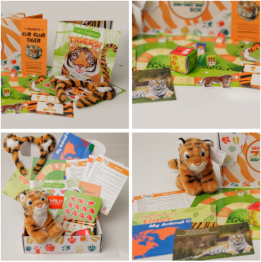
I will give the thumbnail score to this ad a 3.5 out of 5. This thumbnail nails the visual storytelling.
The ad uses a 4-grid thumbnail collage showing plush animals, learning cards, and colorful packaging. It’s bright, tactile, and instantly communicates hands-on learning fun.
The collage-style layout with multiple product shots creates a sense of abundance and value, and parents can immediately see they’re getting a BOX full of activities, not just a single item.
What works exceptionally well is the authenticity. This doesn’t look like a sterile product photoshoot. It looks like someone is unboxing their delivery on their living room floor, which creates relatability for parents.
The hands-on setup shots show the product in use, not just sitting pretty.
However, it loses some points because there’s no overlay text creating urgency or highlighting the key benefit. Something like “PROMO CODE: FREEBOX” or “First Box FREE” directly on the thumbnail would have been powerful.
2. Click Score:
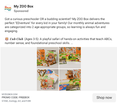
I’d give the click score a 4 out of 5. The caption is remarkably strong.
It opens with a question that immediately qualifies the audience: “Got a curious preschooler OR a budding scientist?” This is smart targeting.
The caption also does a good job of positioning the product as “EDventure” (clever wordplay that suggests education + adventure). It addresses the pain point of monthly decision fatigue and shows that it offers 2 distinct offerings: Cub Club and Zoologist Club.
Providing the age groups is educational, emotionally appealing, and builds trust with structure.
However, I feel the caption could have been written with a bit more breathing room by adding line spaces after each sentence. That would make it easier to read, feel more natural, and help each line land with more impact.
The “PROMO CODE: FREEBOX” in the headline is genius. It creates immediate curiosity as parents want to know what “FREEBOX” means. Is it a free box? A discount? This drives clicks.
The description is also quite effective as STEM, Zoology, Art, and Fun help parents visualize the value.
However, there should be a more explicit “Claim Your Free Box Now” or “Start Your Adventure Today” with urgency baked in. Also, no social proof (number of families subscribed, testimonials, ratings) is mentioned.
3. Ugly Score:
This ad sits in the middle ground. It’s not overly polished and branded, but it’s not truly “ugly” either.
The collage format and real-product-in-use shots give it an authentic feel, which is good. Thus, I would give a score of 3 out of 5 here.
What keeps it from being a 1-2 (too polished) is the genuine unboxing vibe. It looks like content a parent might share in a Facebook mom group: “Look what we got today!”
But it could be more real. A quick video of a mom unboxing it with her excited kids would work way better than this neat collage. Show the kids’ happy faces, the fun mess they make while learning, and a tired but smiling parent saying, “This kept them busy for 2 hours!” – that kind of real moment would connect instantly.
5. Congruency Score:
I will give a congruency score of 4 out of 5 to this ad.
The landing page connects really well with the ad and keeps the same friendly, trustworthy tone.
The line “Inspire Curiosity. Spark Conservation. The My ZOO Box Guarantee” instantly tells parents what the brand stands for. “Trusted by grown-ups. Loved by kids.” feels warm and genuine, showing that it’s both fun for children and reassuring for parents.
The sections about the brand’s credibility are strong.
- Zoologist Approved: Each box is created with real zoologists, so it feels expert-backed and authentic.
- Dedicated Team of Educators: Parents can trust that every activity is age-appropriate and enjoyable.
- Quality PAW-surred and 30-Day Money Back Guarantee: These lines make parents feel safe buying, knowing they can get a refund or replacement easily if something goes wrong.
The testimonials add a nice human touch. Parents talk about how their kids look forward to every new box, how it keeps them busy for hours, and how it makes learning fun again. These reviews make the brand feel reliable and relatable.
One small improvement would be to bring the reviews higher up on the page so new visitors see them sooner.
How Can You Use This For Your Business?
1.The collage format is criminally underused.
Most ads show just one product, but this one shows the full experience: the box, plush toy, activities, and learning materials together. It instantly adds value and makes parents think, “All this in one box?” For subscription products, collage-style visuals work best.
Show everything inside, from different angles, and in real use. More visuals often lead to better conversions.
2.Speak directly to your audience’s identity, not just their problem.
“Got a curious preschooler or a budding scientist?” works perfectly because it speaks to a parent’s identity. They feel proud and understood. This is identity-based marketing.
For your brand, focus on who your customer wants to be and write your hook for them. Example: “Busy moms who still chase their goals,” “Professionals who eat healthy even on tough days,” or “Lazy skincare girls who still want to glow.”
3.Age segmentation is powerful positioning.
Dividing the offer into Cub Club (3-5) and Zoologist Club (5-12) works really well. It keeps all parents interested and makes the product feel personalized for their child’s age.
For your business, if you target different customer groups, speak to each one separately. Create clear options and use language that makes everyone feel included, like “For beginners” or “For advanced users.”
4.Monthly recurring revenue (MRR) products need different creative.
For subscription products, you’re selling a relationship, not just a one-time box. The ad should show convenience, variety, and ongoing fun while hinting at flexibility. Focus on solving the monthly “What will keep my kids engaged this month?” problem.
Test creatives that highlight the unboxing joy, monthly surprise, growing community, and how kids learn more each month.
Check out their Landing Page:
Here’s the landing page for this product:https://www.myzoobox.com/
This post is packed with insights; I again recommend bookmarking it in your browser for future reference.
Well, that’s all for the newsletter, folks!
Finally, I would like to add that I will continue sending you these ads every Monday, but they alone may not be sufficient for your success as you would want more concepts under your belt.
Therefore, if you are a Facebook ads marketer and want more ads like these for yourself, then go ahead and check out Minea.
Here is the promo code offering you 20% off for 3 months: SANNIDHYA20
And here is my affiliate link: [https://app.minea.com/find-winning-product?ref=k63dd]
Also, let me know which niche’s ad I should pick up next for you. I would love to hear from you.
DISCLAIMER: This post contains affiliate links, which means that if you click on one of the product links, I’ll receive a small commission.