Hey,
If this post were written by a group of academicians studying the impact of FB advertising, the abstract would be simple – Facebook advertisements suck
Well, at least most of them do. It’s funny how we, as an industry, never seem to acknowledge that “most FB ads are bad.” The reason they don’t work is because they’re boring, silly, and even stupid.
It’s a tough pill to swallow, but it’s crucial if you’re serious about using Facebook’s massive advertising potential.
Let’s break down why most ads fall flat and what you can do to ensure yours stand out.
1. “What’s the point of this ad?”
You’ve seen them—ads that make you scratch your head and wonder, “What on Earth is this about?”
Case in point:
See this ad by Airbnb, for instance. At first glance, you’re unsure what to make of it. It feels off because, much like many ineffective Facebook ads, it doesn’t directly communicate a clear value or actionable insight for the intended audience.
What is Airbnb trying to achieve here? Support libraries? Highlight the taxes they’ve contributed. The message is disjointed, and that’s the problem.

In an era where the average attention span is shorter than that of a goldfish, your ad needs to grab attention and make its purpose crystal clear within seconds. If viewers can’t decipher the purpose of your ad right away, you’ve lost them.
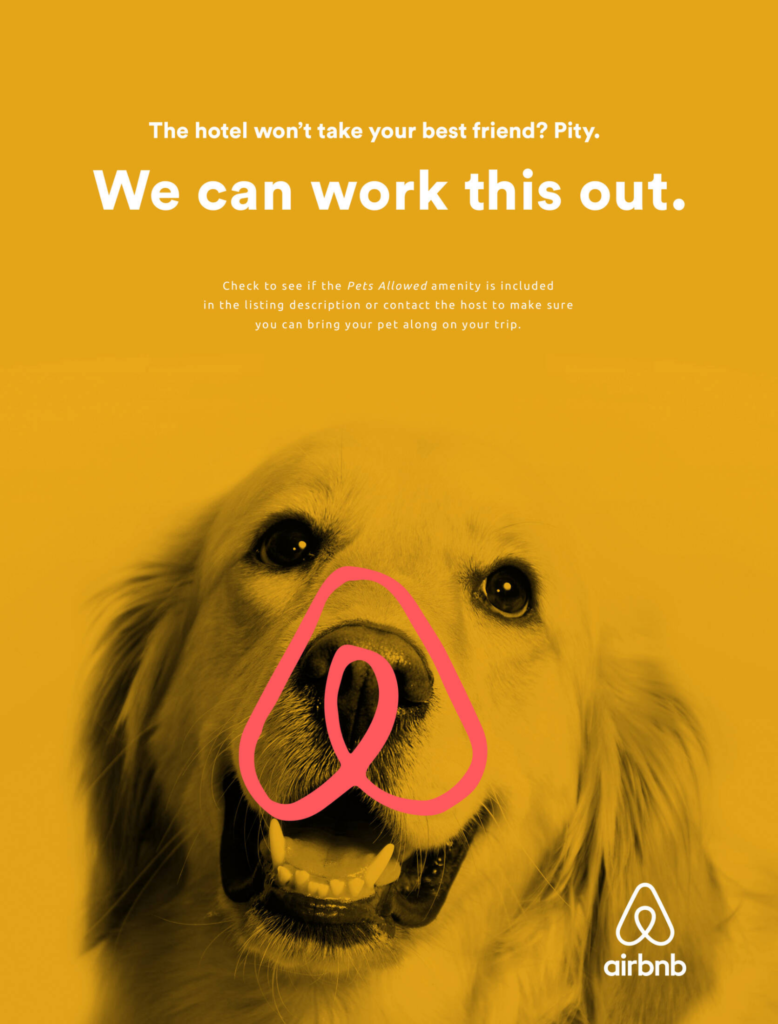
Now, let’s look at another ad from the same brand, Airbnb, where they get it right. It’s straightforward and immediately connects with pet owners who’ve likely experienced this issue.
The visual of the dog, combined with the friendly, solution-oriented text, creates an emotional hook. Airbnb is offering a tangible benefit (the ability to bring your pet), addressing a pain point that many travelers face.
2. “What’s in it for me?”
Here’s a hard truth: nobody cares about your company’s history or your brand logo unless you’re a household name with a cult following.
Take a look at this ad:
20g of protein, 1.3g net carbs, zero sugar, and 249 calories per 60g. These are great stats on paper, but there’s a big question left unanswered—“What’s in it for me?”
While the ad does an excellent job of listing the product’s features, it fails to communicate the direct benefits. Sure, I see the protein and the low carbs, but what will I actually achieve by eating this product?
How will it make me feel? Will it help me stick to my fitness goals, curb cravings without guilt, or keep me full longer?

People care about how your offer makes their life better. So cut the fluff about your company’s milestones and focus on answering the only question that matters to your audience: “What’s in it for me?”
Now, let’s look at this ad from Huel that gets it right.
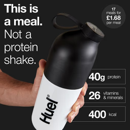
It doesn’t just list the product’s features. It takes it further by clearly stating the benefit: “This is a meal. Not a protein shake.” This simple yet powerful statement tells the audience exactly what they can expect.
It’s not just about consuming protein or calories; it’s about replacing a full meal with a convenient, balanced option.
3. Ads don’t speak to their audience.
Many ads fail because they don’t resonate with their intended audience. They either speak at them or, worse, talk down to them.
Case in point:
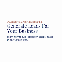
At first glance, the message is clear but monotonous. It lacks a deeper connection with the audience. It feels generic and doesn’t address the specific pain points or emotions of the target audience.
The key is to engage with your audience as you would in a conversation. Use language that mirrors theirs, address their needs directly, and make them feel understood.
Here’s what to do:
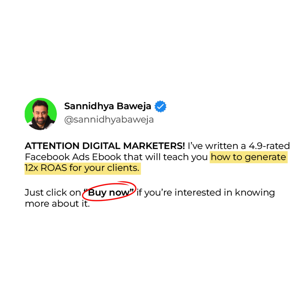
This ad addresses a specific audience’s direct needs and desires. It offers a clear benefit that the audience can relate to and is motivated by.
This is how you should approach your ads—by ensuring you connect with your audience, offer a tangible benefit, build trust, and make the next step clear and easy.
4. Incentivize the action
Many ads fall short because they lack a compelling call-to-action (CTA). You’ve grabbed attention with a strong headline, connected with your audience’s pain points, and showcased an amazing solution—but what’s next?
Your ad must have an element that drives the click or action. Remember, people are bombarded with thousands of ads daily, and most of them don’t result in clicks.
To cut through the noise, you need to provide a clear, persuasive reason for them to take the next step.
Whether it’s offering a limited-time discount, a free trial, or exclusive access to a resource, give them a strong incentive to click.
Here’s an ad creative that does not incentivize the click:

Every ad should have a strong CTA that guides them on what to do next—whether that’s to “Sign Up,” “Learn More,” or “Buy Now.”
Here’s how to do it better:
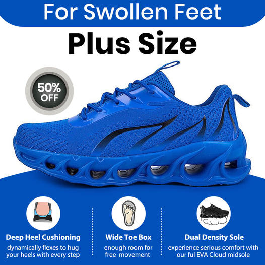
This ad is an excellent example of how to incentivize the click. The 50% off badge is a powerful motivator.
It creates a sense of urgency and offers an immediate benefit for the viewer, encouraging them to take advantage of the discount before it’s too late.
This bold and visible discount makes it clear that there’s a significant deal waiting for those who click.
5. “I can’t relate to this.”
Your ad needs to speak directly to your audience’s experiences and emotions.
If people can’t see themselves in your ad, they won’t feel compelled to engage. Relatability builds trust, and trust leads to conversions.
6. Lack of a data-feedback loop.
Many ads don’t evolve because there’s no feedback loop in place.
Data from ad performance should be constantly analyzed and used to refine your messaging, targeting, and creative elements. Without this, you’re essentially flying blind.
At times when attention spans are shrinking, and competition is fiercer than ever, your Facebook ads can’t afford to be mediocre. While it’s true that most FB ads suck, yours don’t have to.
By addressing these common pitfalls—unclear messaging, lack of audience connection, weak calls to action, and more—you can transform your ads from forgettable to unforgettable.
Are you ready to make your ads suck less?
Let’s get started!
Happy advertising.