Hey,
Welcome to the 25th edition of Ad Pulse Monday!
For those new to this series, every Monday, I select an ad or ads that I believe have performed exceptionally well. I’ll break down their success factors, key takeaways, and how you can apply these insights to your business.
If you’re already familiar with Ad Pulse Monday, welcome back!
Consider bookmarking these posts, creating a handy repository right in your browser.
Without further ado, let’s dive in
Award-Winning Razor

To view the ad, register on Minea using this affiliate link (and get a flat 20% discount on paid plans):
https://app.minea.com/ads/facebook?ref=k63dd
And then click on this link:
https://app.minea.com/en/ads/facebook/867467712088406/details?ref=k63dd
1. Thumbnail score:
I’m giving this a solid 4.5 out of 5.
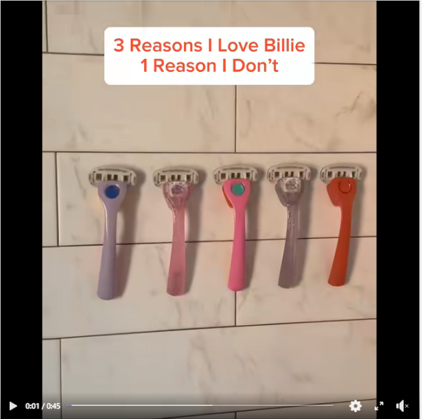
Using an overlay headline is one of the best ways to reduce your CPM for video ads.
What I really love about this overlay headline is how it cleverly uses negative psychology to grab attention.
Anything that mentions ‘Reasons I don’t love’ or ‘Why you should not do…’ will engage your audience because people are naturally drawn to actions they’re usually told not to do.

2. Hook Score:
This gets a 3.5 out of 5 from me.
The ad begins with a zooming visual of the product along with the overlay headline.
While the headline builds curiosity well, instead of just zooming in, there should have been more jump cuts and product visuals in the first 3 seconds to hook the viewer.
The music, however, does a good job of drawing you into the ad.
3. Retention Score:
This is a solid 4 out of 5.
I’ve said time and again that shorter videos (below 20 seconds) are winning right now. But this is a good example of a 40-second video ad done right.
The overlay headline effectively piques your interest. You’re invested in knowing the reasons why a person would love and not love the product.
The ad swiftly moves from one reason to another without wasting time, so I know it has a good retention rate.
4. Click Score:
This gets a 3.5 out of 5 from me.
The headline does a good job of building social proof and creating a sense of urgency.
However, it could have been used to highlight the offer. Additionally, since the ad has been running for quite some time now; it has also gathered significant social proof in the form of engagement, which will improve the click rate of this video ad.

5. Ugly Score:
This is an easy 5 out of 5.
There’s no flashy branding here. The product is shown from various angles, but the shots and edits aren’t polished, keeping it from feeling like a typical ad.
Using the Instagram story font to list the reasons is also a great way to capitalize on familiar UI and boost engagement.
6. Congruency Score:
This is a 4 out of 5.
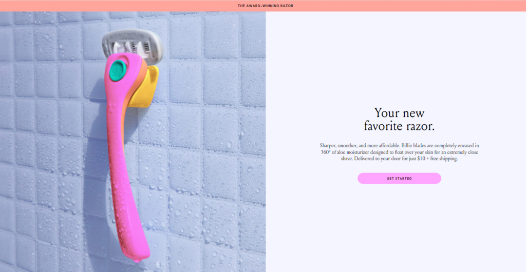
I like how minimalistic yet colorful the landing page is. You’re redirected to product visuals that highlight this award-winning product.
While the landing page looks great, it could have done a better job of highlighting the product’s benefits.

Caption:
This is a 1 out of 5 for me.
I’ve been saying this for ages now—your caption is very important in building up your offer.
It ensures that no matter how the audience consumes your ad, there’s a clear message and call to action they understand.
It’s about time brands start paying attention to their captions along with their ad creatives.
How can you use this for your business?
- Flip the script in your headlines. Challenge norms or address common objections upfront. It’s a great way to engage and convert.
- Ditch the overly polished look for something more raw. This will make your ad stand out as more genuine and less ‘sales-y.’
- Never underestimate the power of your words in the caption. It should complement your video by reinforcing the message and directing viewers to their next steps.
Check Out the Landing Page:
Here’s the landing page for this product:
https://mybillie.com/pages/razor
This post is packed with insights; I again recommend bookmarking it in your browser for future reference.
Well, that’s all for post, folks!
Finally, I would like to add that I will continue sending you these ads every Monday, but they alone may not be sufficient for your success as you would want more concepts under your belt.
Therefore, if you are a Facebook ads marketer and want more ads like these for yourself, then go ahead and check out Minea.
Here is the promo code offering you 20% off for 3 months: SANNIDHYA20
And here is my affiliate link: [https://app.minea.com/find-winning-product?ref=k63dd]
Also, let me know which niche’s ad I should pick up next for you. I would love to hear from you.
DISCLAIMER: This post contains affiliate links, which means that if you click on one of the product links, I’ll receive a small commission.