Hey,
Welcome to the 77th edition of Ad Pulse Monday!
For those new to this series, every Monday, I select an ad or ads that I believe have performed exceptionally well. I’ll break down their success factors, key takeaways, and how you can apply these insights to your business.
If you’re already familiar with Ad Pulse Monday, welcome back!
Consider bookmarking these posts, creating a handy repository right in your browser.
Without further ado, let’s dive in
To view the ad, register on Minea using this affiliate link (and get a flat 20% discount on paid plans):
https://app.minea.com/ads/facebook?ref=k63dd
And then click on this link:
https://app.minea.com/en/ads/facebook/832421482227338/details
1. Thumbnail score:
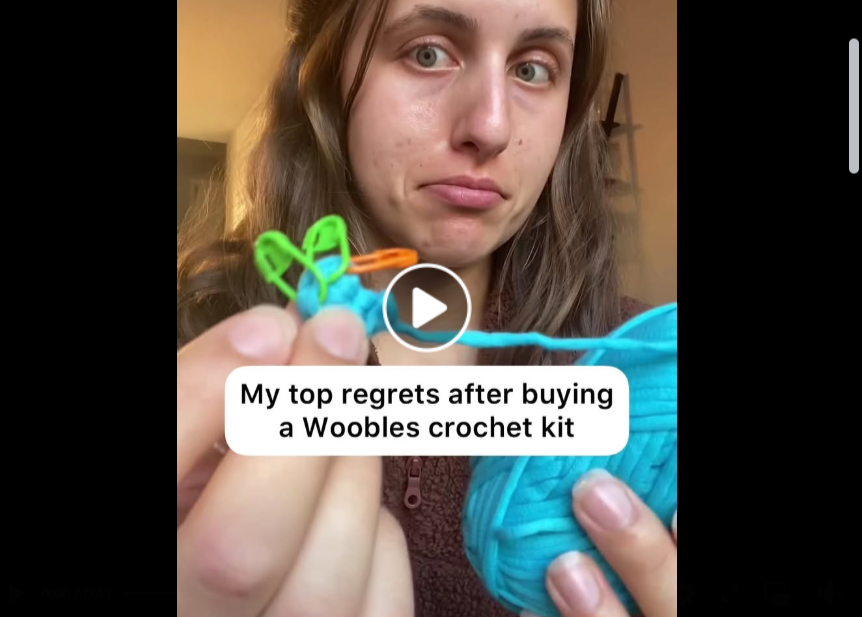
For the thumbnail, I give it a 4.5 on 5 since it uses the “negative pattern interrupt” style of getting the attention of the user.
The “regret” angle is bound to generate curiosity, and will want to make the user click on the video ad.
The overlay text is clear and well-positioned enough to catch any user’s attention and stop their scroll.
2. Hook Score:
For the hook, it’s again a solid 5 out of 5 for me since it stops the scroll and generates curiosity.
The whole “negative pattern interrupt”, as I mentioned earlier, tends to work well when it comes to wanting users to get curious about your ad/brand.
The hook “My top regrets after buying a Woobles crochet kit” immediately stops the scroll because our brains are wired to pay attention to negative information (it’s called negativity bias).
3. Retention Score:
For retention, I give it a 5 on 5 again since it manages to hold the attention of the user for more than 3 seconds, with its storytelling format.
Beginning the ad with the regret angle and then setting context with a backstory is bound to grab attention. The ad manages to do exactly that.
Not just the storytelling, but telling it in pointers, giving time for the audience to engage with what’s being shown and using UGC content like video calls are also a good way to retain views.
4. Click Score:
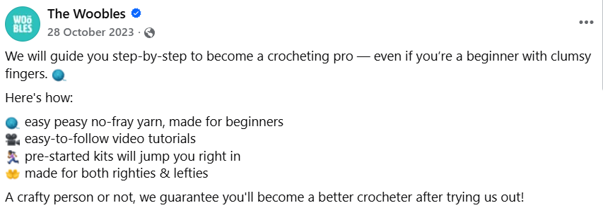
The click score gets a 3.5 out of 5 for me.
What works for the caption is that it addresses the pain points and solutions directly.
It also uses inclusive language, which is a plus point, and it addresses all the doubts that a beginner might have.
However, there is a slight disconnect between the video and the caption since the video is using storytelling elements while the caption is addressing pain points and does not set any context before jumping right into it.
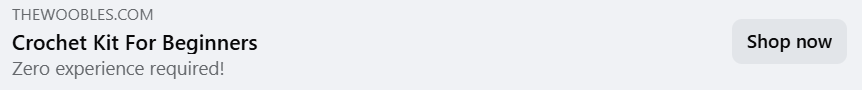
Meanwhile, the headline and description tie well with the copy but fail to create a sense of urgency for viewers to click on the “Shop Now” button. There is also a missed opportunity to use numbers or customer testimonials to back the claim of turning someone into a pro from an amateur.
Overall, the main work is being done by the video itself, although the caption does address the pain point, the CTA in the headline or description aren’t urgent enough for someone to want to click on the ad.
5. Ugly Score:
The ugly score is a perfect 5 out of 5 since it uses UGC content instead of going down the polished brand ad route.
The low production value actually increases trust because it doesn’t trigger our “ad blindness.”
Real person + real lighting + real crochet work = real results in the consumer’s mind.
6. Congruency Score:
The congruency score is a 5 on 5 since it maintains messaging from the ad to the landing page and also has clear CTAs and customer testimonials and numbers for social proof.
What it lacked in the click score, it makes up for in congruency. The landing page picks up right where the ad is left off.
How can you use this for your business?
- Master the Negative Pattern Interrupt: “Regrets,” “mistakes,” “what I wish I knew,” and “don’t buy until…” are powerful hooks that create immediate curiosity. They work because they flip the expected script. Test this angle in your own ads, especially for products where buyers have hesitation or analysis paralysis.
- Objection-Focused Features: Notice how every bullet point addresses a specific fear? “No-fray yarn” = won’t mess up the materials. “Pre-started kits” = won’t fail at the beginning. “Righties & lefties” = won’t be excluded. Map your product features to emotional objections, not just functional benefits.
- UGC-Style Creative Beats Polished Every Time: In 2025, authenticity trumps production value. If you’re running DTC ads, test raw, real, user-generated style content against your polished brand assets. The “ugly” usually wins.
- Bridge Your Hook to Your Body: The disconnect between the “regret” hook and the feature-heavy copy is the weak link. Always create a seamless narrative bridge. Example: “The only regret? That I didn’t know about these 4 game-changers sooner…”
- Caption Real Estate is GOLD: Stop treating captions as an afterthought. Use them to extend the story, add social proof, create urgency, and drive action. A great caption can lift conversion by 20-30%.
Check Out the Landing Page:
Here’s the landing page for this product:
https://thewoobles.com/pages/ep-po-v1
This post is packed with insights; I again recommend bookmarking it in your browser for future reference.
Finally, I would like to add that I will continue sending you these ads every Monday, but they alone may not be sufficient for your success as you would want more concepts under your belt.
Well, that’s all for post, folks!
Therefore, if you are a Facebook ads marketer and want more ads like these for yourself, then go ahead and check out Minea.
Here is the promo code offering you 20% off for 3 months: SANNIDHYA20
And here is my affiliate link: [https://app.minea.com/find-winning-product?ref=k63dd]
Also, let me know which niche’s ad I should pick up next for you. I would love to hear from you.
DISCLAIMER: This post contains affiliate links, which means that if you click on one of the product links, I’ll receive a small commission.