Hey,
Welcome to the 76th edition of Ad Pulse Monday!
For those new to this series, every Monday, I select an ad or ads that I believe have performed exceptionally well. I’ll break down their success factors, key takeaways, and how you can apply these insights to your business.
If you’re already familiar with Ad Pulse Monday, welcome back!
Consider bookmarking these posts, creating a handy repository right in your browser.
Without further ado, let’s dive in

To view the ad, register on Minea using this affiliate link (and get a flat 20% discount on paid plans):
https://app.minea.com/ads/facebook?ref=k63dd
And then click on this link:
https://app.minea.com/en/ads/meta-library/lib_2238927219660061/details
1. Thumbnail score:
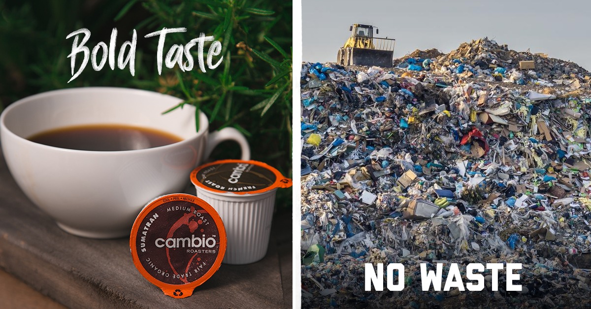
I give the thumbnail a 5 out of 5 since this will appeal to an audience looking to consume more sustainably and ethically.
The “Bold Taste, No Waste” comparison is a good way to show how sustainable your brand is. But the image of the massive pile of trash may put them off from trying to click on the ad.
On the other hand, using unconventional imagery like a pile of trash can generate enough curiosity for new users to click on the ad.
The reason I give the thumbnail full marks is that even though it might put users off, it still will generate an extreme reaction.
It grabs the attention and makes the user stop the scroll.
I give the thumbnail a score of 5 on 5 because the photo of the massive pile of trash is bound to generate curiosity, or if not that, at least induce an extreme reaction.
The aim isn’t always to get clicks, sometimes it’s about grabbing the attention of the user and stopping their scroll, which, I believe, this thumbnail will be successful in doing so.
2. Click Score:

The caption feels confusing and lacks any emotional pull.
The users will not only fail to understand what the brand is trying to sell but it also has no storytelling with regard to why this product is needed.
It doesn’t address the pain points and might not attract the TOFU audience. The caption is a 2 out of 5 for me.

The headline again has no context, leaving the audience confused as to what the brand is trying to sell.
It’s got emotional pull but seems to come off as scolding instead of inspiring.
There can be a clearer incentive for the audience to convert without having to come off as patronising.
It’s all about what not to do instead of what can be done. It also doesn’t address the pain point effectively.
The description is unclear at best because once again, the user will have no idea what the brand is trying to sell- the cup or the coffee?
Overall, I feel the major work is being done by the thumbnail. Nothing aside from the thumbnail builds the case for it.
The overall copy is good as an awareness hook but not as an ad for conversion.
of 5 because once
3. Ugly Score:
For the ugly score, I give it a 5 on 5 since it’s using unconventional imagery to make a point.
It’s got an amateur feel to it. The image is enough for viewers to get curious and click on the ad.
The image alone is strong enough to trigger curiosity and make viewers pause, and click on the ad just to figure out what’s going on.
It’s trying to be scroll-stopping instead of conventionally appealing, and it nails that.
4. Congruency Score:
I give the congruency score a 0 out of 5 since the landing page does not align with what the ad promises to deliver.
It might be confusing for first-time visitors about the product that the brand is trying to sell.
A separate landing page should have been built, customised solely for the specific ad, rather than taking viewers to the main landing page, which is filled with confusing messaging and for which they have no context.
How can you use this for your business?
- Use unconventional imagery and language to create curiosity among your audience.
- Be transparent about what your product is so users know what they’re clicking on when they click.
- Generate curiosity about your product through your captions and CTA button.
- You have to have a landing page which is congruent with the ad messaging.
Check Out the Landing Page:
Here’s the landing page for this product:
https://cambioroasters.com/
This post is packed with insights; I again recommend bookmarking it in your browser for future reference.
Finally, I would like to add that I will continue sending you these ads every Monday, but they alone may not be sufficient for your success as you would want more concepts under your belt.
Well, that’s all for post, folks!
Therefore, if you are a Facebook ads marketer and want more ads like these for yourself, then go ahead and check out Minea.
Here is the promo code offering you 20% off for 3 months: SANNIDHYA20
And here is my affiliate link: [https://app.minea.com/find-winning-product?ref=k63dd]
Also, let me know which niche’s ad I should pick up next for you. I would love to hear from you.
DISCLAIMER: This post contains affiliate links, which means that if you click on one of the product links, I’ll receive a small commission.