Hey,
Welcome to the 73rd edition of Ad Pulse Monday!
For those new to this series, every Monday, I select an ad or ads that I believe have performed exceptionally well. I’ll break down their success factors, key takeaways, and how you can apply these insights to your business.
If you’re already familiar with Ad Pulse Monday, welcome back!
Consider bookmarking these posts, creating a handy repository right in your browser.
Without further ado, let’s dive in
Data-Driven Rides

To view the ad, register on Minea using this affiliate link (and get a flat 20% discount on paid plans):
https://app.minea.com/ads/facebook?ref=k63dd
And then click on this link:
https://app.minea.com/en/ads/facebook/752725366975834/details?ref=k63dd
1. Thumbnail score:
I’m giving this a solid 5 out of 5.
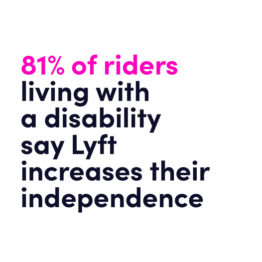
This is what I call a statistic ad and it works because numbers hit the logical side of your brain.
Sure, emotions sell, but stats justify the purchase. In this case, it’s doing a great job of leading with a sharp, specific number that builds immediate trust.
What I really like is how it targets a very specific group – eople with disabilities who may have reservations about taking cabs.
And instead of dancing around the issue, it addresses the concern head-on with a bold number.
That’s smart marketing. When your message is this clear, you don’t need fancy visuals. That’s exactly why a text-only ad works here.
2. Click Score:
This one gets a 3.5 out of 5.
The creative grabs your attention. The design is clean, and the stat is strong.
But here’s my issue – the headline and description feel disconnected from the creative.
The stat feels like it’s part of a bigger report, and that’s totally fine if that’s the goal. But then say it clearly in the creative.
Are we promoting the report? The service? The brand? Right now, the creative, headline, and description all feel like they’re pulling in slightly different directions.
Bring them into alignment, and this could hit harder.

3. Ugly Score:
Giving this a 3.5 out of 5.
The design is simple and not overly polished, which is a plus.
But it still follows very visible branding guidelines and that can work against the “ugly ad” effect over time.
That said, the Instagram-style infographic format gives it a nice native feel, so it will still stand out in the feed for most users.
4. Congruency Score:
This one gets a solid 5 out of 5.
The click takes you exactly where you expect – a clean, easy-to-read landing page that gives you the full report.
What I like even more is that there’s no form to fill.
You just land and start reading.
And the report is broken into bite-sized sections, which makes it far more likely that users will actually consume the content.
No barriers. No friction. Just value.

Caption:
This caption gets a 2 out of 5.
Honestly, this could’ve been so much more.
The creative is doing all the heavy lifting and the caption just… sits there. No structure. No real narrative. No CTA. Emojis don’t fix that.
When you’re building something thoughtful like a category awareness ad, your caption should do three things: reinforce the value, handle the main objection, and give a reason to click. This one doesn’t do any of that.
How can you use this for your business?
1. Segment your audience. This ad works because it talks to a very specific group with a very real concern. The tighter your targeting, the sharper your messaging.
2. Don’t over-polish. If your message is strong, let it breathe. A clean, minimal design with a clear number or fact can often beat a busy, overdesigned creative.
3. Tell them what they’re clicking for. If your ad is driving traffic to a report or a piece of content, make sure the creative says that. People don’t like surprises unless they know there’s value on the other side.
Check Out the Landing Page:
Here’s the landing page for this product:
https://www.lyft.com/impact/economic-impact-report
This post is packed with insights; I again recommend bookmarking it in your browser for future reference.
Finally, I would like to add that I will continue sending you these ads every Monday, but they alone may not be sufficient for your success as you would want more concepts under your belt.
Well, that’s all for post, folks!
Therefore, if you are a Facebook ads marketer and want more ads like these for yourself, then go ahead and check out Minea.
Here is the promo code offering you 20% off for 3 months: SANNIDHYA20
And here is my affiliate link: [https://app.minea.com/find-winning-product?ref=k63dd]
Also, let me know which niche’s ad I should pick up next for you. I would love to hear from you.
DISCLAIMER: This post contains affiliate links, which means that if you click on one of the product links, I’ll receive a small commission.