Hey,
Welcome to the 71st edition of Ad Pulse Monday!
For those new to this series, every Monday, I select an ad or ads that I believe have performed exceptionally well. I’ll break down their success factors, key takeaways, and how you can apply these insights to your business.
If you’re already familiar with Ad Pulse Monday, welcome back!
Consider bookmarking these posts, creating a handy repository right in your browser.
Without further ado, let’s dive in
Patient Perspective
To view the ad, register on Minea using this affiliate link (and get a flat 20% discount on paid plans):
https://app.minea.com/ads/facebook?ref=k63dd
And then click on this link:
https://app.minea.com/en/ads/meta-library/lib_2278577169193754/details?ref=k63dd
1. Thumbnail score:
I’m giving this a solid 4.5 out of 5.
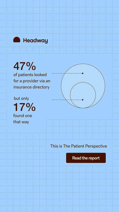
This is what I call a statistic ad. Numbers and data speak to the logical side of the brain, and while emotions drive purchases, statistics provide a strong rationale for consumers to choose your product.
Using precise numbers to showcase results, especially in healthcare, can be incredibly persuasive.
This ad doesn’t lead with the product or even its benefits. It leads with value. It educates the customer about the category first, which is smart. Because in a space like insurance, people are skeptical.
They’re looking for something they can trust. Sharing a research-backed stat builds that trust fast.
Plus, the numbers aren’t rounded off or generic – they’re super specific, which makes the information feel more credible.
2. Click Score:
This gets a 3.5 out of 5 from me.
The stats and clean layout do grab attention, but the rest of the ad doesn’t quite follow through.
The headline and description feel like an afterthought. If they had positioned the stat as part of a larger research report, maybe even hinted at sample size or expert backing, it could’ve added major weight to the offer and boosted CTR.
That said, the ad has been running long enough to build solid social proof, which will help with conversions. But there’s definitely more that could’ve been done to guide the click.
3. Ugly Score:
A decent 3.5 out of 5 here.
The design is clean and minimal, which works in its favor.
But it still feels very much “on-brand.” And that can be a double-edged sword.
While consistency is good, when your creative starts to look the same across the board, people begin to scroll right past it.
4. Congruency Score:
This one gets a 4 out of 5.
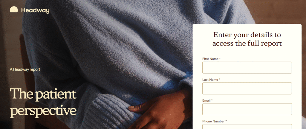
You’re taken to a landing page where you can access the full report, which is aligned with what the ad talks about.
But here’s the catch: it suddenly asks you to fill out a form.
That’s fine if you’ve prepped the viewer for it.
But in this case, there’s no mention of the form in the creative or caption – which can break the user journey a bit.
People might bounce just because they didn’t see it coming.
Caption:
This caption gets a 1 out of 5.
The creative is doing a solid job, but the caption drops the ball completely.
There’s barely any context, no story, no explanation, and no CTA. Just throwing in an emoji won’t save it.
This could’ve been a great place to frame the stat, highlight the report, tease what’s inside, and push people to click. Such a wasted opportunity.
How can you use this for your business?
1. Lead with value, not just the product. If you’re in a trust-heavy category like healthcare, finance, or insurance – start by educating. A stat, a data point, or a short insight that helps your audience understand the why behind your product can open the door better than any benefit list.
2. Make the data specific. General numbers feel made up. “82% of people” is better than “most people.” Specifics increase trust and show that you’ve actually done the work.
3. Use research as a lead magnet. If you’ve got proprietary data, even a small survey, position it as a free report or insight piece. People love to feel informed, especially if it helps them make a smart decision.
Check Out the Landing Page:
Here’s the landing page for this product:
https://join.headway.co/content/the-patient-perspective/
This post is packed with insights; I again recommend bookmarking it in your browser for future reference.
Finally, I would like to add that I will continue sending you these ads every Monday, but they alone may not be sufficient for your success as you would want more concepts under your belt.
Well, that’s all for post, folks!
Therefore, if you are a Facebook ads marketer and want more ads like these for yourself, then go ahead and check out Minea.
Here is the promo code offering you 20% off for 3 months: SANNIDHYA20
And here is my affiliate link: [https://app.minea.com/find-winning-product?ref=k63dd]
Also, let me know which niche’s ad I should pick up next for you. I would love to hear from you.
DISCLAIMER: This post contains affiliate links, which means that if you click on one of the product links, I’ll receive a small commission.