Hey,
Welcome to the 70th edition of Ad Pulse Monday!
For those new to this series, every Monday, I select an ad or ads that I believe have performed exceptionally well. I’ll break down their success factors, key takeaways, and how you can apply these insights to your business.
If you’re already familiar with Ad Pulse Monday, welcome back!
Consider bookmarking these posts, creating a handy repository right in your browser.
Without further ado, let’s dive in
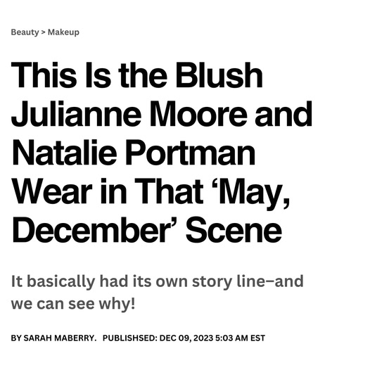
Hollywood Blush
To view the ad, register on Minea using this affiliate link (and get a flat 20% discount on paid plans):
https://app.minea.com/ads/facebook?ref=k63dd
And then click on this link:
https://app.minea.com/en/ads/facebook/894859265330507/details?ref=k63dd
1. Thumbnail score:
I’m giving this a solid 5 out of 5.
Text-only ads are dominating on Meta right now, and this one is a perfect example of why.
It cuts through the usual visual clutter and grabs attention using pure storytelling and copy.
What makes this one stand out even more is the magazine-style UI. It doesn’t look like an ad. It looks like a headline from a celeb gossip site.
That makes it feel native to the feed and instantly boosts clickability.
It cleverly uses a nostalgic pop culture moment from a popular movie, triggering emotional recall. And then it uses that to plug the product in a subtle but smart way.
This is classic halo effect in action. The ad is using a beloved celebrity or character to make the product more desirable.
I also love the finesse in the copy. It’s tight, intriguing, and nails the tone of a Hollywood insider article.
This is not just good creative; it’s a masterclass in format-first thinking.
2. Click Score:
Another 5 out of 5 from me.
The story setup is doing most of the heavy lifting, but the headline and description take it across the finish line.
Since the product isn’t directly shown in the visual, the headline steps in to clearly list the key ingredients and benefits, building curiosity and trust.
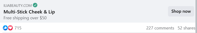
The description throws in a “free shipping” offer, which is a proven CTR booster.
Plus, the ad has been live long enough to build real social proof. That plays a huge role in increasing clicks, especially for newer audiences.
3. Ugly Score:
Straight 5 out of 5.
This is what an “ugly ad” should be. It doesn’t scream ad at all.
It feels like something you’d naturally click on – like a magazine feature or a piece of celebrity news.
That’s what makes it scroll-stopping.
There’s no polish, no branding screaming in your face, just a cleverly positioned, native-feeling story that hooks you.
This kind of designed imperfection is what works best right now.
You’re not trying to impress people.
You’re trying to fit into their scroll like a friend sharing something interesting. Nailed it.
4. Congruency Score:
Another solid 5 out of 5.
When you click on the ad, you land exactly where you expected to go.
The same offer, same messaging, and same tone are carried over to the landing page.
That alignment makes the experience frictionless.
The layout is clean, the copy is on point, and you’ve got customer reviews and CTAs in all the right places.
Caption:
The caption is sadly a missed opportunity. Major missed opportunity.
One line is not going to cut it, especially for an ad that requires people to give you something (like a phone number).
You’ve already done the hard work with the creative – why not carry that clarity into the caption?
A good caption could’ve easily added a sense of urgency, reinforced the benefit, and handled the objection around sharing personal info.
How can you use this for your business?
1. Design your ads like articles, not ads. Use the magazine/newspaper-style layout with a bold headline to draw attention. People engage more when they feel like they’re discovering something, not being sold to.
2. Tap into pop culture or nostalgia. Reference a moment, a movie, or a cultural cue that your audience already loves – then tie it to your product with subtlety. That’s how you create emotional recall.
3. Use the halo effect to your advantage. Even if you can’t name-drop a celebrity, borrow elements of their lifestyle, visuals, or endorsements to create association and increase product desirability.
4. Focus on the story first, product second. Make your copy do the heavy lifting. Lead with a hook, back it with proof, and only then bring in the product as the natural next step.
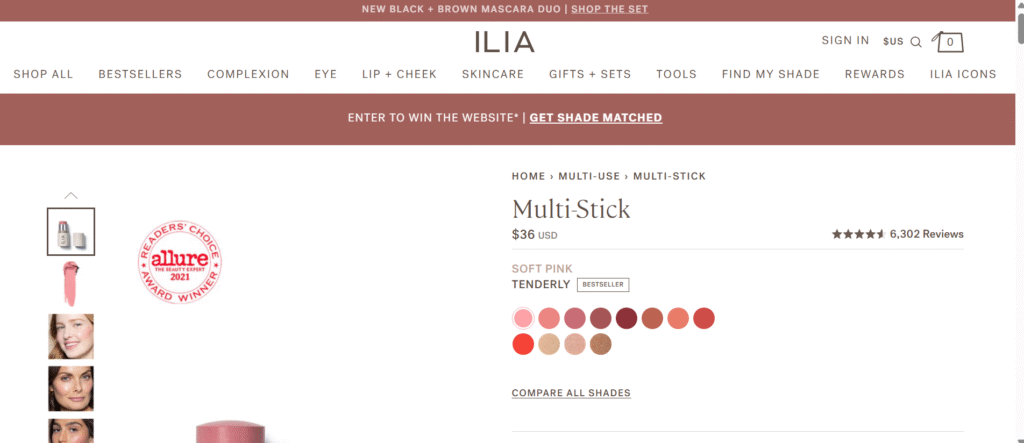
Check Out the Landing Page:
Here’s the landing page for this product:
https://iliabeauty.com/products/multi-stick-cream-blush-stick-lip-cheek-tint
This post is packed with insights; I again recommend bookmarking it in your browser for future reference.
Finally, I would like to add that I will continue sending you these ads every Monday, but they alone may not be sufficient for your success as you would want more concepts under your belt.
Well, that’s all for post, folks!
Therefore, if you are a Facebook ads marketer and want more ads like these for yourself, then go ahead and check out Minea.
Here is the promo code offering you 20% off for 3 months: SANNIDHYA20
And here is my affiliate link: [https://app.minea.com/find-winning-product?ref=k63dd]
Also, let me know which niche’s ad I should pick up next for you. I would love to hear from you.
DISCLAIMER: This post contains affiliate links, which means that if you click on one of the product links, I’ll receive a small commission.