Hey,
Welcome to the 68th edition of Ad Pulse Monday!
For those new to this series, every Monday, I select an ad or ads that I believe have performed exceptionally well. I’ll break down their success factors, key takeaways, and how you can apply these insights to your business.
If you’re already familiar with Ad Pulse Monday, welcome back!
Consider bookmarking these posts, creating a handy repository right in your browser.
Without further ado, let’s dive in
Impact Coffee
To view the ad, register on Minea using this affiliate link (and get a flat 20% discount on paid plans):
https://app.minea.com/ads/facebook?ref=k63dd
And then click on this link:
https://app.minea.com/en/ads/facebook/832829468846258/details?ref=k63dd
1. Thumbnail score:
I’m giving this a solid 5 out of 5.
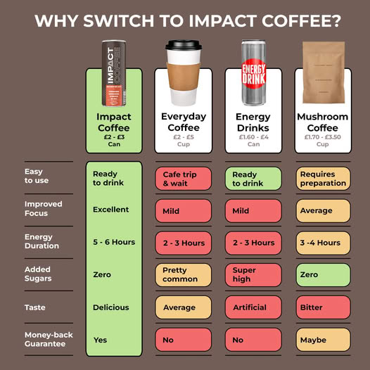
There’s this common myth that Us vs. Them ads go against Meta’s policies, but that’s simply not true.
In fact, when executed well, they consistently outperform other ad formats. This creative nails the approach by laying out a clear, well-structured comparison that positions their product as the smarter choice, without bashing the competition.
What I love is how they’ve expanded the frame of competition. They’re not just comparing with other coffee brands.
They’ve brought in Coke and energy drinks too. That’s how you win. You need to know exactly what your audience is using instead of you.
That’s your real competition. The color-coded breakdown (green, red, yellow) simplifies the comparison visually. And even though the chart dominates the creative, it doesn’t scream “ad.” It feels like something you’d screenshot to show a friend. Big win.
2. Click Score:
This gets a 4.5 out of 5.
The ad instantly grabs attention and highlights the offer using a checklist format which is already a pattern that converts well.
The headline includes a discount, and let’s be honest, freebies and deals always reduce hesitation and drive clicks. But there’s one area that could be improved – the description. It runs too long and gets cut off on the feed.
If you want people to follow through, make sure they can read the full message without clicking “see more.”
3. Ugly Score:
When done right, the Us vs. Them format can be a total game-changer.
This ad avoids flashy branding and directly addresses customer pain points. It doesn’t feel overly salesy but speaks to the audience in a straightforward way.
The design looks more like an infographic, which works in its favor by giving it a fresh and authentic vibe.
4. Congruency Score:
A perfect 5 out of 5.
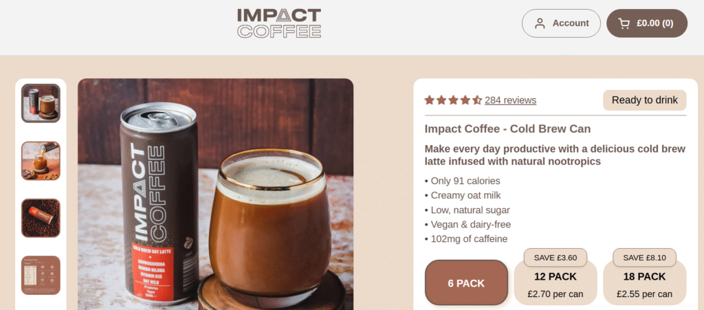
The landing page picks up exactly where the ad leaves off. Same offer, same messaging, zero friction.
When a user clicks through and sees what they expected, it reinforces their decision to buy.
The layout is clean, there are strong CTAs, testimonials are placed right, and the navigation is intuitive. No surprises, just smooth flow.
Caption:
The caption is just one line and that’s not enough for an ad that’s trying to do so much heavy lifting.
There’s no context, no amplification of the offer, and definitely no clear CTA. Even a short, well-written paragraph would’ve made this ad way stronger.
How can you use this for your business?
1. Don’t just compare yourself to direct competitors – think about all the products your customer is using to solve the same problem.
2. Use visual comparison charts. They simplify your messaging and help people make fast decisions.
3. Focus more on educating than selling. This ad works because it helps users understand, not just buy.
Check Out the Landing Page:
Here’s the landing page for this product:
https://www.impact-coffee.com/products/impact-coffee
This post is packed with insights; I again recommend bookmarking it in your browser for future reference.
Finally, I would like to add that I will continue sending you these ads every Monday, but they alone may not be sufficient for your success as you would want more concepts under your belt.
Well, that’s all for post, folks!
Therefore, if you are a Facebook ads marketer and want more ads like these for yourself, then go ahead and check out Minea.
Here is the promo code offering you 20% off for 3 months: SANNIDHYA20
And here is my affiliate link: [https://app.minea.com/find-winning-product?ref=k63dd]
Also, let me know which niche’s ad I should pick up next for you. I would love to hear from you.
DISCLAIMER: This post contains affiliate links, which means that if you click on one of the product links, I’ll receive a small commission.