Hey,
Welcome to the 34th edition of Ad Pulse Monday!
For those new to this series, every Monday, I select an ad or ads that I believe have performed exceptionally well. I’ll break down their success factors, key takeaways, and how you can apply these insights to your business.
If you’re already familiar with Ad Pulse Monday, welcome back!
Consider bookmarking these posts, creating a handy repository right in your browser.
Without further ado, let’s dive in
More Than Just Coffee

To view the ad, register on Minea using this affiliate link (and get a flat 20% discount on paid plans):
https://app.minea.com/ads/facebook?ref=k63dd
And then click on this link:
https://app.minea.com/en/ads/facebook/1062463862552352/details?ref=k63dd
1. Thumbnail score:

I’m giving this a 4.5 out of 5.
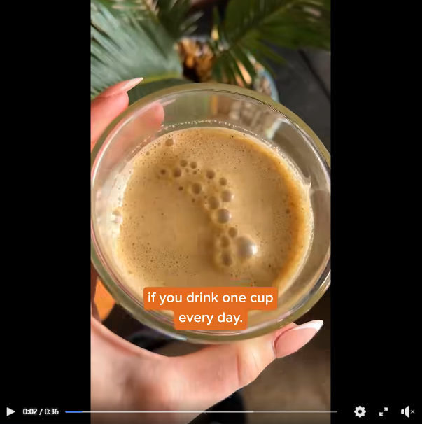
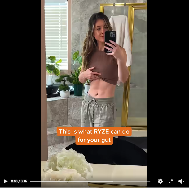
User-generated content is a winner for skincare brands (or any industry, really). People trust content from regular folks more than traditional ads.
Ads that mimic UGC are winning across advertising platforms right now and Meta is no exception. I love that this ad particularly uses native Meta features for creating on overlay headline that grabs attention.
The visuals complement the headline perfectly, presenting a compelling value proposition that draws viewers in.
2. Hook Score:
This gets a 4 out of 5 from me.
The ad grabs your attention and then hooks you in the first three seconds with jump cuts and storytelling.
Right from the beginning, you’re pulled into the narrative the ad sets, indicating a strong hook that effectively engages viewers.
3. Retention Score:
This is a solid 4 out of 5.
While shorter ads are performing better, this particular example is a long ad done right.
This is a testament to the fact that if you create ads with good storytelling, the right visuals, and good audio – it will generate interest irrespective of it’s length.
Moreover, there are so many things happening in the ad that people are bound to watch it again, which will further enhance the retention rate.
4. Click Score:
This gets a 4 out of 5 from me.
The headline builds the offer further and entices you to click on the link. Plus, since the ad has been running for a while, it has gathered a huge amount of social proof through engagement, which will boost the click rate.

5. Ugly Score:
This is a 5 out of 5.
The UGC format lends a lot of authenticity, making it relatable and engaging. At the same time using native platform features, jump cuts, and unpolished shots make it even better.
6. Congruency Score:
This is a 5 out of 5.
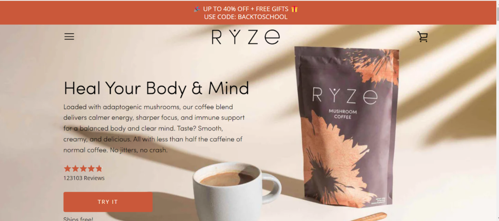
You’re redirected to a landing page that highlights the exact same offer from the ad right at the start. This validates your choice.
Moreover, the landing page is clean and clearly lists the product benefits along with customer testimonials.

Caption:
The caption is well-written but lacks effective formatting, such as adequate line breaks and emojis, which would improve the click-through rate.
Currently, benefits are lumped together in a paragraph which decrease the overall readability. Using bullet points here would make more sense.
Additionally, a more compelling call-to-action is needed to maximize response.
How can you use this for your business?
- UGC can massively boost trust and engagement in your campaigns. Encourage your customers to share their experiences with your products. You can incentivize them to create videos or photos that showcase the benefits and usage of what you offer.
- Use the platform’s native features to add engaging headlines directly on your video ads. This approach not only grabs attention quickly but also keeps your costs low by avoiding heavy production investments.
- Invest in creating ads that hook the viewer in the first few seconds. Use jump cuts, engaging questions, or intriguing visuals to make sure you catch the eye early. Then, maintain their interest with compelling storytelling that narrates the value of your product through a customer’s journey or experience.
Check Out the Landing Page:
Here’s the landing page for this product:
https://www.ryzesuperfoods.com
This post is packed with insights; I again recommend bookmarking it in your browser for future reference.
Well, that’s all for post, folks!
Finally, I would like to add that I will continue sending you these ads every Monday, but they alone may not be sufficient for your success as you would want more concepts under your belt.
Therefore, if you are a Facebook ads marketer and want more ads like these for yourself, then go ahead and check out Minea.
Here is the promo code offering you 20% off for 3 months: SANNIDHYA20
And here is my affiliate link: [https://app.minea.com/find-winning-product?ref=k63dd]
Also, let me know which niche’s ad I should pick up next for you. I would love to hear from you.
DISCLAIMER: This post contains affiliate links, which means that if you click on one of the product links, I’ll receive a small commission.