Hey,
Welcome to the 32th edition of Ad Pulse Monday!
For those new to this series, every Monday, I select an ad or ads that I believe have performed exceptionally well. I’ll break down their success factors, key takeaways, and how you can apply these insights to your business.
If you’re already familiar with Ad Pulse Monday, welcome back!
Consider bookmarking these posts, creating a handy repository right in your browser.
Without further ado, let’s dive in
Stylish Activewear

To view the ad, register on Minea using this affiliate link (and get a flat 20% discount on paid plans):
https://app.minea.com/ads/facebook?ref=k63dd
And then click on this link:
https://app.minea.com/en/ads/facebook/389760393927169/details?ref=k63dd
1. Thumbnail score:
I’m giving this a solid 5 out of 5.
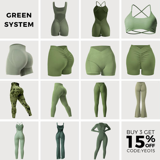
Ads that show multiple product options are winning on Facebook right now. You can also use these ads to represent different product lines, items, or categories.
The reason why this creative type works is because people like to believe they have choices.
Displaying different SKUs allows the right products to stand out to the right people thereby improving your conversion rates.
2. Click Score:
This earns a 4 out of 5 from me.
The ad captures your attention with its array of SKUs and the discount offer.
I’ve deducted a point because the headline doesn’t adequately convey the ad’s value proposition.
However, the offer detailed in the description is likely to boost the CTR for this ad.

3. Ugly Score:
This is a good 4.5 out of 5.
The ad skips flashy branding and talks directly to customers, almost like a product catalog.
This makes it stand out because it doesn’t look like a typical advertisement.
4. Congruency Score:
This ad’s congruency score is a solid 5 out of 5.
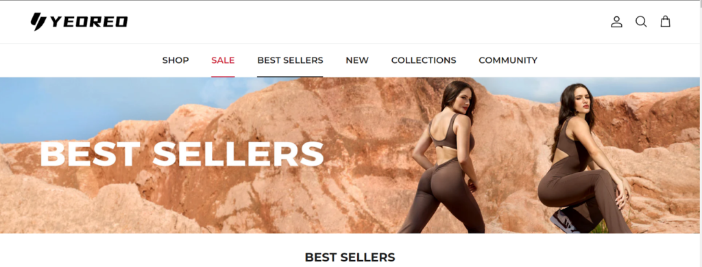
You’re directed to the brand’s product page where you find similar SKUs listed.
The landing page is clean and user-friendly, showcasing offers and sale items prominently.
The categorization of products into packs with discounts on bundles will likely increase the average order value (AOV) for the business.

Caption:
This caption gets a 3.5 out of 5.
It effectively outlines the different discount offers.
It’s also informative, listing various benefits with bullet points and emojis to draw your attention.
However, refining the structure to enhance flow would make it even more effective.
How can you use this for your business?
- Showcase Variety: Showing a variety of your products can significantly boost interest and engagement. Consider using a similar strategy in your ads by displaying an array of options. This helps cater to different preferences within your target audience and increases the chances that viewers will find something they like.
- Highlight Offers Clearly: Utilize your ad space to highlight special offers, discounts, or exclusive deals.
- Refine Your Captions: While emojis and discounts are great, don’t underestimate the power of a well-crafted caption. Use storytelling or relatable scenarios to make your captions more engaging and personable.
Check Out the Landing Page:
Here’s the landing page for this product:
https://yeoreo.com/collections/best-sellers?fbadid=%7B%7Bad.id%7D%7D
This post is packed with insights; I again recommend bookmarking it in your browser for future reference.
Well, that’s all for post, folks!
Finally, I would like to add that I will continue sending you these ads every Monday, but they alone may not be sufficient for your success as you would want more concepts under your belt.
Therefore, if you are a Facebook ads marketer and want more ads like these for yourself, then go ahead and check out Minea.
Here is the promo code offering you 20% off for 3 months: SANNIDHYA20
And here is my affiliate link: [https://app.minea.com/find-winning-product?ref=k63dd]
Also, let me know which niche’s ad I should pick up next for you. I would love to hear from you.
DISCLAIMER: This post contains affiliate links, which means that if you click on one of the product links, I’ll receive a small commission.