Hey,
Welcome to the third edition of Ad Pulse Monday!
For those new to this series, every Monday, I select an ad or ads that I believe have performed exceptionally well.
I’ll break down their success factors, key takeaways, and how you can apply these insights to your business
If you’re already familiar with Ad Pulse Monday, welcome back!
Consider bookmarking these posts, creating a handy repository right in your browser.
Without further ado, let’s dive in!
Firefly Lights

Thumbnail
Watch the full video here: https://app.minea.com/en/ads/pinterest/990932724235314788/details
or
If you are not a Minea user, then here: https://in.pinterest.com/pin/990932724235314788/
1. Thumbnail score:
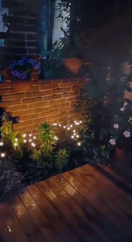
I would give it a 3 out of 5. They could have enhanced it by adding text to set the context or using a clearer picture to prevent viewers from exerting extra mental effort to decipher it.
Although it has an amateur look, which I often recommend, it’s excessively blurry to the point of being almost unrecognizable.
It takes considerable mental effort to understand what this ad is actually about. Overburdening your customers with such a cognitive load is not advisable.
2. Hook Score:

In the first three seconds, the blurred video and numerous lights led me to think that it was a conspiracy-themed video revealing secrets about extraterrestrial activities, which seemed very spooky.
I give it a 5 out of 5 for this effect. It’s brilliant. I believe that no one would skip these first 3 seconds, which is even better.
3. Retention Score:

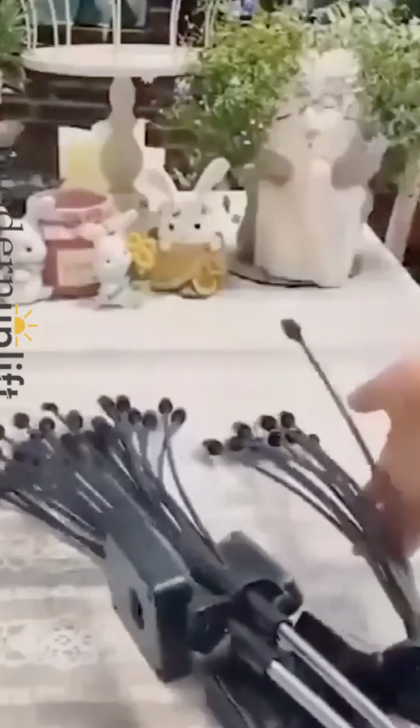
Immediately after the first three seconds, the video reveals the product, effectively bursting the mystery and making everything clear.
It transitions from a seemingly extraterrestrial theme to showcasing decor lights – a complete 180-degree turn.
This moment is ideal for creating a lasting impression of the product, especially when you’ve captured the viewer’s attention.
The magic continues with multiple jump cuts every two seconds, displaying before-and-after scenes and the product in various settings.
I would give this ad a 5 out of 5. If you’re selling decor lights, consider replicating this ad frame by frame.
4. Click Score:
Unfortunately, this scores a 0/5. Despite building significant hype, the ad fails to create urgency or exclusivity. A simple “buy now” CTA would have sufficed.
5. Ugly Score:
The ad is overly blurry, which, while situationally advantageous, is not a recommended approach. Avoid excessive blurriness.
Caption:
As with TikTok, captions on Pinterest ads are typically brief and not the main focus.
How can you use this for your business?
- Create a slightly better-quality thumbnail that isn’t blurry.
- If you can make the subject appear mysterious, do so in the first 3 seconds to pique the viewer’s curiosity.
- Use multiple shots and angles of the product, including before-and-after views, to maintain viewer interest.
- Use a time-sensitive CTA at the end; otherwise, what’s the purpose of such a buildup if you don’t strike while the iron is hot?
- Keep the duration under 15 seconds.
Check Out the Landing Page
Here’s the landing page for this product: https://www.craboss.com/products/salesolar-powered-firefly-light?st=
This post is packed with insights; I again recommend bookmarking it in your browser for future reference.
Well, that’s all for the post, folks!
Finally, I would like to add that I will continue sending you these ads every Monday, but they alone may not be sufficient for your success as you would want more concepts under your belt.
Therefore, if you are a Facebook ads marketer and want more ads like these for yourself, then go ahead and check out Minea.
Here is the promo code offering you 20% off for 3 months: SANNIDHYA20
And here is my affiliate link: [https://app.minea.com/find-winning-product?ref=k63dd]
Also, let me know which niche’s ad I should pick up next for you. I would love to hear from you.
DISCLAIMER: This post contains affiliate links, which means that if you click on one of the product links, I’ll receive a small commission.