Hey,
Welcome to the 26th edition of Ad Pulse Monday!
For those new to this series, every Monday, I select an ad or ads that I believe have performed exceptionally well. I’ll break down their success factors, key takeaways, and how you can apply these insights to your business.
If you’re already familiar with Ad Pulse Monday, welcome back!
Consider bookmarking these posts, creating a handy repository right in your browser.
Without further ado, let’s dive in
Customer-Favorite Oats

To view the ad, register on Minea using this affiliate link (and get a flat 20% discount on paid plans):
https://app.minea.com/ads/facebook?ref=k63dd
And then click on this link:
https://app.minea.com/en/ads/facebook/755468006616682/details?ref=k63dd
1. Thumbnail score:
I’m giving this a 4 out of 5.
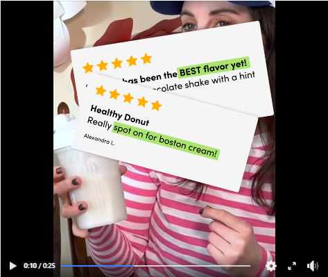
This is the exact UI you use in Instagram stories during a Q&A session. Using native elements from popular apps will significantly reduce your CPM and increase the engagement rate of your creatives.
The USP of the brand (Oats Overnight) is its ability to come up with unique flavors. The question they used here highlights this feature, making you curious to know the answer.
Plus, using a human face in the ad is an effective way to improve engagement. Bonus points if it’s someone in-house because it saves a lot of time and money compared to hiring actors for your ad.

2. Hook Score:
This gets a 4.5 out of 5 from me.
As soon as the ad begins, you’re hit with subtitles, jump cuts, and a shaky frame. The mention of 50,000 customers instantly adds weight to the ad and hooks you right in.
Send this ad to your video editors to show them how to generate curiosity using nothing but subtitles.
3. Retention Score:
This is a solid 5 out of 5.
The ad is just 25 seconds long, and so much is happening on the screen that people are bound to watch it repeatedly.
The ad builds a storyline well, with different visuals from product processing to customer testimonials appearing quickly. This will compel people to rewatch it, further improving its retention rate.
4. Click Score:
This gets a 4 out of 5 from me.
The headline does a good job of explaining the product. The CTA in the video will also push people to click on the ad.
Since the ad has been running for a while, it has gathered significant social proof in the form of engagement, which will improve the click rate.
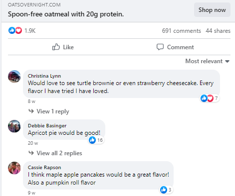
Take this opportunity to look at the comment section of the ad and see how your creatives can flourish by asking customers to weigh in with their opinions.
This ad’s comments are filled with people recommending different oatmeal flavors. You can do this by asking for customer feedback as well.

5. Ugly Score:
This is a good 4.5 out of 5.
The ad looks more like a native Q&A session than an ad, which is a huge win. The random shots used to create this video make it look like someone with basic editing skills made it, giving it a more authentic, “ugly ad” vibe.
6. Congruency Score:
This ad’s congruency score is a solid 3.5 out of 5.
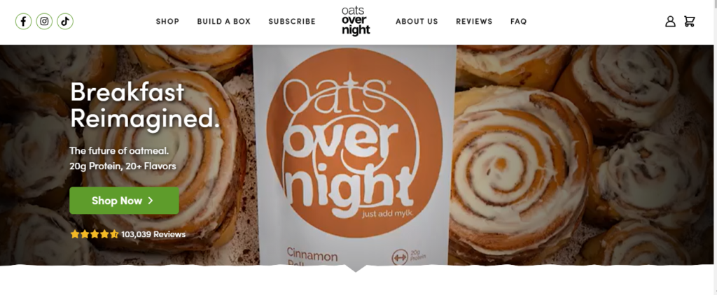
When you’re redirected to the landing page, you see a catalog of different products. If the flavor in the ad made you click, you’ll have a hard time finding it. A better idea is to link directly to the product page of the oatmeal flavor from the ad.
That being said, the landing page is pleasing to the eye and easy to navigate. It also has CTAs and customer testimonials placed at the right spots.

Caption:
This caption gets a 0 out of 5. It doesn’t make any sense, and this brand should have serious concerns with its marketing team for using this caption.
A good caption with line breaks, benefits, bullet points, and a CTA would have elevated the whole ad. Right now, this is just a terribly missed opportunity.
How can you use this for your business?
- Think about how you can use familiar elements from social platforms to enhance your ads. It reduces costs and bumps up engagement because it feels less like an ad and more like the content they’re already interacting with daily.
- Boost interaction by inviting your audience to participate in the conversation. Ask questions or for feedback in your ads to encourage a flurry of comments.
- Ensure that when customers click through your ad, they find exactly what they expect. If the ad features a specific product, link directly to that product’s page to simplify the user journey and reduce bounce rates.
- Don’t let your captions be an afterthought. They should enhance the ad’s message, clearly outline benefits, and guide viewers with a strong call to action.
Check Out the Landing Page:
Here’s the landing page for this product:
This post is packed with insights; I again recommend bookmarking it in your browser for future reference.
Well, that’s all for post, folks!
Finally, I would like to add that I will continue sending you these ads every Monday, but they alone may not be sufficient for your success as you would want more concepts under your belt.
Therefore, if you are a Facebook ads marketer and want more ads like these for yourself, then go ahead and check out Minea.
Here is the promo code offering you 20% off for 3 months: SANNIDHYA20
And here is my affiliate link: [https://app.minea.com/find-winning-product?ref=k63dd]
Also, let me know which niche’s ad I should pick up next for you. I would love to hear from you.
DISCLAIMER: This post contains affiliate links, which means that if you click on one of the product links, I’ll receive a small commission.