Hey,
Welcome to the 24th edition of Ad Pulse Monday!
For those new to this series, every Monday, I select an ad or ads that I believe have performed exceptionally well. I’ll break down their success factors, key takeaways, and how you can apply these insights to your business.
If you’re already familiar with Ad Pulse Monday, welcome back!
Consider bookmarking these posts, creating a handy repository right in your browser.
Without further ado, let’s dive in
Data-Driven Beauty

To view the ad, register on Minea using this affiliate link (and get a flat 20% discount on paid plans):
https://app.minea.com/ads/facebook?ref=k63dd
And then click on this link:
https://app.minea.com/en/ads/facebook/693626805726111/details?ref=k63dd
1. Thumbnail score:
I’m giving this a solid 4.5 out of 5.
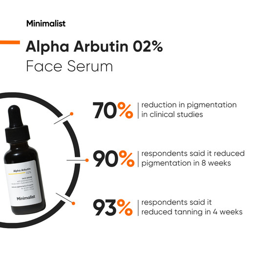
This is what I call a statistic ad. Numbers and data speak to the logical side of the brain, and while emotions drive purchases, statistics provide a strong rationale for consumers to choose your product.
Using precise numbers to showcase before-and-after results, especially in skincare, can be incredibly persuasive.
Additionally, this ad creative type is a great way to showcase before and after results without using the regular format. Another thing that I really like about this ad creative is the use of bullet points and lines to organize the test.
I have deducted half a point because using round numbers like 70% or 90% isn’t believable. Odd numbers or very specific decimal points are more convincing.
2. Click Score:
This earns another 3 out of 5 from me.
The ad catches your attention with its statistics and minimalist design. However, the headline and description do not support the creative well.
Instead of highlighting the product’s features, the headline could have been used to highlight the benefits of making a lucrative offer.
Now, I am not saying that features are not great, but it’s important to understand that while features can help you gain your customer’s attention, they’re not enough to compel them to make the purchase decision.
There’s a reason they say features tell, but benefits sell.

3. Ugly Score:
This is a good 3.5 out of 5.
I like that the format of the ad is basic, with nothing flashy or polished. However, the creative still follows branding guidelines, which reduces the ugly score.
People might build tolerance toward Minimalist’s branding guidelines and become immune to the message.
4. Congruency Score:
This ad’s congruency score is a solid 5 out of 5.
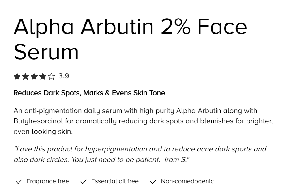
You’re redirected to the serum’s product page, where you find the exact same benefits listed as showcased in the ad. The landing page is pleasing to the eyes and easy to navigate.
It also has CTAs, customer testimonials, and related product catalogs placed at the right spots.

Caption:
This caption gets a 2 out of 5.
I have no idea why brands don’t capitalize on their captions. This is such a missed opportunity.
While there’s some use of emojis, the lack of formatting and content makes the caption barely useful to the ad creative. It doesn’t even have a CTA.
How can you use this for your business?
- Whether you’re in the skincare industry or any other field, incorporating statistics into your ads can significantly boost your credibility and increase your CR.
- Using bullet points in your ads is an effective way to present information clearly and concisely. This format is easy to scan and can quickly show your audience why they should be interested in what you’re selling.
- Make every word count in your captions. Start with a strong hook, such as a compelling question or statement that reflects the viewer’s potential skepticism or desire. Include testimonials or endorsements to add credibility. Emphasize the product’s unique benefits with concise, powerful language and incorporate a clear call-to-action (CTA) that guides users on what to do next.
Check Out the Landing Page:
Here’s the landing page for this product:
https://beminimalist.co/products/alpha-arbutin-2
This post is packed with insights; I again recommend bookmarking it in your browser for future reference.
Well, that’s all for the post, folks!
Finally, I would like to add that I will continue sending you these ads every Monday, but they alone may not be sufficient for your success as you would want more concepts under your belt.
Therefore, if you are a Facebook ads marketer and want more ads like these for yourself, then go ahead and check out Minea.
Here is the promo code offering you 20% off for 3 months: SANNIDHYA20
And here is my affiliate link: [https://app.minea.com/find-winning-product?ref=k63dd]
Also, let me know which niche’s ad I should pick up next for you. I would love to hear from you.
DISCLAIMER: This post contains affiliate links, which means that if you click on one of the product links, I’ll receive a small commission.